Maker Monday Connie Maker Monday Connie

Why Some Booths Feel Easy to Shop (and Others Don’t)

People are stepping into your booth—but they’re not stopping. They move through, look around, and leave without anything changing. The difference isn’t traffic. It’s what happens after they step in.

Shopper engaging with products at a craft booth while other shoppers walk past without stopping

One person stops and engages—but most continue moving past without slowing down

Someone steps into your booth.

They slow down.

They look at something—

and then they keep moving.

It happens again.

Someone else comes in.
Makes a quick loop.
Glances across everything.

And leaves.

Nothing really stops them.

Nothing holds them long enough
for anything to change.

Shoppers walking past a craft booth display without stopping or interacting with products

People move past the booth—but nothing slows them down or pulls them in

At first, it looks like activity.

People are coming in.
They’re looking around.
They’re not ignoring you.

But nothing builds.

No one stays in one place.
No one settles into anything.
No one moves from browsing into buying.

That’s the difference.

Not traffic.

Not visibility.

What happens after they step in.

The Pattern

When a booth feels easy to shop, something changes the moment a person enters.

They don’t just move through it.

They stop.

They shift from walking → looking → staying.

In booths that don’t feel easy to shop, that shift never happens.

The movement continues the same way it started.

In.
Around.
Out.

And because nothing interrupts that motion—

nothing builds from it.

The Cause

This isn’t about how your booth looks.

It’s about what your booth does to movement.

Most booths are set up to be seen.

Clean layout.
Nice products.
Everything visible at once.

But visibility doesn’t create engagement.

If everything can be seen at a glance,
there’s no reason to stop.

If nothing asks for a second look,
people don’t give one.

So they keep moving.

The Constraint

Even when someone is interested—

your booth still has to hold them long enough
for that interest to turn into something else.

If it doesn’t:

  • they don’t slow down

  • they don’t interact

  • they don’t stay long enough to decide

And without that time—

nothing progresses.

Shopper approaching a craft booth display while other shoppers walk past without stopping or engaging

Some people approach—but most continue moving past without stopping

The Shift

In booths that feel easy to shop, something interrupts the flow.

Not everything.

Just enough.

There’s a moment where movement changes.

Where a person:

  • stops walking

  • focuses on one area

  • stays long enough to engage

That moment is what everything else depends on.

Without it,
the booth stays in motion.

With it,
everything starts to build.

Shopper stopping to examine and engage with products at a craft booth display

When someone stops and engages, everything else has a chance to build

Diagnostic Checks

If you’re not sure where your booth falls, watch what people actually do:

  • If people step in but don’t move deeper → nothing is guiding them inward

  • If they look across everything at once → there’s no focal starting point

  • If they move continuously without pausing → nothing is interrupting motion

  • If they hesitate briefly but keep going → interest isn’t being held

These aren’t random behaviors.

They’re signals.

What This Means

A booth that feels easy to shop doesn’t feel easier because of better products.

It feels easier because movement changes inside it.

People don’t just pass through.

They stop.

They stay.

They engage.

That’s where the difference starts.

Well-organized craft booth display with vendor arranging products but no customers engaging

A booth can be set up well—and still not create any engagement

Where This Leads

Right now, your booth is doing one of two things:

  • letting people move through it

  • or giving them a reason to stop

That difference decides everything that happens next.

But knowing that isn’t enough.

👉 What to Focus On When Your Booth Feels Busy—But Isn’t Selling

Read More
Maker Monday Connie Maker Monday Connie

Why Shoppers Browse Your Booth But Don’t Buy

Shoppers are stopping at your booth.
They’re noticing things.
Sometimes they even pause long enough to look more closely.

And then they leave.

If that pattern keeps repeating, it’s not just about interest—it’s about what happens after that first moment.

Because browsing doesn’t always mean someone has started shopping.

Sometimes it means they noticed something…
but didn’t have a clear way to move forward.

This is where a lot of booths quietly break down.

Not because they look wrong—
but because they don’t carry attention into a buying path.

Shopper standing inside a craft show booth browsing handmade goods and display shelves without engaging further or making a purchase

She’s already in your booth.
Looking. Considering.

But nothing is moving her forward into buying.

They stop.

They look.

Sometimes they even lean in for a second.

And then they leave.

You notice it enough times that it stops feeling random.

Because it’s not that people ignored your booth.

It’s that something almost happened
…and then didn’t.

You can feel the break in it.

That weird moment where interest shows up—
but shopping never really starts.

And after a while, the thought creeps in:

Maybe they liked it.
Maybe it just wasn’t enough.

Or maybe something in the booth is asking too much too soon.

Shopper pauses at the front of a handmade craft booth, looking interested but not moving further into the display.

Shoppers are noticing your booth—but that doesn’t mean they’re entering the buying process.

A lot of makers read this moment as mild interest.

Better than being ignored.
Better than walking straight past.
At least something caught their attention.

But when shoppers browse and leave over and over, the problem usually isn’t that nothing worked.

It’s that the booth created enough interest to start attention—
but not enough clarity to carry that attention into a buying decision.

That’s a different problem.

And it needs to be understood clearly before you start changing everything.

They’re browsing—but they’re not entering the shopping process

When someone slows down at your booth, that does not automatically mean they’ve started shopping.

Sometimes they’re only reacting.

They noticed a product.
They liked the colors.
They saw something that felt pleasant or curious.

But noticing is not the same thing as moving into a clear buying path.

That’s the pattern a lot of booth setups create without meaning to.

They give shoppers just enough to glance, pause, and browse the surface—
but not enough structure to help them keep going.

So the booth gets attention.

But it doesn’t turn attention into movement.

The break usually happens before the product decision

This is the part that gets missed.

If shoppers are browsing but not buying, most makers assume the issue is product price, product appeal, or the shopper’s budget.

Sometimes that’s true.

But when the same browse-and-leave behavior keeps repeating across many shoppers, the booth itself is often creating the stall.

Not because it looks bad.

Because it asks the shopper to do too much interpretation on their own.

They have to figure out where to look first.
What matters most.
What kind of item this booth is really about.
How deep they should go.
Whether there’s a reason to stay.

That mental work feels small from the seller side.

From the shopper side, it’s friction.

And friction is often enough to stop a sale before the product ever gets a fair chance.

A neat booth can still feel mentally heavy

A booth does not have to look messy to feel hard to shop.

Sometimes the hardest booths to diagnose are the ones that look “pretty good.”

Everything is arranged.
Nothing seems obviously wrong.
There’s product variety.
The display looks decent from a distance.

But once shoppers step in, the booth gives them too many equal choices and not enough visual direction.

Nothing stands out as the place to begin.
Nothing clearly carries them from one thing to the next.
Nothing tells them what this booth is really helping them notice.

So they browse lightly.

They react in pieces.

They leave without ever locking onto a reason to buy.

Craft booth display with multiple handmade items arranged neatly but without a clear focal point, causing shopper hesitation.

When everything feels equally important, shoppers don’t know where to begin.

What’s really happening is not lack of interest—it’s lack of directional clarity

That distinction matters.

If people were fully uninterested, they would keep walking.

But they’re not doing that.

They’re stopping.

They’re browsing.

They’re showing signals.

What’s missing is the shift from passive looking to active shopping.

And that shift usually depends on directional clarity inside the booth:

  • what the shopper should notice first

  • what makes the booth feel easy to enter

  • what connects one product area to the next

  • what reduces hesitation instead of adding more choice

When that clarity is weak, the booth keeps generating shallow engagement.

Enough to look promising.
Not enough to convert.

What to look for in your own setup

These are the kinds of signals that often show up when the booth is creating browse behavior without buying momentum:

  • If shoppers stop at the outer edge and scan without stepping in, your booth entry point likely isn’t visually clear enough.

  • If they step in, look at one or two things, and then back out quickly, your display may be creating isolated points of interest instead of a connected shopping path.

  • If they pick up items but do not continue exploring nearby products, the booth may be functioning like separate mini-displays instead of one guided experience.

  • If they circle visually without asking questions or moving deeper, they may be doing too much silent sorting on their own.

  • If different shoppers keep reacting to different items but none of those reactions turn into sustained engagement, your booth may be catching attention in fragments rather than focusing it.

Visual representation of shopper movement through a booth showing pause, browsing, and exit without purchase.

The pattern: pause → browse → lose momentum → leave.

That’s the part worth paying attention to.

Not just whether people stop.

But whether the booth helps them keep going after they stop.

Because that’s where the real loss usually happens.

And once you see that, a lot of random booth tweaking starts to make less sense.

Four shifts that change this pattern

1. Give the booth a clear starting point

A shopper should not have to decide where shopping begins.

When everything has equal visual importance, the booth feels open—but mentally flat.

A stronger starting point helps shoppers enter the booth with less hesitation. That might come from your most recognizable category, your clearest problem-solver, or the area that best tells shoppers what your booth is about.

The point is not to make one thing louder just to be loud.

The point is to reduce the first moment of uncertainty.

2. Connect interest instead of scattering it

A shopper who notices one item should feel pulled naturally toward the next useful thing to look at.

When products feel disconnected, browsing stays shallow.

When displays support one another, shoppers stay in motion longer.

That does not always mean adding more signs or more explanation.

Often it means reducing visual separation and making the booth easier to read as one environment instead of many unrelated decisions.

3. Make staying feel easier than leaving

A lot of browse-and-leave behavior happens because the booth does not give the shopper an easy reason to remain engaged.

Not a sales pitch.
Not pressure.

Just enough visual coherence that staying feels natural.

The booth should lower the effort required to keep looking.

When the experience feels disjointed, leaving becomes the easiest move.

4. Let the booth answer one question clearly

A shopper may not say it out loud, but the booth is always being judged by a silent question:

What am I supposed to notice here?

If the answer is fuzzy, the whole shopping experience becomes weaker.

If the answer is clear, attention has somewhere to go.

That does not mean the booth needs to be simple in a boring way.

It means the booth needs to make its value legible faster.

This is why “they stopped” is not enough

It’s easy to overvalue browsing because browsing looks close to shopping.

And sometimes it is close.

But not always.

Sometimes browsing is just polite curiosity.

Sometimes it is visual interest without structural support.

Sometimes it is the shopper’s way of saying, “Something here caught me—but I don’t know how to move further into it.”

That is a booth problem worth taking seriously.

Because it means the issue may not be your products at all.

It may be what the booth is asking the shopper to sort out before they can feel confident enough to buy.

Craft booth with a clear focal display guiding shoppers deeper into the booth and encouraging continued browsing.

A clear path helps shoppers move from interest into real engagement.

Once that starts happening, the next question is not just whether shoppers are interested.

It becomes:

What are they actually focusing on when they browse?

Because that focus point usually tells you where the booth is helping—
and where it’s failing.

And that’s the part you need to see clearly before you decide what to change next.

To keep going, read What to Focus On When Shoppers Browse—But Don’t Buy.

Read More
Maker Monday Connie Maker Monday Connie

Why Your Booth Can Look Right—but Still Not Work

Your booth can look put together and still feel off to customers. When nothing appears obviously wrong, it’s often harder to see what’s actually holding your setup back.

Sometimes the booth looks fine.

The table is covered.
The display pieces are in place.
Nothing seems obviously wrong.

And yet something still feels off.

You step back and think, Why does this look better in my head than it works in real life?


Then the day starts, people glance in, and somehow the booth still doesn’t feel easy to enter, or easy to understand.

It can be frustrating when the booth appears “put together” but still doesn’t create the response you expected.


Because when nothing looks clearly broken, it becomes harder to see what actually needs to change.

If your booth looks good but still isn’t working, you don’t need to redo everything—you need to adjust how it functions.

Craft booth with an open layout where customers can step in and browse comfortably.

Craft booth with an open layout where customers can step in and browse comfortably.

The Pattern

A booth can look finished… and still not work.

You don’t want to tear it all down… but you don’t trust it either.

Why This Happens

That usually happens when the maker is judging the booth by appearance alone:

  • everything fits

  • the table looks full

  • the colors feel cohesive

  • the display pieces match

  • the setup seems finished

But customers do not experience the booth as a still image.

What looks complete to you doesn’t always translate into something usable for the customer.

They experience it as movement—moment by moment.

They walk by.
They scan quickly.
They decide whether it feels approachable.

They try to understand what you sell.
They look for a place to pause—
without feeling crowded or trapped.

So a booth can “look right” to the maker because it appears complete, while still not working for the customer because the booth experience itself is unclear.

The Cause

What usually breaks here is not effort.
It’s structure.

Here are the patterns that usually show up when a booth looks right—but doesn’t work:

A visually pleasing booth can still struggle when one or more of these problems are present:

1. The booth has no clear entry point
(customers don’t know where to begin)

If customers cannot tell where to begin looking, they keep moving.
A setup that feels balanced to you may still read as closed, flat, or uncertain from the aisle.

2. The eye lands everywhere at once

When every area asks for equal attention, nothing stands out.
The booth may look full and thoughtfully arranged, but the customer never receives a clear first impression.

3. Product grouping is decorative instead of directional

Items may be arranged attractively, but not in a way that helps people understand categories, price relationships, or what kind of work you actually sell.

4. The setup protects symmetry more than shopping flow

Sometimes makers keep things visually even because it feels safer or more polished.
But symmetry does not always create movement.
In some booths, it actually flattens the experience and removes natural points of curiosity.

5. The booth is readable only after effort

If a customer has to work to understand what they are seeing, many simply won’t.
A booth does not need to be loud, but it does need to become clear quickly.

The Constraint

This is what makes booth problems hard to solve.

Most makers adjust based on what feels visibly wrong:

  • too empty

  • too cluttered

  • too plain

  • too busy

But when the booth looks “basically good,” the real issue often hides underneath those more obvious categories.

That is why you can keep tweaking small details without fixing the actual problem.

You change riser height.
You move a sign.
You add another crate.
You remove a basket.
You shift products around.

And still, the booth behaves the same way.

Because the issue was never just how it looked.
It was how it worked.

Working on a Booth Layout That Doesn’t Feel Settled Yet

Working on a Booth Layout That Doesn’t Feel Settled Yet

The Shift

The question to ask isn’t:

Does my booth look right?

The better question is:

Does my booth help people know:

  • where to look,

  • where to move,

  • and why to stop?

That shift matters because a working booth is not just a styled space.
It’s a readable environment—one that makes sense without effort.

A strong booth usually does three things well:

  • it gives the eye somewhere to land first

  • it gives the customer a clear way to enter and browse

  • it makes the products easy to understand without effort

When those things are missing, the booth can still look attractive while quietly underperforming.

And that underperformance often gets misread as a sales problem, a product problem, or even a confidence issue.

Sometimes, it’s simply a structure problem.

Simple diagram showing three stages of customer experience in a booth: first look focal display, entry opening, and browsing flow across product sections with directional arrows.

How Customers Move Through a Craft Booth

Structured Change

Here are four ways to check whether your booth is only looking right—or actually working.

These aren’t design tweaks—they’re structure checks.

1. Check the first three seconds

Stand outside the booth and look at it the way a passing customer would.

Ask:

What do I notice first?

Is there one clear focal point?

Do I immediately understand what kind of products are here?

Does this feel open enough to approach?

If the booth isn’t clear within a few seconds, it may be visually fine—but functionally weak.

2. Check whether the layout creates entry

Look at the front edge and center of the booth.

Ask:

Is there a visible opening?

Does anything feel like a barrier?

Are display pieces creating hesitation instead of invitation?

Does the booth feel easy to step into with the body, not just the eyes?

Many booths look organized—but unintentionally block entry—through tight spacing, hard front lines, or overfilled front tables.

3. Check whether products are grouped for understanding

A customer should be able to make sense of the booth in sections.

Ask:

Are similar items grouped together clearly?

Can someone tell the difference between categories quickly?

Does each area help the customer understand something—or just fill space?

Is the arrangement helping the customer make decisions?

Pretty arrangements can still create confusion when the grouping logic is not obvious.

4. Check whether the booth supports movement

A working booth has rhythm.

Ask:

Where does the eye move after the first focal point?

Is there a natural next place to look?

Do height changes create interest or just busyness?

Is the booth guiding browsing, or scattering attention?

If movement feels random, the booth may look complete—but won’t support real browsing.

Stepping Back to Evaluate a Craft Booth That Looks Right.png

When a Booth Looks Finished but Still Isn’t Working

The Decision

If your booth has been feeling close—but not effective—the problem usually isn’t that it looks bad.

It may be that the booth is asking the customer to do too much work.

That’s a different problem.
And it needs a different kind of fix.

And once you see it that way, the next step becomes much clearer.

If you’re ready to fix what’s actually causing the problem, start here:

Read More
Maker Monday Connie Maker Monday Connie

How to Make a Craft Booth Easier for Customers to Shop

When customers approach a craft booth, they are usually deciding one simple thing:

Does this look easy to explore?

Shoppers at markets often move quickly from booth to booth, scanning displays and deciding where to pause.

Booths that feel calm and easy to browse tend to hold attention longer. Customers feel comfortable stepping closer, taking their time, and exploring the products on display.

Making a booth easier to shop rarely requires dramatic changes.

Often it simply means arranging displays in a way that allows customers to move naturally through the space.

In This Post

We’ll explore a few simple ways makers often make their booths easier for customers to browse:

• why clear product groupings help shoppers explore
• how display height affects visibility
• why browsing comfort matters more than quantity
• small booth adjustments that improve the shopping experience

1. Group Similar Products Together

When customers approach a booth, they often scan quickly to understand what is being offered.

Displays that group similar products together help shoppers understand the booth more easily.

For example:

• jewelry grouped in one area
• candles arranged on a single display
• wood products displayed together

Clear groupings allow customers to explore naturally rather than feeling unsure where to begin.

2. Vary Display Heights

Flat displays can sometimes make products blend together visually.

Varying heights — through shelves, risers, or small stands — helps certain items become more visible.

This doesn’t require dramatic displays.

Even small height differences can guide the customer’s eye across the booth in a comfortable way.

3. Leave Space for Browsing

Customers often need a little physical and visual space to browse comfortably.

When displays are spaced slightly apart, shoppers can pause, lean closer, and look more carefully at products.

Open space also helps booths feel calmer and more inviting.

4. Let Your Best Pieces Stand Out

Not every product needs equal attention in a booth.

Allowing a few standout items to become natural focal points helps customers decide where to look first.

This can happen through:

• a slightly elevated display
• a centered table arrangement
• a small featured grouping

Focal pieces help guide browsing without overwhelming the booth.

If you're experimenting with booth layouts or product placement for the upcoming market season, the Craft Booth Layout Planner can help you sketch display ideas and test arrangements before setting up at a show.

Closing Reflection

A Small Clarity Before You Go

A craft booth doesn’t need to be elaborate to be inviting.

Often the booths that customers enjoy browsing most are simply the ones that feel easy to explore.

When displays are arranged with the shopper’s experience in mind, browsing tends to happen naturally — and the products have more room to be noticed.

Read More
Maker Monday Connie Maker Monday Connie

How to Plan a Craft Booth Layout (Without Overthinking It)

Planning your craft booth layout doesn’t have to feel rushed or overwhelming. This guide helps you understand how booth flow works, avoid common layout mistakes, and create a setup that feels clear, organized, and easy for shoppers to browse.

Your booth layout probably isn’t the problem you think it is.

Most of the time, it’s not about creativity, effort, or having the “right” displays.

It’s about trying to make layout decisions at the wrong time.

If setup day has ever felt rushed…
if you’ve rearranged things more than once…
or if your booth looked fine but didn’t quite work…

you’re not doing anything wrong.

You’re just making decisions under pressure.

Why Booth Layout Feels Harder Than It Should

Booth layout feels complicated because everything is happening at once.

  • space is limited

  • inventory varies

  • displays take up more room than expected

  • and there’s pressure for everything to look “right”

On top of that, it’s easy to compare your booth to polished photos online—which can make simple, functional setups feel inadequate.

Then you arrive at the event, other vendors are already unloading, and suddenly every decision feels urgent.

That’s where most of the stress comes from.

Not a lack of ability—
just a lack of structure before you arrive.

The Real Problem: Planning During Setup

One of the most common patterns is trying to design your booth while setting it up.

But setup time is:

  • noisy

  • rushed

  • physically demanding

It’s the worst possible moment to decide:

  • where tables should go

  • how customers will move

  • what deserves priority placement

So what happens?

You adjust things on the fly.
You second-guess decisions.
You end up with a booth that feels a little crowded or unclear.

Not because your ideas were wrong—
but because the timing was.

Setup time is for assembling.
Not for designing.

Start With Booth Size (Not Product Placement)

A strong booth layout always begins with the space itself.

Most events give you standard sizes like:

  • 6×6

  • 8×8

  • 10×10

Once you know your dimensions, everything else becomes easier.

Your space determines:

  • how much walking room you have

  • how many tables actually fit

  • where displays can realistically go

If you start with products instead, it often leads to overcrowding.

When you start with space, you make clearer decisions about what belongs—and what doesn’t.

Space is the framework.
Product comes second.

Design for Flow, Not Perfection

A good booth isn’t about filling every inch.

It’s about how people move through it.

Flow is:

  • how shoppers enter

  • how they move

  • how they exit

When flow is clear:

  • people step in more easily

  • they stay longer

  • they engage more naturally

When flow is blocked:

  • people hesitate

  • they glance and move on

  • they don’t fully browse

Booths that feel open and navigable almost always perform better than booths packed with inventory.

Perfection isn’t the goal.
Clarity is.

Common Booth Layout Traps

Even experienced vendors run into the same patterns:

  • blocking the entrance with tables or tall displays

  • placing too much inventory at the front

  • using displays that visually close in the space

  • having no clear focal point

  • forgetting to plan where you will stand and move

None of these are obvious while you’re setting up.

But once you know to look for them, they’re much easier to avoid.

Why Repeatable Layouts Work Better

It’s easy to feel like you need a new layout for every show.

But repeatable layouts are what actually reduce stress.

When you use a similar structure each time:

  • setup becomes faster

  • decisions feel easier

  • you know what works (and what doesn’t)

Instead of starting over, you refine.

Instead of guessing, you adjust.

You don’t need a new layout.
You need a better version of the same one.

A Simple Way to Plan Ahead

One of the easiest ways to reduce decision fatigue is to sketch your booth layout before show day.

It doesn’t have to be perfect.

It just needs to exist.

Planning ahead lets you:

  • test arrangements without pressure

  • visualize spacing

  • make decisions while you’re calm

If you prefer something more structured, simple planning tools can make this even easier.

Turn Your Plan Into a Real Setup

Once you have a basic layout, the next step is applying it in a real booth.

Inside Artisan Kraftwerks, you’ll find tools designed specifically for this:

👉 Explore Craft Show Booth Tools

These are designed to help you move from:
guessing → planning → repeatable setup

Keep It Simple and Refine Over Time

You don’t need a perfect booth layout.

You need a clear one.

Start with your space.
Create a simple structure.
Refine it a little each time.

That’s where confidence comes from.

Not from getting it right all at once—
but from making it easier each time you set up.

Where This Fits

If your booth feels off but you’re not sure why:
👉 Booth Clarity Reset

If you’re noticing patterns but haven’t named them yet:
👉 Maker Notes

If you’re ready to plan your booth more intentionally:
👉 Craft Booth Layout & Planning Guide

Read More
Maker Monday Connie Maker Monday Connie

Small Craft Booth Display Ideas That Maximize Limited Space

Smart display ideas that help small craft booths feel bigger, clearer, and easier for customers to browse.

You step back from your booth and try to see it the way customers do.

There’s product on every table.
Shelves are full.
You’ve brought everything you thought might sell.

And still… people glance, hesitate… and keep walking.

It doesn’t feel empty.

It feels… crowded.

Crowded craft booth with too many items displayed, shoppers walking past without stopping

Most makers don’t struggle with having enough product.

They struggle with how that product is experienced.

When everything is visible at once…
nothing stands out.

You’re trying to show everything equally

It feels logical:

More products = more chances to sell
More visibility = better results

But your booth doesn’t behave like inventory.

It behaves like a decision environment.

And too many equal choices create hesitation.

Why adding “better displays” doesn’t fix it

Most advice leads here:

Add more shelves
Stack vertically
Fill empty space

So the booth becomes:

👉 Taller
👉 Fuller
👉 Busier

But not clearer.

The problem isn’t space.

It’s lack of structure inside the space.

This isn’t a space problem—it’s a structure problem

Small booths don’t fail because they’re small.

They fail because:

👉 Everything competes at the same level
👉 Nothing guides the customer’s eye
👉 There’s no clear place to start

When structure is missing, space feels smaller than it actually is.

If this feels familiar, you’re not the only one noticing it.
When Your Booth Feels Crowded No Matter What You Do


4 ways to make a small booth feel bigger (without adding space)

1. Create a single starting point

Your booth needs an entry anchor.

Not everything at once—just one clear place to begin.

Examples:

  • One featured table

  • One product category front and center

  • One visual focal point

👉 This reduces hesitation immediately


2. Group by decision, not by product type

Instead of:
“All earrings here”
“All signs there”

Try:
“Quick gifts”
“Best sellers”
“Seasonal items”

👉 You’re helping customers decide faster, not sort inventory


Craft booth display organized into clear sections like best sellers and gifts for easy shopping

3. Build visual levels—but limit them

Levels create clarity… until they don’t.

Use:

  • 2–3 height layers max

  • Clear spacing between groups

Avoid:

  • Stacking everything upward

  • Filling every vertical inch

👉 Space between items is what creates visibility

4. Leave intentional empty space

This feels wrong—but it’s critical.

Empty space:

  • Gives products breathing room

  • Creates contrast

  • Signals where to look

👉 Without space, nothing feels important

This is a structure problem, not a space problem.

Until the structure changes:

More products won’t help
More displays won’t help
More effort won’t help

But once structure is clear…

Even a small booth can feel easy to browse.

Simple craft booth layout with open space and one focal display that feels easy to browse

If something feels off…
If your booth looks good but isn’t working…

👉 Craft Booth Check: Why It Looks Good But Isn’t Working

Small space doesn’t have to mean limited potential.

With a few intentional shifts, your booth can feel clear, open, and easy to explore —
which is exactly what makes people stop and stay.

Read More
Maker Monday Connie Maker Monday Connie

Signs Your Craft Booth Display Might Be Too Crowded

A crowded craft booth display can make it harder for shoppers to browse your products. Learn the common signs of an overcrowded booth and simple layout changes that can improve shopper flow.

Introduction

A busy craft booth can look exciting at first glance. Tables filled with handmade products often signal creativity, effort, and a wide selection for shoppers.

But there is a quiet downside many craft show vendors discover over time.

When a craft booth display becomes too crowded, shoppers often stop browsing.

Not because the products aren’t good — but because the booth becomes mentally difficult to navigate.

Instead of feeling curious, visitors feel overwhelmed.

The goal of a strong craft booth layout is not to show everything at once.
It is to create a space that feels easy to explore.

Below are a few common signs that your booth display might be working harder than it needs to.

In This Post

We’ll explore a few common signs that a booth display may be feeling a bit crowded to customers:

• when every display surface is filled
• when shoppers hesitate instead of stepping closer
• when products compete equally for attention
• how small spacing changes can make displays easier to explore

1. Shoppers Look Quickly — Then Walk Away

One of the clearest signals of an overcrowded booth is fast scanning behavior.

Visitors glance across the table but don’t step in.

Why this happens:
When products are packed tightly together, the eye has trouble finding a starting point. Instead of curiosity, the shopper feels visual noise.

Strong booths create clear entry points:
• a focal display
• a featured product
• an open browsing area

This small change can dramatically increase how long shoppers stay.

2. Every Inch of Table Space Is Filled

Many vendors feel pressure to fill every available inch of their booth.

After all, more products should mean more sales, right?

In practice, the opposite is often true.

A well-designed craft show vendor booth uses intentional spacing.

Spacing allows:
• individual products to stand out
• shoppers to visually separate categories
• the display to feel organized and calm

Think of empty space as breathing room for your products.

3. Products Blend Together

When a display becomes crowded, different items start to visually merge together.

This makes it difficult for shoppers to notice individual pieces.

For example:
A table with 30 items tightly packed together may appear like one large collection rather than many unique products.

A table with 10–15 well-spaced items often sells better because each piece can be seen clearly.

Simple changes that help:
• small risers
• tiered displays
• grouped product zones

These adjustments give each item its own visual moment.

4. Shoppers Don’t Know Where to Look First

Good craft booth displays guide the eye.

Crowded displays remove that guidance.

If everything is equally dense, the shopper has to decide where to start — and many simply choose not to.

Instead, aim to create a visual hierarchy:

Top Level
Featured product

Middle Level
Primary items

Lower Level
Supporting items

This layered approach makes browsing feel natural.

5. Your Best Products Get Lost

Ironically, the products you are most proud of are often the ones that disappear in a crowded booth.

When too many items compete for attention, the strongest pieces lose their spotlight.

Consider creating:
• one hero display
• one secondary display
• supporting product areas

This structure naturally guides shoppers through the booth.

Practical Example

Imagine two vendor tables.

Booth A

• 40 items on one table
• no spacing
• flat layout
• similar product sizes

Shoppers scan quickly and move on.

Booth B

• 18 products displayed
• varied heights
• grouped categories
• open space between items

Shoppers step in, pause, and browse.

The difference isn’t product quality.
It’s display clarity.

Summary Insight

Crowded displays usually come from a good place.

Makers want to show the full range of their work.

But the most effective craft booth displays focus on clarity rather than quantity.

When shoppers can easily see:
• where to start
• what stands out
• how products are organized

They naturally spend more time browsing.

And time spent browsing is often the first step toward a sale.

Next Step

If you're working on improving your booth layout, you may find these helpful:

Craft Booth Layout Planner
A simple planning guide designed to help craft show vendors create balanced displays that are easier for shoppers to explore.

Maker Path
The broader Artisan Kraftwerks framework for building a craft business with intention, clarity, and steady progress.

Both resources are designed to help makers refine the small structural decisions that often make the biggest difference.

Related Craft Booth Display Guides

If you're thinking about improving your booth layout, these articles may help you explore the topic further:

Small Craft Booth Display Ideas That Maximize Limited Space
Why Some Craft Booth Displays Feel Easy to Browse

These posts explore how booth layout, product spacing, and display structure influence how shoppers experience your booth.

Happy Maker Monday 🌿

Connie - Artisan Kraftwerks

Read More
Maker Monday Connie Maker Monday Connie

Craft Booth Layout Ideas That Encourage Customers to Stop and Browse

A well-designed craft booth invites shoppers to slow down and explore. These simple booth layout ideas help create displays that naturally encourage browsing.

Once a craft booth catches someone’s attention, the next question is simple:

Will they step closer to browse?

This decision often happens before a customer ever looks closely at a product.

Booth layout plays a big role in this moment.

When a layout feels open and easy to explore, shoppers tend to step forward naturally. When the arrangement feels tight or unclear, customers sometimes keep walking — even if the products themselves are beautiful.

Fortunately, booth layouts don’t have to be complicated to work well.

Often the most effective layouts are simply the ones that make browsing feel comfortable.

A well-organized booth display doesn't just look better — it quietly invites shoppers to step closer and browse.

In This Post

We’ll explore a few layout observations that many makers discover after working several markets:

• why simple booth layouts often work better than complex ones
• how open space encourages customers to step inside
• where focal displays help guide the shopper’s eye
• small layout adjustments that make booths easier to explore

1. Open Space Invites Curiosity

Many new vendors feel pressure to fill every inch of booth space.

But customers often respond more positively to booths that include breathing room.

Open space allows shoppers to:

• pause comfortably
• look around without feeling crowded
• approach displays without hesitation

A booth that feels open and balanced often attracts browsing more easily than one packed with displays.

2. Clear Entry Points Matter

When customers approach a booth, they instinctively look for a place where they can step closer.

If the layout creates a clear entry point — even a subtle one — shoppers tend to move forward naturally.

Some vendors achieve this with:

• L-shaped table arrangements
• open front displays
• angled tables that guide movement

Layouts that unintentionally block entry points can make browsing feel awkward.

3. Guide the Eye, Not the Customer

A booth layout doesn’t need to control how people move.

Instead, it can gently guide the eye.

This might happen through:

• a central display table
• a featured product grouping
• a slightly elevated focal piece

When the eye knows where to look first, browsing begins to feel effortless.

4. Comfort Encourages Exploration

When customers feel physically comfortable in a booth, they stay longer.

Comfort can come from small details such as:

• space between displays
• clear walking paths
• lower table heights
• uncluttered product groupings

These simple adjustments can transform how long someone spends browsing.

If you're experimenting with booth layouts for the upcoming market season, the Craft Booth Layout Planner can help you sketch and test display arrangements before setting up at a show.

Closing Reflection

A Small Clarity Before You Go

Many makers assume a booth needs to feel impressive to attract attention.

But the booths customers linger in are often the ones that simply feel easy to explore.

When a layout invites curiosity rather than directing it, browsing tends to happen naturally.

And sometimes the smallest layout adjustments make the biggest difference.

Related Booth Setup Tips

Happy Maker Monday 🌿

Connie - Artisan Kraftwerks

Read More
Maker Monday Connie Maker Monday Connie

What Customers Notice First in a Craft Booth (And Why It Matters for Sales)

Customers don’t notice your products first.
They notice how your booth feels.

When shoppers walk through a craft market, they make dozens of tiny decisions in just a few seconds.

Which booths to approach.
Which displays to look at.
Which tables to skip entirely.

Many makers assume customers notice the products first, but that isn’t always the case.

More often, shoppers respond to something much simpler — the overall feeling of the booth. The layout, the spacing, and the way the display invites them to step closer.

Understanding what customers notice first can make booth planning feel much clearer.

In This Post

We’ll look at a few simple observations that many makers notice once they begin paying attention to booth behavior:

• what shoppers tend to notice first when approaching a booth
• why booth layout often matters more than the products themselves
• how display simplicity helps customers feel comfortable browsing
• a few small booth adjustments that make displays easier to explore

1. The Overall Booth Shape

Before customers see individual products, they notice the shape and structure of the booth.

From several steps away, shoppers quickly sense whether a booth feels:

• open
• crowded
• easy to step into
• or difficult to navigate

Booths that feel open and balanced tend to invite browsing. Booths that feel packed with displays can unintentionally signal that stepping closer might feel overwhelming.

Even small changes — spacing tables differently or lowering one display — can change the entire impression of a booth.

2. The First Focal Point

Once a booth catches someone’s attention, their eyes look for a single focal point.

This might be:

• a standout product
• a well-lit display
• a central table arrangement
• or a visually distinct item

If everything in the booth competes equally for attention, customers often feel unsure where to look first.

When a booth naturally guides the eye toward one area, browsing becomes easier and more enjoyable.

3. The Ease of Browsing

Customers rarely decide to stop at a booth because they want to buy something immediately.

More often they stop because it feels comfortable to browse.

Shoppers subconsciously ask:

Can I step closer without bumping something?
Can I see what’s on the table easily?
Is there space to pause for a moment?

Booths that allow for simple, relaxed browsing often hold attention longer.

4. The Overall Feeling

Long before a customer considers price or product details, they absorb the overall feeling of the booth.

Does it feel calm?
Balanced?
Welcoming?

Or busy and slightly chaotic?

This emotional impression forms quickly and often determines whether someone chooses to explore further.

If you're preparing for markets this season, the Craft Booth Layout Planner can help you map your booth layout and displays before show day so you can experiment with spacing, focal points, and product placement.

Closing Reflection

A Small Clarity Before You Go

Most booth improvements don’t require dramatic changes.

Often the biggest difference comes from stepping back and noticing what customers see before they ever touch a product.

When makers begin observing their booths from the shopper’s perspective, small adjustments start to become much easier to recognize.

And those small adjustments often make the biggest difference.

Happy Maker Monday 🌿

Connie - Artisan Kraftwerks

Read More
Maker Monday Connie Maker Monday Connie

When Shoppers Glance and Walk Away

When shoppers glance and walk away,
it’s rarely rejection—it’s a lack of immediate clarity.

One of the hardest moments at a craft show isn’t slow sales.

It’s when someone looks at your booth… pauses… and keeps walking.

It’s easy to internalize that moment.

But most of the time, it isn’t rejection.

It’s speed.

It’s how quickly shoppers have to decide.

What Happens in the First 3 Seconds at a Craft Booth

Shoppers scan quickly. In just a few seconds, their brain decides:

  • Do I understand what this is?

  • Is there a clear starting point?

  • Does this feel inviting or overwhelming?

  • Is there a reason to step in instead of step past?

If that clarity isn’t immediate, they move on.

Not because your work isn’t good.

Because their brain didn’t find an easy entry point.

Before you change your inventory or pricing, pause and observe:

Where does the eye land first?
Is there a natural path through your booth?
What might feel visually crowded?

Small structural shifts often matter more than adding more product.

🔹 If you’re trying to understand why customers walk past your booth and want a clear way to adjust your setup, you can explore the Craft Booth Execution Bundle here:

[Craft Booth Execution Bundle]

It’s designed to help you show up prepared — and feel confident in the decisions you’ve already made.

Happy Maker Monday 🌿

Connie - Artisan Kraftwerks

Read More
Maker Monday Connie Maker Monday Connie

Clarity

Clarity doesn’t come from trying more things.
It comes from letting something work long enough to be seen.

Your Knowledge Bank Should Match the Kind of Maker You Are

There’s a lot of advice out there about “tracking everything” in your business.

Keep notes.
Track metrics.
Save ideas.
Document lessons.

But not every maker needs to collect the same kind of information.

The notes, reminders, checklists, and lessons you keep from one season to the next — your Knowledge Bank — should reflect how you actually sell right now.

If your selling style is different, your stored knowledge should be different too.

That’s where clarity begins.


🧭 Why This Is a Clarity Issue

Clarity isn’t just about choosing a direction.
It’s also about understanding what kind of information actually matters for your business.

When you don’t know what kind of maker you are right now, you try to track everything — and end up overwhelmed, inconsistent, or unsure what’s useful.

When you do know, your Knowledge Bank becomes simpler and more supportive. It helps you notice patterns, make better decisions, and move forward without constantly second-guessing.

Here’s how that shifts depending on how you sell.


🛍 Makers Who Sell at Craft Shows & Markets

Your Knowledge Bank is about logistics, layout, and physical flow.

You’re collecting things like:

  • Which booth layouts worked best

  • What displays drew the most attention

  • Which products sold in different seasons

  • Setup notes (“Bring extra weights for windy shows”)

  • What you wish you had brought but didn’t

Your growth comes from refining space, setup, and product mix over time. Each event becomes a learning loop, not just a sales opportunity.


💻 Makers Who Sell Only Online

Your Knowledge Bank is about visibility, content, and customer behavior.

You’re tracking things like:

  • Which listings get the most views

  • What keywords bring traffic

  • What photos or thumbnails perform better

  • Questions customers ask repeatedly

  • Seasonal trends in searches or engagement

Your growth comes from refining how people find you and how clearly your products are understood.


🔁 Makers Who Sell Both Online and In Person

Your Knowledge Bank is about translation between worlds.

You’re noticing:

  • What sells in person but not online (and why)

  • What works online but needs adapting for a booth

  • How customers describe products face-to-face

  • Which items get the most questions in each environment

Your growth comes from connecting real-world feedback to your online presence — and letting each environment inform the other.


🌱 A Knowledge Bank Is Just Better Memory

When your Knowledge Bank matches how you actually sell, the information you keep supports clearer decisions — instead of creating more mental noise.

A Knowledge Bank isn’t meant to be more work.
It’s not another system to maintain perfectly.

It’s simply a way to stop relearning the same lessons every season.

When you know what kind of maker you are right now, you stop trying to save everything — and start keeping the information that actually helps you move forward with more clarity.

That’s clarity in action.

This idea is also part of this month’s Maker Notes, where we look at how a small, intentional Knowledge Bank can reduce mental clutter and support clearer choices.

Where to Go Next

Continue with the path that fits how you sell

Now that you’ve thought about what kind of information actually supports you, the next step is choosing tools that match the way you sell.

Not every maker needs the same systems — and you don’t have to build everything at once. Just start where your real work happens.


If you sell at craft shows, markets, or in-person events

Your next step is creating planning tools that help you prepare, set up smoothly, and sell with confidence in real time.

That usually means focusing on things like booth layout, display decisions, and show-day flow — not just online marketing advice.

👉 Explore Craft Booth Planning & In-Person Selling Tools


If you sell mostly online

Your next step is building a visibility system that supports steady, sustainable growth without constant pressure to post or promote.

That means focusing on where and how you show up — and choosing strategies that fit your energy, time, and stage of business.

👉 Explore the Visibility Lane

A useful knowledge bank starts with knowing where you stand. The free Maker Orientation Guide offers a calm place to begin.

Part of the Artisan Kraftwerks Approach

This Maker Monday post is part of the Clarity lane inside Artisan Kraftwerks LLC — designed to help makers understand their current stage and build systems that support steady, sustainable progress.

Happy Maker Monday 🌿

Connie - Artisan Kraftwerks

Read More
Maker Monday Connie Maker Monday Connie

Where You Sell Matters More Than You Think

When selling feels harder than it should,
it’s often not your strategy—it’s where you’re selling.

When selling starts to feel heavier than it should, most makers assume they need a new strategy.

Better marketing.
Better photos.
More social media.
A different pricing model.

Sometimes those things help.

But often, the real issue isn’t how you’re selling — it’s where you’re selling.

Your selling environment shapes your energy, your workload, your expectations, and even how successful your business feels. If that environment doesn’t fit your current season, everything can feel harder than it needs to.

This guide is here to help you pause and look at your selling environment before you start changing everything else.

Your Selling Platform Is Not Just a Tool

We often treat platforms like neutral containers — just places to put our products.

But each selling environment comes with its own built-in rhythm, demands, and pressure points.

Selling at craft shows is different from selling online.
Selling on a marketplace is different from selling on your own website.
Selling locally is different from selling nationally or globally.

Each one quietly shapes:

  • How you spend your time

  • What kind of preparation is required

  • How customers discover you

  • How often you interact with buyers

  • How much uncertainty you carry day to day

If you’re trying to use strategies designed for one environment while working inside another, things can feel confusing and discouraging very quickly.

Why Things Might Feel Hard Right Now

If you’ve been thinking:

  • “I should be doing better than this.”

  • “Other makers make this look easy.”

  • “Maybe I’m just not cut out for this.”

…it may not be a skill issue.

It may be a fit issue.

For example:

  • A maker who thrives on face-to-face interaction may feel drained trying to grow through constant online content.

  • A maker who needs flexibility at home may feel overwhelmed by the physical demands and scheduling of in-person shows.

  • A maker who prefers slow, steady production may struggle in high-volume online environments.

None of these are personal failures. They are signs that your current selling environment might not match your current capacity, energy, or goals.

There Is No “Best” Place to Sell

One of the most unhelpful questions in the maker world is:

“Where’s the best place to sell handmade products?”

There isn’t one answer.

The “best” place depends on:

  • Your available time

  • Your energy level

  • Your personality

  • Your life season

  • Your product type

  • Your comfort with visibility, travel, or technology

A platform that’s perfect for someone else might be completely wrong for you right now — and that’s okay.

Clarity comes from fit, not trends.

Before You Change Strategies, Check Your Environment

When sales slow down or growth feels stuck, the instinct is to add more:

More posts.
More listings.
More platforms.
More effort.

But adding more inside a misaligned environment usually leads to burnout, not progress.

Instead, try asking:

  • Does my current selling method match the amount of time I realistically have?

  • Does it match the kind of interaction I enjoy (in-person vs online)?

  • Does it support my energy, or drain it?

  • Am I trying to force a strategy that belongs to a different kind of selling environment?

These questions often bring more clarity than any new marketing tactic.

You’re Allowed to Choose What Fits

You are allowed to:

  • Sell in fewer places

  • Focus on one environment for a season

  • Shift from in-person to online (or the other way around)

  • Pause growth to regain stability

  • Change your mind as your life changes

Choosing a selling environment that fits your current reality is not “playing small.”
It’s building a business that can actually be sustained.

Start With Clarity, Not Urgency

If you’ve been feeling pressure to change platforms, add new ones, or completely overhaul your business, this is your reminder:

Pause first.

Look at where you’re selling now.
Notice how it affects your time, energy, and stress.
Let that information guide your next decision.

Clarity leads to better decisions than urgency ever will.

Want help thinking this through?

If you’re second-guessing where you sell, the free Foundations guide may be a helpful place to pause:

👉 Where You Sell Matters

It will walk you through how different selling environments shape your experience — so your next decision comes from clarity, not pressure.

Happy Maker Monday 🌿

Connie - Artisan Kraftwerks

Read More
Maker Monday Connie Maker Monday Connie

Why clarity comes before momentum

Momentum doesn’t create direction.
It follows clarity.

Momentum is usually treated as the goal.

Move faster.
Post more.
Make progress.

When things feel stuck, the instinct is often to add motion — to do something so it feels like forward movement is happening again.

But I keep noticing that when makers feel overwhelmed, behind, or unsettled, the problem usually isn’t a lack of momentum.

It’s a lack of clarity.

Momentum without clarity doesn’t resolve anything

It just amplifies whatever uncertainty is already there.

You can be busy and still feel lost.
You can be productive and still feel unsure.
You can move quickly and still feel like nothing is landing.

That’s because momentum doesn’t create direction.
It follows it.

When direction is unclear, momentum turns into:

  • constant tweaking

  • endless planning

  • starting things that never quite finish

  • motion that feels necessary but unsatisfying

From the outside, it looks like effort.
From the inside, it feels like friction.

Clarity is not certainty

This is where things often get confused.

Clarity does not mean:

  • knowing the perfect answer

  • eliminating risk

  • feeling confident all the time

Clarity means something simpler and more practical:

You know what you’re working on, you know why you chose it,
and you know what you’re not focusing on right now.

That’s it.

Clarity creates a boundary.
Momentum needs boundaries to be useful.

Why activity often shows up before clarity

Activity feels safer.

Moving gives the illusion of progress without asking for commitment. It postpones the moment where a decision has to be made and lived with. It allows options to stay open “just in case.”

But open-ended motion rarely settles anything.

When clarity hasn’t been established, momentum becomes a way to search for it — instead of something that flows from it.

That’s when effort starts to feel heavy.

The sequencing matters

In a healthy system, the order looks like this:

  1. Clarify the direction

  2. Commit to it long enough to learn

  3. Apply momentum in service of that decision

When the order gets flipped — when momentum comes first — friction follows.

More action doesn’t fix mis-sequenced effort.
It just makes it louder.

What clarity actually does for you

When clarity is present:

  • Tweaking becomes contained

  • Planning moves toward decisions

  • Momentum feels reinforcing instead of draining

  • Progress becomes easier to recognize

You’re no longer asking activity to figure things out for you.
You’re asking it to support something already chosen.

That’s a very different experience.

A quiet reframe

If you’re feeling behind, overwhelmed, or unsure why nothing feels settled, it’s worth asking:

“Am I trying to use momentum to solve a clarity problem?”

If the answer is yes, slowing down briefly isn’t a step backward.

It’s the step that allows momentum to matter again.

Clarity doesn’t rush.
It sets the conditions.

And once those conditions exist, momentum can finally do its job.

Closing thought

You don’t need more movement to get unstuck.

You need something solid enough to move from.

That’s what clarity provides.

Where to Go Next

If you sell mostly at craft shows or markets:
Start with booth planning and in-person selling tools

If you sell mostly online:
Start with visibility and online selling foundations

Read More
Maker Monday Connie Maker Monday Connie

Observation Counts - Why January Isn’t About Finishing

January isn’t about speed—it’s about attention.


What feels like hesitation is often observation, and that’s where better decisions begin.

Observation Counts

January has a strange reputation.

It’s treated like a reset button — a time to plan, launch, overhaul, and finally get everything together. And for a lot of makers, that pressure quietly turns into friction.

Because instead of moving forward, you find yourself hesitating.

Watching.
Revisiting the same ideas.
Putting things down and picking them back up again.

That can feel like failure.

But it isn’t.

January Isn’t About Speed

January doesn’t reward speed.
It rewards attention.

If this month looked quieter than you expected — fewer launches, fewer decisions, fewer “done” boxes checked — that doesn’t mean you stalled.

It often means you were paying attention.

You noticed:

  • What drained you faster than expected

  • Which ideas kept resurfacing (and which didn’t)

  • Where friction showed up again and again

  • What felt heavy, forced, or prematurely rushed

That kind of noticing doesn’t show up in metrics.
But it shows up in better decisions later.

Observation Is Work (Even If It Doesn’t Look Like It)

In creative businesses — especially handmade and maker-led ones — we’re taught to value visible effort.

Posting.
Producing.
Listing.
Launching.

Observation feels passive by comparison.

But observation is how patterns emerge.

It’s how you start to see:

  • Why certain tasks keep getting postponed

  • Why one sales channel feels lighter than another

  • Why an idea looks good on paper but resists execution

Those aren’t motivation problems.
They’re information.

Clarity Comes After You Stop Reacting

Most misaligned decisions don’t come from lack of planning.

They come from reacting too quickly:

  • copying what worked for someone else

  • launching because “it’s time”

  • adding another product without removing anything

Clarity usually shows up after you slow the loop.

This is the role of creative business foundations — giving your observations structure before you move into execution.

After you stop reacting and start noticing what’s actually happening in your business, your energy, and your capacity.

That’s why January matters — even when it feels uneventful.

Ending the Month Intentionally

You don’t need a full plan for what comes next.

You don’t need everything mapped, named, or scheduled.

You only need one thing:

One clearer decision than last time.

And that decision is almost always easier to make when it’s grounded in observation instead of pressure.

So if January felt slower, quieter, or less productive than expected — let it stand.

That wasn’t lost time.
That was foundation work.

A Note for Makers Moving Forward

Before you rush into the next phase, pause long enough to ask:

What did I notice this month that I shouldn’t ignore?

The answer to that question tends to shape everything that follows.

At Artisan Kraftwerks, we believe clarity comes before execution — and January is where that clarity starts to take shape.

Read More
Maker Monday Connie Maker Monday Connie

Observation Month Edition

Not every week needs a new strategy.
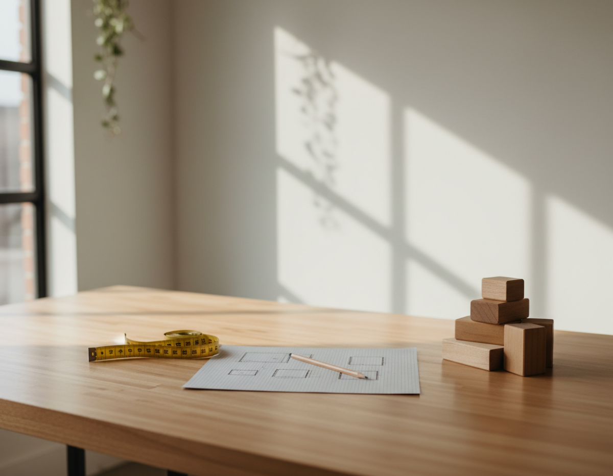
Sometimes the most productive thing is paying attention.

Maker Monday 🤍

Not every week needs a new strategy.

Sometimes the most productive thing a maker can do is pause long enough to notice what’s actually working — and what isn’t.

This month, we’re observing before we build.

If you’re in a season of slowing down, recalibrating, or choosing clarity over hustle… you’re not behind. You’re paying attention.

Happy Maker Monday 🌿

Connie - Artisan Kraftwerks

Read More
Maker Monday Connie Maker Monday Connie

Maker Monday: Top Display Trends for 2026 — What Makers & Vendors Should Embrace Next Year 

Most booths don’t feel off by accident.
They’re just not aligned with how customers shop anymore.

Craft booth displays are changing—and most setups haven’t caught up.

If your booth has ever felt:

  • full but not working

  • overlooked

  • or like shoppers just pass by

…it’s usually not random.

More often, it’s because your setup doesn’t match how customers actually shop anymore.

👉 Before you go further (quick reset)

If your booth currently feels:

  • hard to shop

  • unclear

  • or “fine… but not working”

1. Sustainability & Natural Materials

Let Your Booth Reinforce Your Work

Shoppers are drawn to things that feel real.

Not perfect—real.

Displays using:

  • wood

  • linen

  • cotton

  • neutral textures

don’t just look good—they signal craftsmanship.

When your display materials match your product style, your booth stops feeling like a table…

…and starts feeling like a brand.

2. Curated, Boutique-Style Displays

(This is where most booths break)

2026 is not about showing more.

It’s about showing better.

That means:

  • editing what you bring

  • grouping intentionally

  • giving products space

  • removing visual noise

Most “crowded booths” aren’t small.

They’re just unedited.

If your booth feels full but unclear:


3. Modular & Flexible Display Systems

Build Once—Adapt Everywhere

Booth sizes change. Layouts change. Conditions change.

Your setup needs to flex without falling apart.

Think:

  • stackable risers

  • collapsible shelving

  • adjustable height pieces

This allows you to:

  • stay consistent across shows

  • adapt quickly

  • avoid rebuilding every time

If you’re constantly reworking your booth from scratch:


4. Your Booth Is an Experience (Not a Table)

People don’t just browse.

They feel your booth first.

Strong booths have:

  • a clear entry point

  • natural movement

  • a cohesive look

  • a sense of “this makes sense”

This can be simple:

  • consistent colors

  • clean structure

  • intentional spacing

If people look—but don’t step in:


5. The “Modern Artisan” Look

Clean + Warm Wins Right Now

What’s working right now is a blend of:

  • simple structure

  • natural materials

  • minimal distraction

Clean—but not cold.
Natural—but not cluttered.

This style attracts buyers who value:

  • craftsmanship

  • quality

  • intentional design

It also makes your products easier to see.


6. Refresh & Rotate (Without Rebuilding Everything)

You don’t need a brand-new booth every show.

You need a booth that can evolve.

Small changes matter:

  • rotating products

  • shifting layout

  • adjusting focal points

This keeps your booth feeling:

  • fresh to customers

  • easier for you to manage

  • less overwhelming over time


👉 What These Trends Actually Mean

All of this points to a few real shifts:

  • Shoppers want clarity, not clutter

  • They follow flow, not randomness

  • They remember how a booth felt—not just what it sold

That’s why so many booths struggle.

Not because the products aren’t good…

…but because the setup isn’t supporting how people naturally shop.


👉 What To Do Next

Don’t try to fix everything at once.

Start with where your booth is right now:

If your booth feels cluttered or overwhelming


If people look but don’t step in


If you’re preparing for an upcoming show

If you’re not sure what’s wrong yet
→ Fix Your Booth Setup (start with clarity)

Final Thought

Most booth problems aren’t about effort.

They’re about alignment.

When your booth matches how customers actually browse:

  • movement feels easier

  • conversations happen more naturally

  • sales start to follow

If you’re changing anything this season…

don’t start with more products.

Start with how your booth works.

Read More
Maker Monday Connie Maker Monday Connie

Rethink Your Booth Flow for the New Year — Layout Tweaks That Boost Browsing & Buying

Better booth flow helps shoppers stay longer, explore more, and feel comfortable enough to buy.

 A new year means a fresh chance to look at your booth with new eyes. Whether you’re gearing up for early-spring markets, planning a full season of vendor events, or simply refreshing your brand presence, one of the easiest ways to increase sales is to improve your booth flow

Booth flow is the path people take when they enter, browse, and exit your space. When the flow feels natural, shoppers stay longer, explore more, and feel comfortable enough to buy. When the flow is cramped or confusing, they move on fast. 

Today’s Maker Monday is all about simple tweaks that give your display a smooth, intuitive, and shopper-friendly feel—no major overhaul required. 

1. Create a Clear Entrance (Even in Small Spaces)

If shoppers can’t tell where to enter, they often won’t. 

A defined entry point, even a subtle one, reduces hesitation. Try: 

  • A slight opening between tables or racks 

  • A small sign inviting shoppers in 

  • A visual “pathway” created with crates, risers, or flooring mats 

  • Angling your first display pieces inward instead of straight across 

Clarity makes shoppers feel welcomed instead of unsure. 

2. Avoid the “Great Wall” Display

Many vendors unintentionally place a long, straight table across the entire front of the booth. This creates a physical and psychological barrier that says, Look from afar, but don’t come in.

Instead: 

  • Angle one or both table ends inward 

  • Break the line with a crate stack, riser, or vertical element 

  • Create a small curve or L-shape 

Your booth should feel open—not like a counter where people must talk before they browse. 

3. Use Zones to Guide Customer Movement

Zoning helps shoppers naturally move from one part of your booth to another. 

You might create zones such as: 

  • Front zone: small impulse items 

  • Middle zone: hero products, best sellers, display stands 

  • Back zone: premium, larger, or higher-margin items 

  • Checkout area: located after browsing, not blocking entry 

Zones should flow left to right or right to left depending on how traffic naturally moves at your typical events. 

4. Add Vertical Interest (But Not Overwhelm)

Vertical displays lift products into the shopper’s line of sight and increase perceived value—but too much height can make the booth feel tight. 

Aim for a balanced mix of: 

  • Eye-level shelving 

  • Mid-height risers 

  • Subtle tall elements placed in corners or back areas 

  • Hanging signage that doesn’t block sightlines 

If shoppers can see deeper into the booth, they’re more likely to enter it. 

5. Simplify Your Checkout Area

Your checkout should not be the first thing people see. 

Instead, your checkout should: 

  • Be placed toward the side or back 

  • Stay clean and uncluttered 

  • Have easy access to bags, tissue, and business cards 

  • Be positioned so you can greet people without blocking flow 

A clean checkout signals professionalism and makes transactions smoother. 

6. Remove at Least 10% of Your Display Items

Every vendor adds “just one more thing”… until the booth feels crowded. 

Challenge yourself to subtract instead of add. Remove: 

  • Duplicate product styles 

  • Props that don’t support your brand 

  • Any display piece that takes visual space without helping sales 

Your best products stand out more when there’s breathing room. 

7. Test Your New Layout Before Show Day

Set up your booth at home or in your garage. Then: 

  • Walk into it as if you’re a shopper 

  • Ask a friend or family member to walk through it 

  • Notice where your eye goes first 

  • Identify crowded or confusing areas 

  • Time how long it takes to browse everything 

If it feels easy, even relaxing, your shoppers will feel the same way. 

Plan Your Next Step

If you want to apply these layout tweaks to your own booth, the Craft Booth Display Planning Worksheet walks you through planning product zones, traffic flow, and display placement step by step — before you ever load the truck.

Final Thoughts

A great booth flow doesn’t happen by accident—it’s intentional. With a few thoughtful tweaks, you can make your space feel bigger, more inviting, and more profitable. 

Here’s to a fresh new year of confident selling, better layouts, and more customers who walk into your booth and feel at home. 

Happy Maker Monday 🌿

Connie - Artisan Kraftwerks

Read More
Maker Monday Connie Maker Monday Connie

Turn Shoppers Into Repeat Customers — Follow-Up Systems That Keep Them Coming Back

The real value of a sale isn’t just the purchase.
It’s the customer who comes back.

You’ve built an amazing product display or craft show booth. Your products are incredible. Shoppers stopped, browsed, and maybe even bought. But here’s the truth:

The real power of a craft show or product display isn’t just the sales you make that day — it’s the customers you bring with you into the future.

Makers who consistently grow their business don’t rely only on the next event…
They build ongoing relationships with customers who already said yes once.

Today’s Maker Monday will show you how to confidently capture and nurture those leads — without feeling salesy.

Step 1: Make It Easy for Shoppers to Stay Connected

During winter markets especially, shoppers buy for others. They don’t always remember the booth or store they intended to visit later.

To stay top-of-mind, give them:

  • A clear QR code sign near checkout linking to:

    • Your website

    • Your email signup page

    • Your most active social platform

  • Bag inserts with a quick “Connect with us” message

  • Thank-you stickers including your handle

Pro Tip:
Place a QR code where they wait to check out. People love something to do in line.

Step 2: Collect Emails Like Your Business Depends on It

Because it does. 😄

Your email list:

✔ isn’t controlled by an algorithm
✔ isn’t limited to local shoppers
✔ works year-round — even between events

Try an email sign-up incentive like:

  • 10% off their next purchase

  • Entry into a monthly product giveaway

  • Exclusive access to seasonal launches

Make it feel like a VIP club — not spam.

Step 3: Follow Up — Quickly & Personally

You want to follow up while the memory of your brand is still warm and cozy.

Use a simple 3-part post-show follow-up:

📅 24–48 hours → “Thank you for supporting handmade!”
📅 1 week later → “Here’s a perk just for you…”
📅 1 month later → “New products, next shows, behind the scenes”

Short. Friendly. Valuable.
Not a single “Hey buy from me!” required.

Step 4: Track Leads Like a Real Business Owner

A mini-CRM (Customer Relationship Manager) doesn’t have to be complicated.

Recommended maker-friendly systems:

Flodesk - Best for Email newcomers

Why? Beautiful visuals + easy automations

MailerLite - Best for Startups

Why? Robust features + inexpensive

HubSpot Free - Best for Customer tracking

Why? CRM database + great notes system

Google Sheets - Best for Simplicity lovers

Why? Quick tracking + customizable

Track key notes:

  • What they bought

  • What they loved

  • Any personalization preferences

  • Whether they subscribed or followed

Those insights guide future product decisions.

Step 5: Support Their Experience Beyond the Purchase

Follow-up success is rooted in connection, not constant selling.

Types of nurture content that convert well:

✨ Care tips for your product
✨ Styling or display ideas
✨ Seasonal craft booth sneak peeks
✨ Restock alerts and preorders
✨ Storytelling about your process

Every message says: “I see you… and I made this for you.”

That’s what builds loyalty — and repeat buyers.

Putting This Into Practice

Strong follow-up systems start with a booth layout that naturally guides shoppers where you want them to go. If you want to plan a booth that supports browsing, conversation, and easy next steps, the Craft Booth Display Planning Worksheet helps you think it through in advance.

Final Thoughts

You Earned That Customer — Keep Them

Shoppers are real humans who saw your work, felt drawn to it, and decided to bring it home.

Follow-up lets that relationship continue long after the market bags are packed away.

You create connection.

Connection brings them back.

And returning customers build sustainable maker businesses.

Happy Maker Monday 🌿

Connie - Artisan Kraftwerks

Read More
Maker Monday Connie Maker Monday Connie

The Ultimate 2026 Craft Show Prep Checklist for Makers & Small Shop Owners

A strong craft show year starts before the first event.
Winter is where planning turns into momentum.

Your 2026 Craft Show Prep Checklist: A Maker’s Guide to Getting Ahead

A new year brings new opportunities — and the winter season is the perfect time to set up your maker business for a strong 2026 craft show lineup. While markets may slow down after the holiday rush, this is your moment to reset, refine, and plan for the year ahead.

This Maker Monday, we’re breaking down the ultimate 2026 Craft Show Prep Checklist for makers, small shop owners, and vendor booth pros.

1. Review Your 2025 Sales Data

Before planning anything new, look at last year's numbers:

  • What sold consistently?

  • What became surprise bestsellers?

  • What didn’t move at all?

This data tells you where to invest and where to scale back.

2. Map Out Your 2026 Event Calendar

Winter is the ideal season to:

  • Research new shows

  • Apply for spring + summer events

  • Join vendor Facebook groups

  • Mark early-bird deadlines

  • Budget for booth fees early

A mapped calendar removes decision fatigue later in the year.

3. Refresh Your Display for the New Year

Your booth is your storefront. Winter is the perfect time to rebuild or improve:

  • Vertical shelving

  • Lighting upgrades

  • Signage (especially photo-friendly signage)

  • New table coverings

  • Modular packing systems

Start fresh before the first show hits.

4. Create Your 2026 Inventory Plan

Think in categories:

  • Everyday sellers

  • Seasonal sellers

  • High-margin items

  • Small impulse buys

  • Custom or personalized offerings

Assign rough quantities for each and adjust as seasons change.

5. Revisit Your Pricing Strategy

Costs increased for many makers in 2025. Review:

  • Material costs

  • Packaging

  • Labor

  • Booth fees

  • Shipping supplies

This ensures your 2026 pricing is profitable — not guesswork.

6. Update Your Branding Pieces

Winter is a powerful reset point for small shops.

Update or refine:

  • Business cards

  • Thank-you cards

  • Logo stickers

  • Booth banner

  • Social templates

  • Product tags

Your brand should feel consistent across events, online listings, and packaging.

7. Set Up a Customer Follow-Up System

Capture leads all year, not just during shows:

  • QR code to an email list

  • Mini coupon cards

  • Social-follow incentives

  • Cross-promotion with other makers

2026 growth hinges on connection — not just sales.

8. Prep Your “Market Survival Kit”

Every seasoned vendor needs:

  • Extra tags

  • Batteries

  • Tape, twine, zip ties

  • Pens, markers

  • Mini toolkit

  • Spare point-of-sale charger

  • Extra tablecloth

  • Snacks + water

Pack it once, keep it stocked all year.

9. Set Three Big Goals for 2026

Choose goals that matter:

  • Revenue target

  • Number of events

  • A new product line

  • A booth redesign

  • Launching a wholesale catalog

Write them down. Review quarterly.

Next Step for Makers

Once you know what needs to be done, the next step is figuring out how your booth actually comes together on the floor. If booth layout and product placement feel overwhelming, the Craft Booth Display Planning Worksheet helps you map it out visually before setup day.

Final Thoughts

Winter is more than a slow season — it’s your foundation-building season. With intentional planning and fresh energy, your 2026 craft show year can be your strongest yet.

Happy Maker Monday 🌿

Connie - Artisan Kraftwerks

Read More
Maker Monday Connie Maker Monday Connie

12 Last-Minute Craft Booth Fixes Every Winter Market Vendor Should Know

Small booth issues can snowball fast during busy markets.
Quick fixes can keep your setup clear, polished, and selling.

When you’re in the middle of the winter market rush, tiny problems can snowball—display gaps, low lighting, missing signage, or products that need a little extra polish.
This Maker Monday guide shares quick and effective craft booth fixes you can apply same-day to keep your setup looking sharp, intentional, and customer-ready.
Perfect for busy makers who need solutions that work fast.

The winter craft market season is busy, fast-paced, and full of surprises. Displays shift, signage falls, crowds move differently than expected, and suddenly you’re adjusting your entire booth in the middle of a live show. Every experienced maker has lived through those moments — and learned to improvise like a pro.

Today’s Maker Monday guide is all about quick, effective last-minute craft booth fixes that help you stay polished and profitable during the final stretch of the year.

1. Turn a Slow Table Into a Sales Magnet

If one of your tables isn’t getting attention, rearrange your display vertically. Shoppers are drawn to height — especially in a crowded winter market where visibility matters. A crate flipped upright or a riser added under a tablecloth can instantly transform eye level and draw foot traffic.

Quick Fix: Group bestsellers in odd-number clusters (3, 5, 7) and elevate the center item.

2. Replace Missing or Damaged Tags With a Single “All Prices Listed Here” Sign

When you’re too busy to reprint individual tags, use one clean, clear price sign per category. It saves time, reduces clutter, and makes checkout faster.

Fast Sign Formula:
Product Name → Price → Short Feature
Example:
Handcrafted Cedar Trees — $18 ea — Solid rustic cedar, perfect for winter displays.

3. Fix Low Lighting With Everyday Items

Winter markets often have dim lighting. If your booth looks shadowy, elevate battery-powered puck lights, fairy lights, or clip-on LEDs using a crate or even your tote bin (hidden under a cloth). The moment your products are well-lit, your booth feels warmer and more inviting.

4. Use a “Bundle & Save” Sign to Increase Your AOV

Bundles sell especially well in winter when customers shop for multiple recipients at once. If sales feel slow, introduce a simple bundle like:

  • Buy 2, Get 10% Off

  • Any 3 for $25

  • Build-Your-Own Gift Set

This is one of the fastest ways to increase sales without adding new inventory.

5. Re-Engage Shoppers With a Quick “Story Prop”

If your booth feels flat, add one prop that tells your brand’s story — a tool you use, a raw material sample, a sketch, or a behind-the-scenes photo. Winter shoppers connect emotionally with authenticity and craftsmanship.

6. Use Your Bags as Walking Advertisements

If your bags are plain, quickly attach a thank-you sticker with your social handle or website. When shoppers walk around the market, they become moving billboards.

7. If Crowds Move the Wrong Way, Flip Your Layout

Winter events often pack visitors in tight lines. If your booth experiences bottlenecks, simply rotate one table or open one side to improve flow. This one-minute change can double the number of people entering your booth.

Final Thoughts

Your booth doesn’t have to be perfect. It just needs to be clear, inviting, and optimized for the unique energy of winter shoppers. With these quick fixes, you’ll be ready for anything the season throws at you.

Happy Maker Monday 🌿

Connie - Artisan Kraftwerks

Read More