

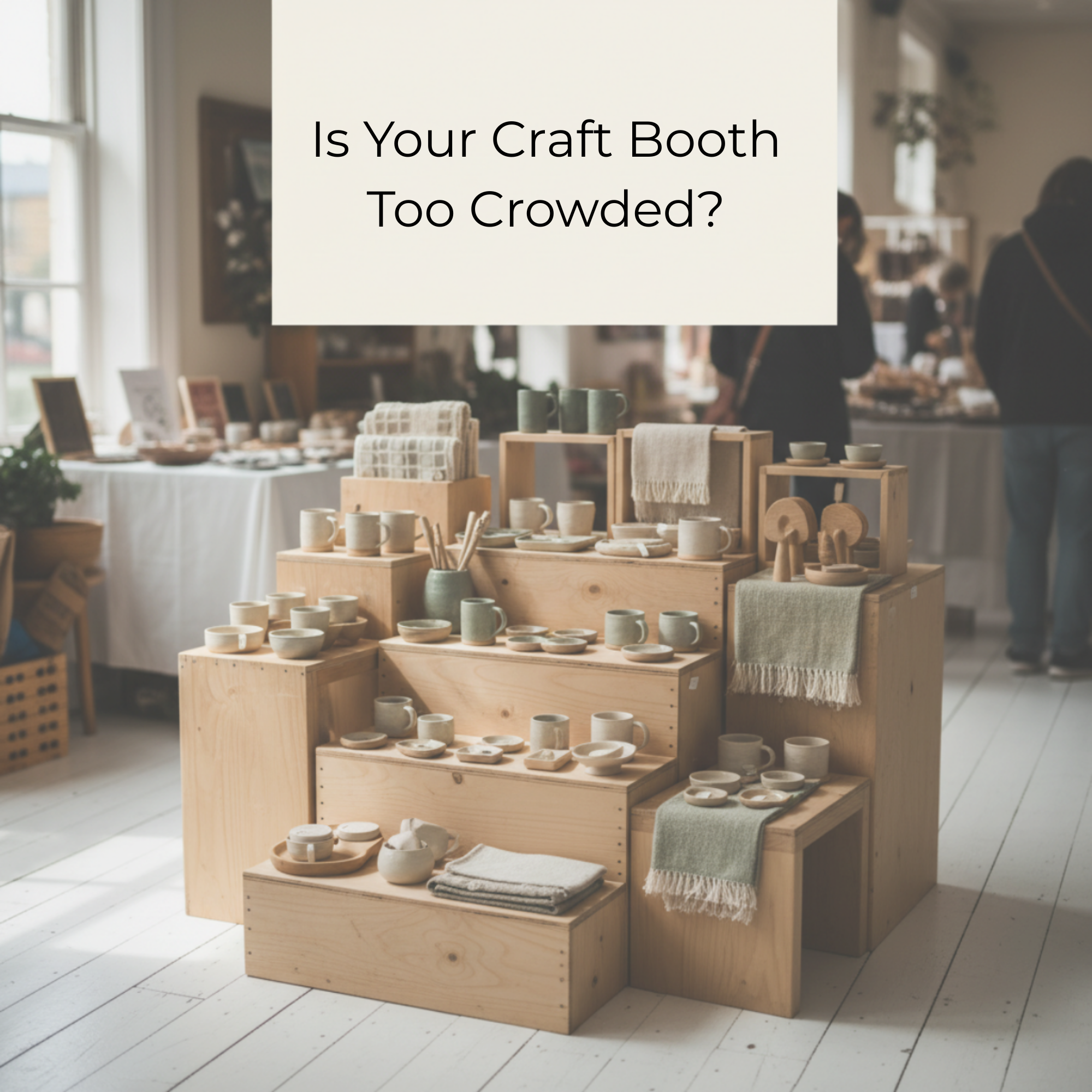
What to Focus On When Shoppers Slow Down—but Never Step Into Your Booth
If shoppers slow down at your booth but stay in the aisle, the issue usually isn’t attention—it’s the entry. This article explains how booth flow, visual friction, and unclear entry points create hesitation before shoppers ever step inside.
They’re not walking past.
They’re slowing down.
—
That means the problem isn’t attention.
It’s the next step.
—
Right now, your booth is asking the shopper to decide how to enter.
And they won’t.
Focus on This First
Define the entry point.
Not the display.
Not the layout as a whole.
Not the products.
—
The entry.

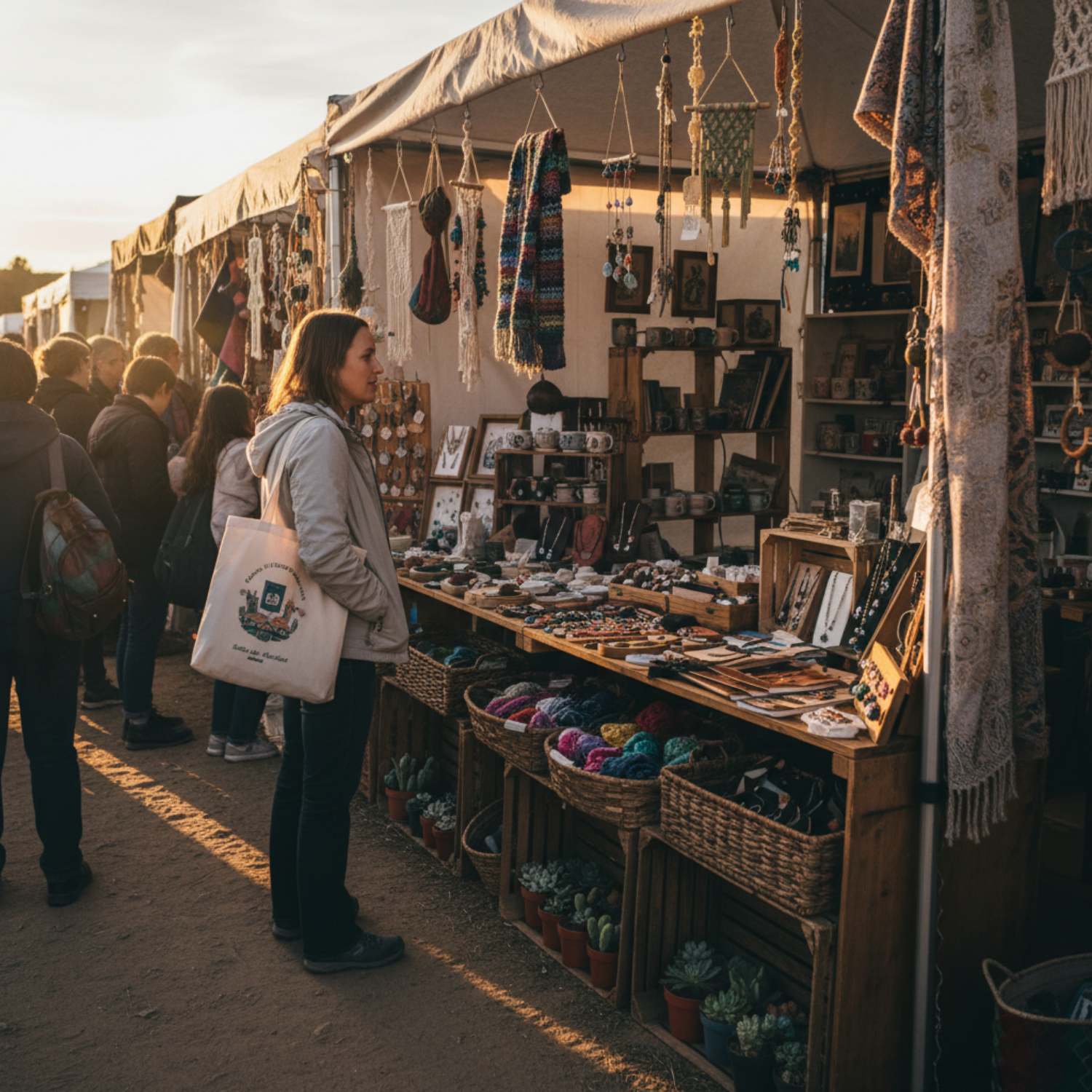
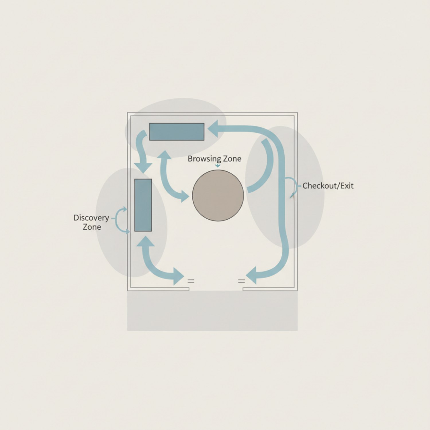
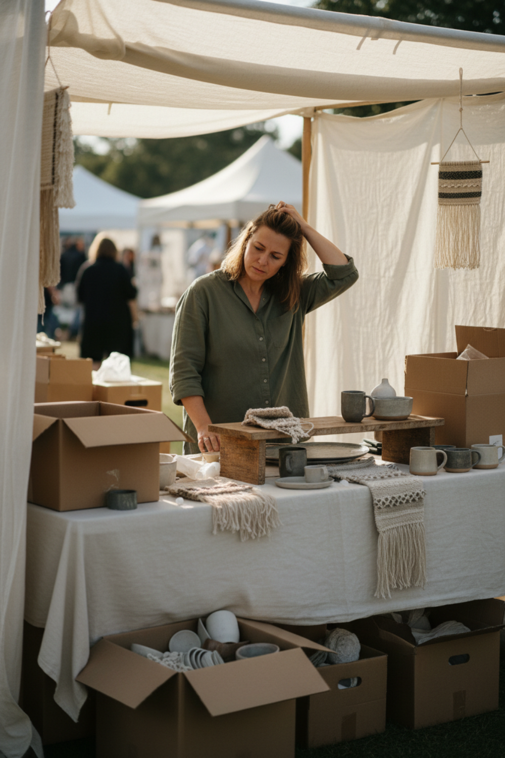
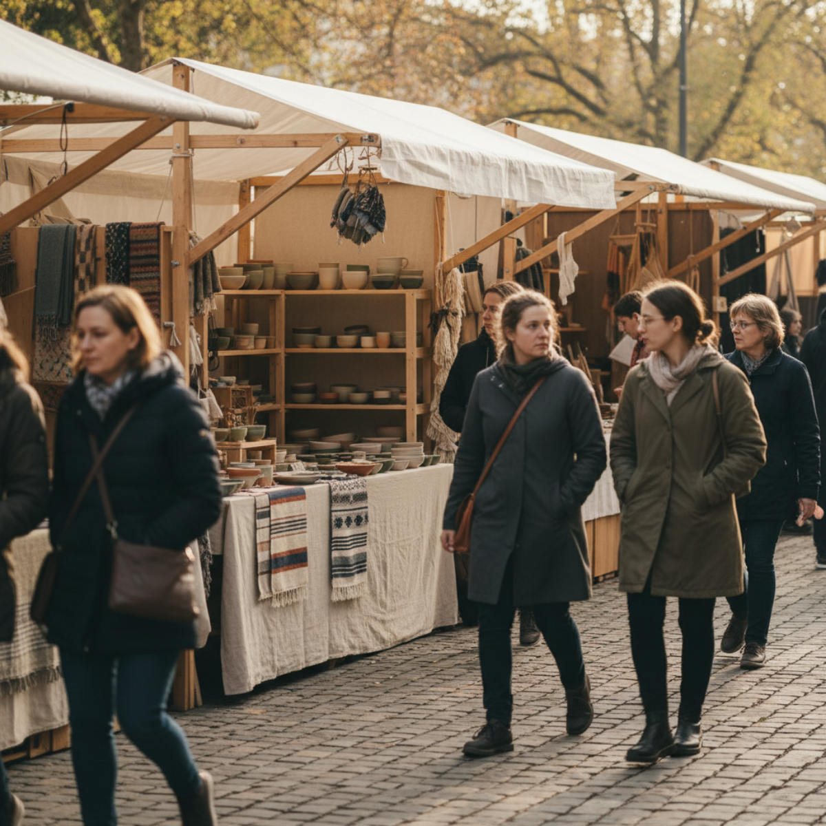
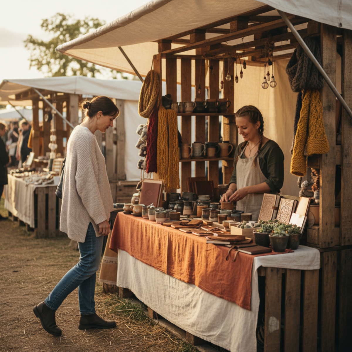
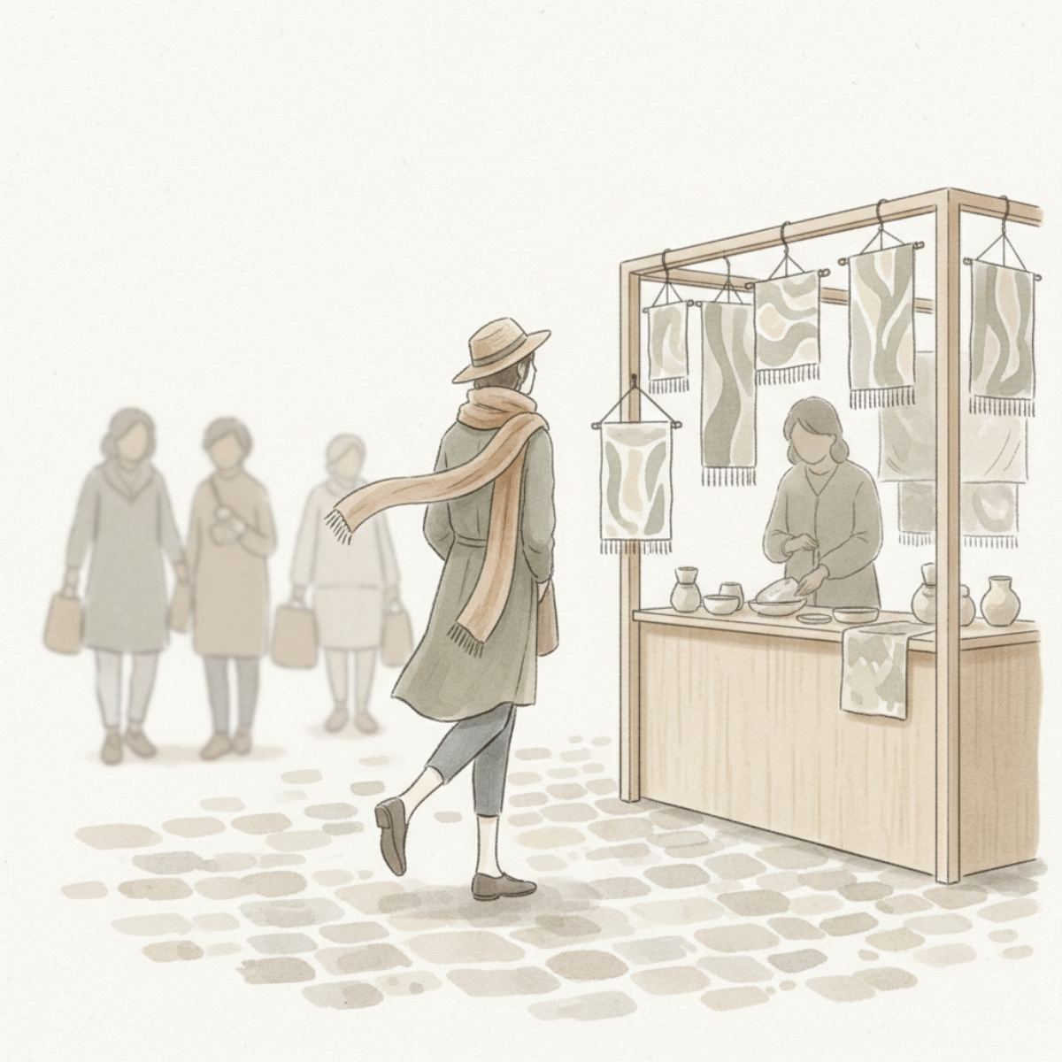
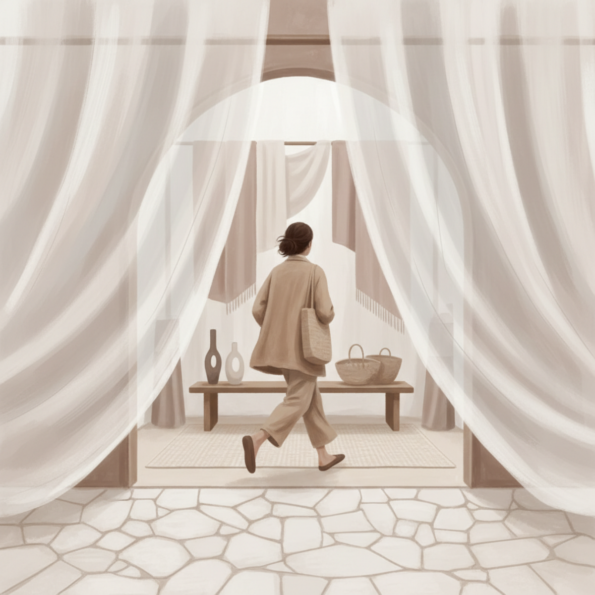
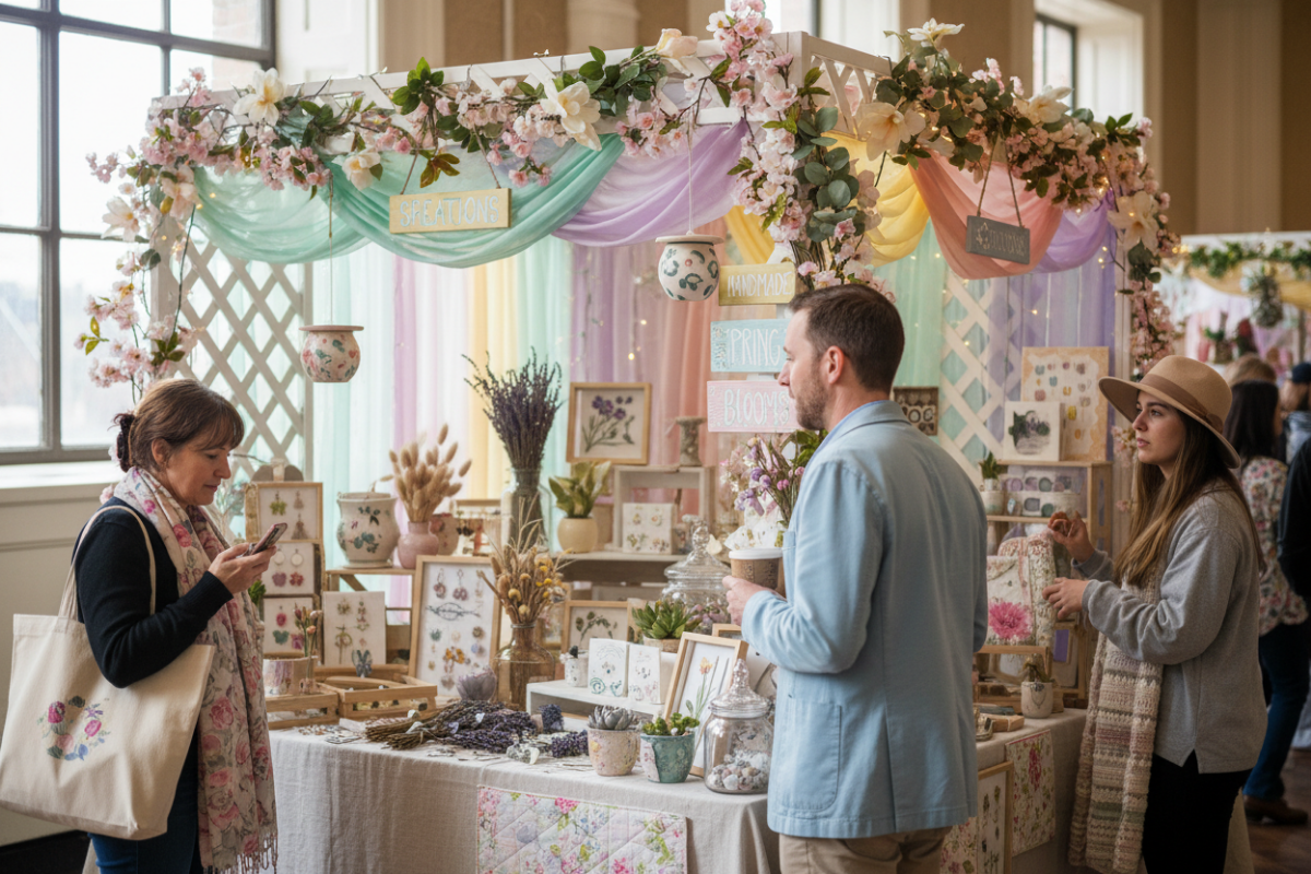
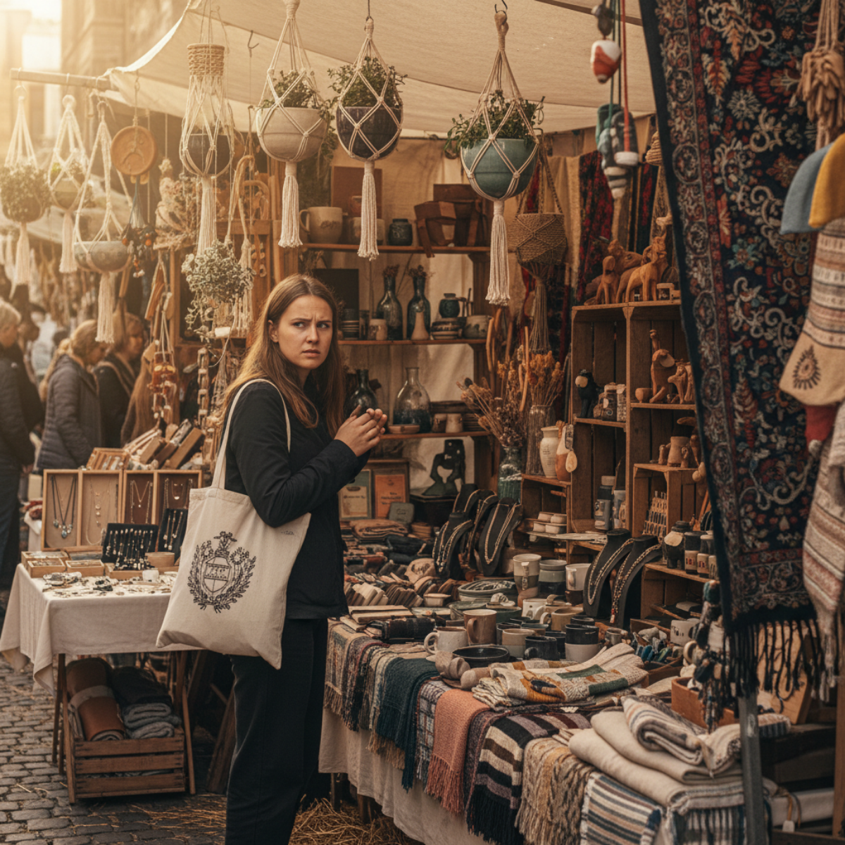
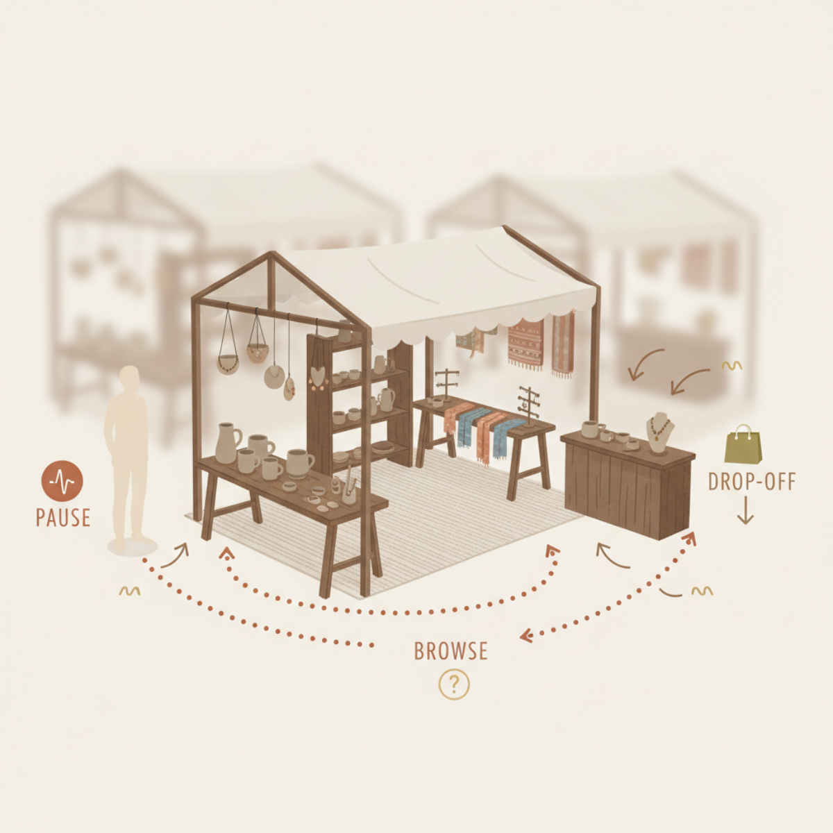
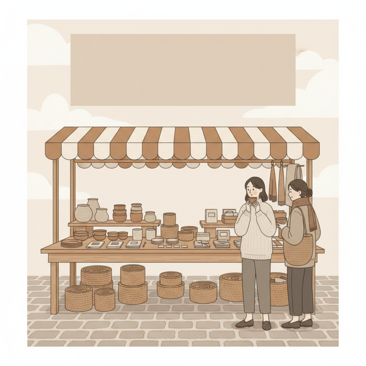
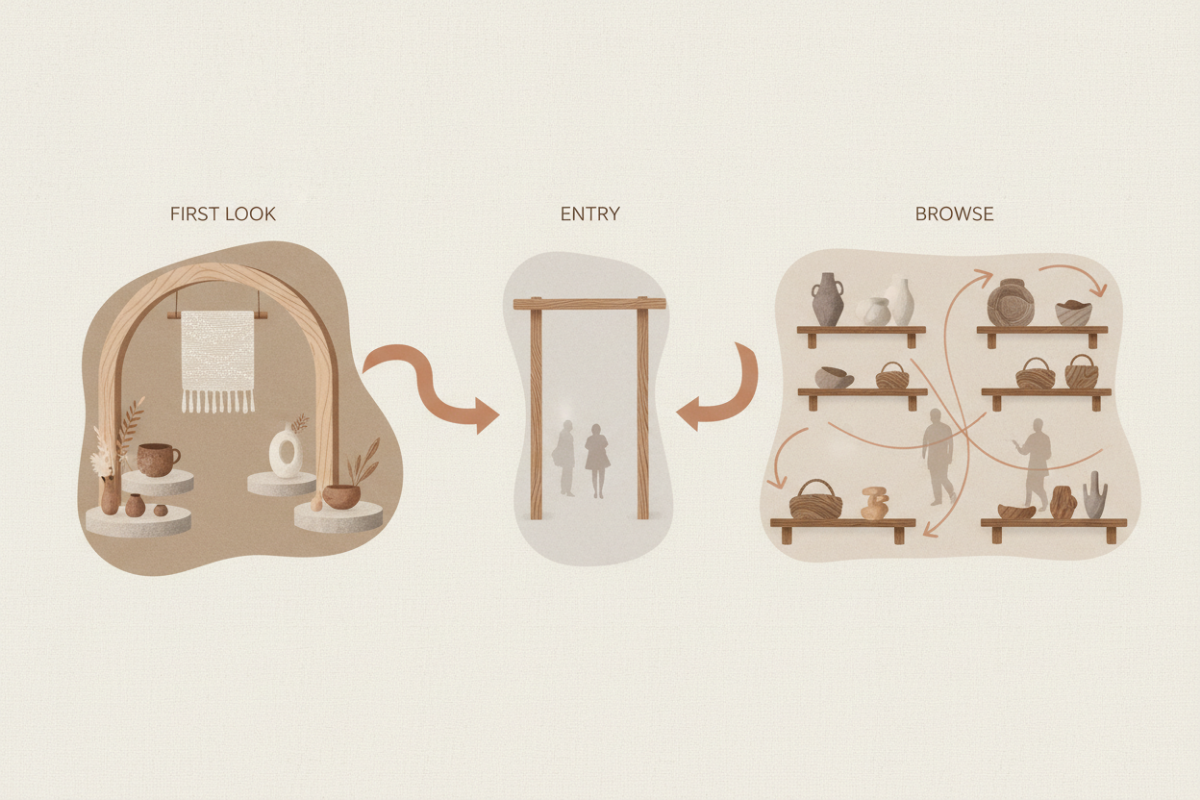
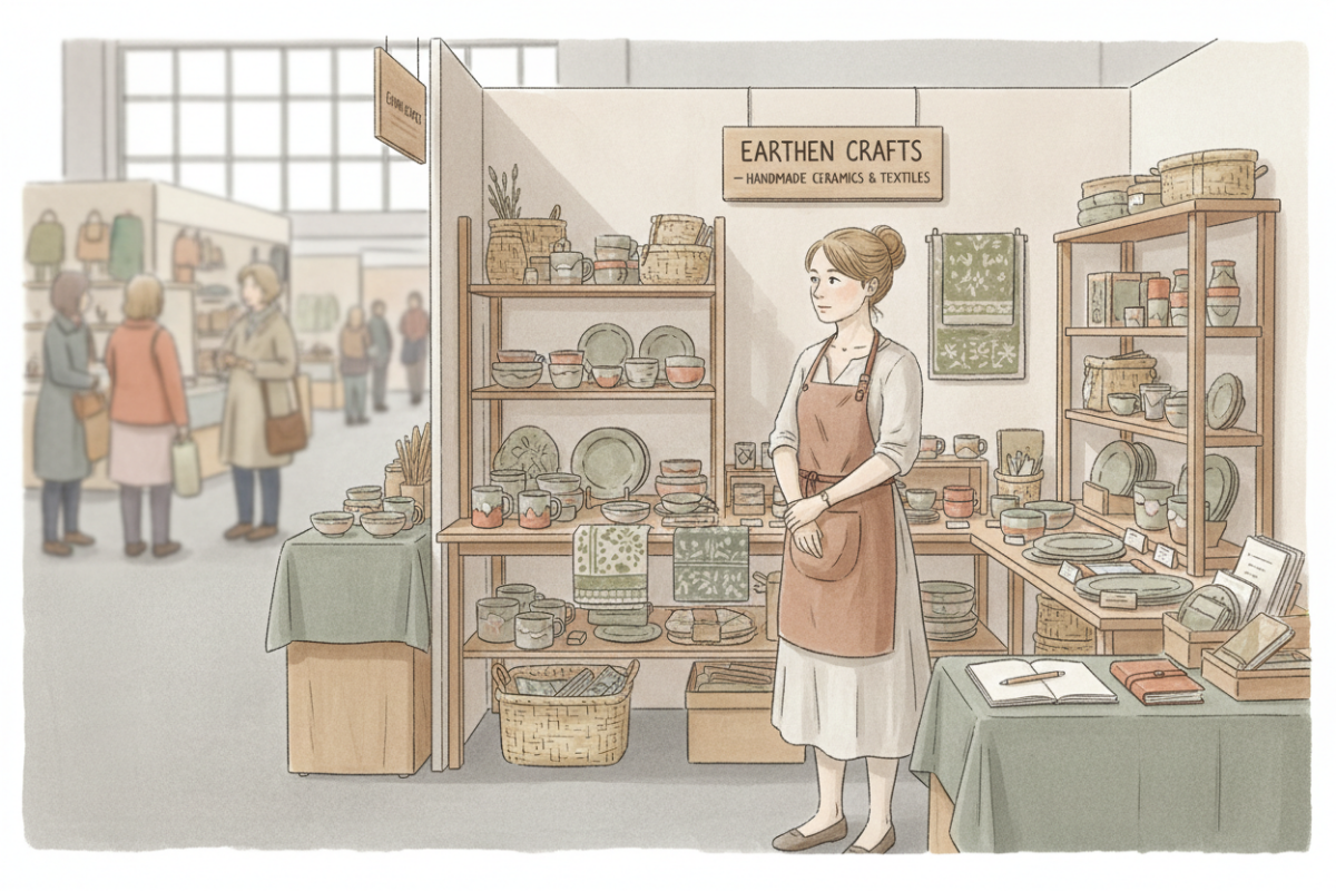
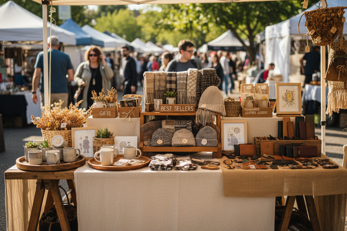
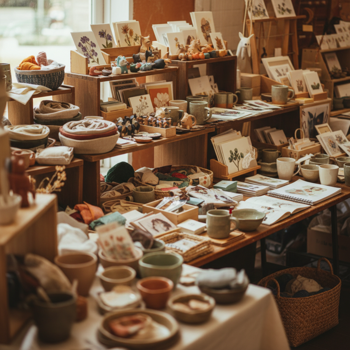
A shopper pauses at a busy handmade market booth filled with layered displays, textiles, jewelry, and artisan products while browsing along the aisle at an outdoor craft fair.
Because until the entry is clear,
nothing else matters.
What That Means
A shopper should not have to:
look across the entire booth
figure out where to stand
decide where to start
—
The first step should already be decided for them.
—
If they slow down and hesitate,
your booth is still asking a question.
—
Remove the question.
What to Change
Create one clear place where the booth begins.
—
That means:
One visible opening
Not blocked by tables, bins, or corners
One direction inward
Not multiple equal paths
One place for attention to land first
Not several competing areas
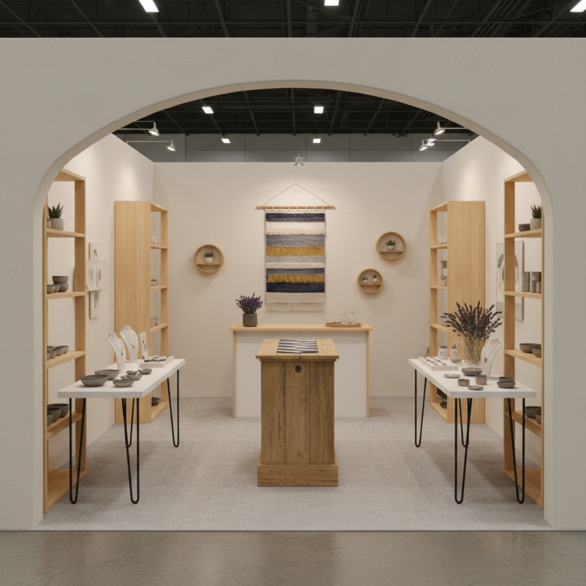
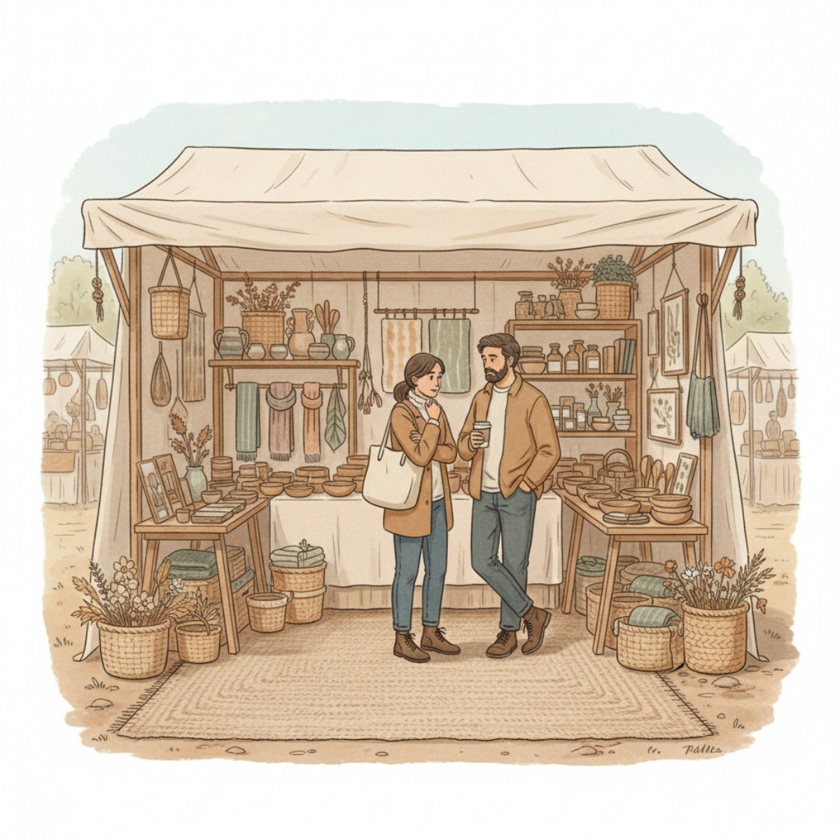
A clean, intentionally designed craft booth layout with open walking space, balanced shelving, and a clear focal point that helps guide shoppers naturally through the booth.
If those aren’t clear,
the shopper stays in the aisle.
What Not to Do
Do not:
Add more products
Adjust small visual details
Rearrange everything at once
—
Those don’t fix the entry.
—
And if the entry isn’t clear,
nothing behind it gets used.
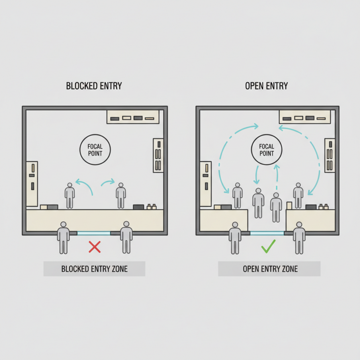
A side-by-side booth layout diagram showing how blocked entrances create hesitation while open entry zones encourage smoother shopper movement, browsing flow, and booth engagement.
What This Fix Does
When the entry is defined:
The shopper doesn’t pause to decide
They step in
—
Movement replaces hesitation
—
And once they enter,
everything else can start working
This Is the Priority
Right now, you don’t need a better display.
You don’t need more variety.
You don’t need to “make it look better.”
—
You need the shopper to take one step forward.
—
So focus on the only thing that controls that:
Start With What You’re Seeing
If shoppers slow down at the edge of your booth but don’t step in,
start with the Craft Booth Check.
If The Whole Booth Feels Off
If your booth feels crowded, confusing, or difficult to shop,
the Fix Your Booth Planning Guide helps you identify where the breakdown is happening.
Explore Related Booth Problems
Booth issues usually connect.
What feels like:
a product problem
a traffic problem
or a sales problem
is often:
flow
focus
spacing
or signal.
Explore more booth patterns and solutions.
What makes shoppers stop—but not step in
Shoppers don’t decide inside your booth.
They decide at the edge.
If they slow down, look—and keep walking—it’s not random. It means something caught their attention, but nothing showed them where to go next.
This article breaks down what’s actually happening in that moment—and why most booths create attention without direction.
Because if they don’t step in, nothing else gets a chance to work.
Craft booth displays don’t fail at the table.
They fail at the edge.
—
You’ve seen it.
Someone slows down as they approach your booth.
They don’t walk straight past.
They hesitate.
They lean slightly.
They look across your display—
but their feet stay in the aisle.
And then…
they keep moving.

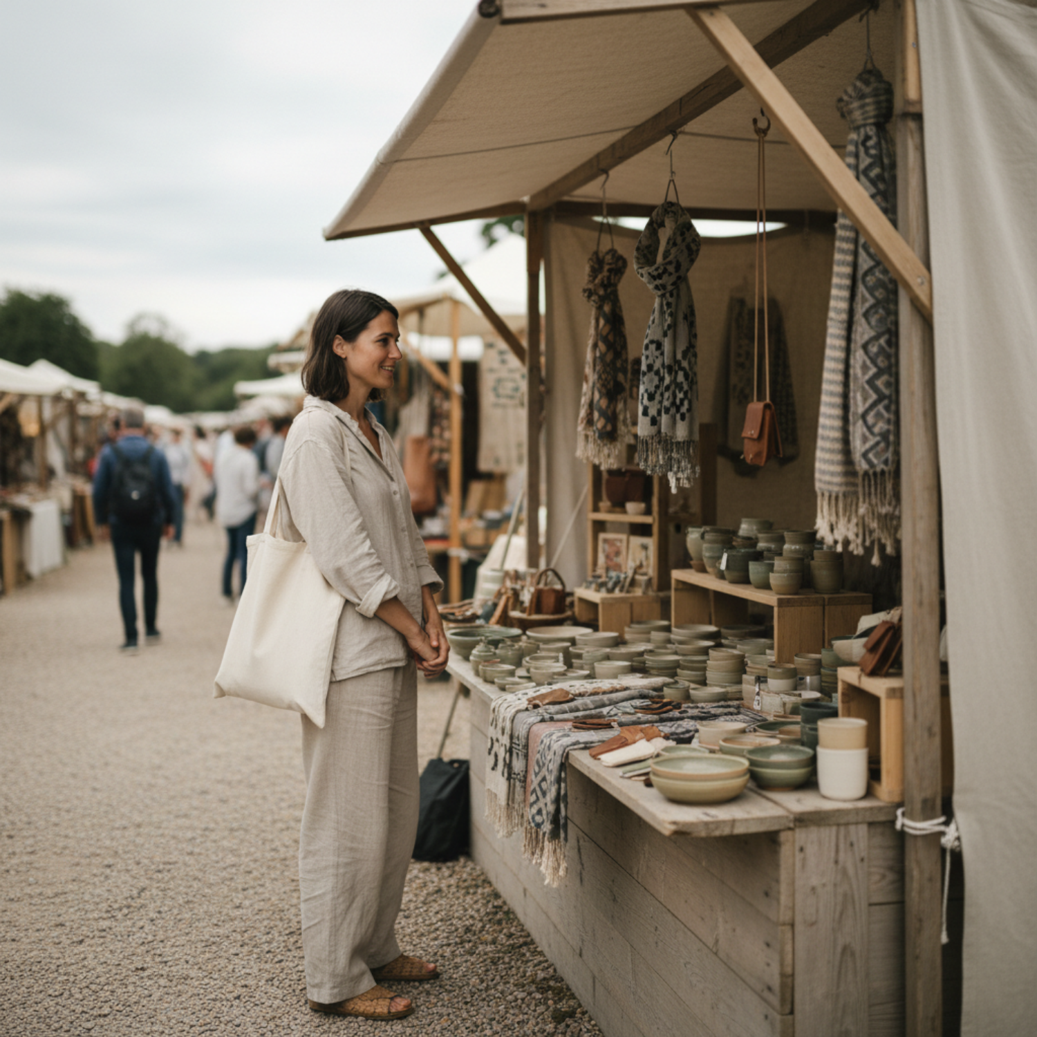
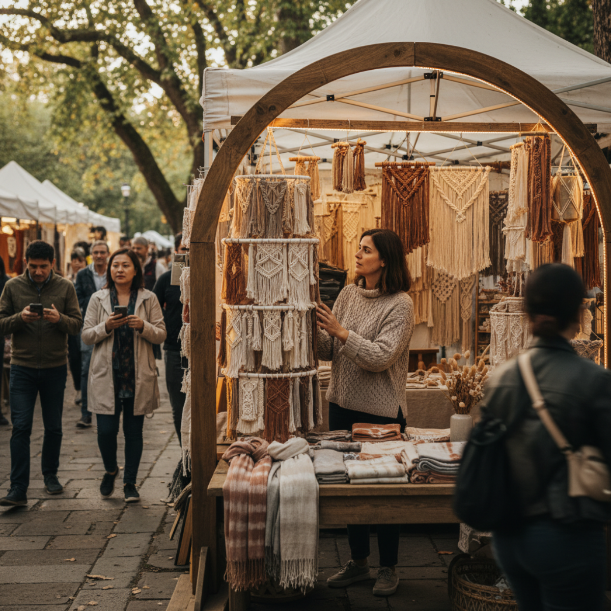
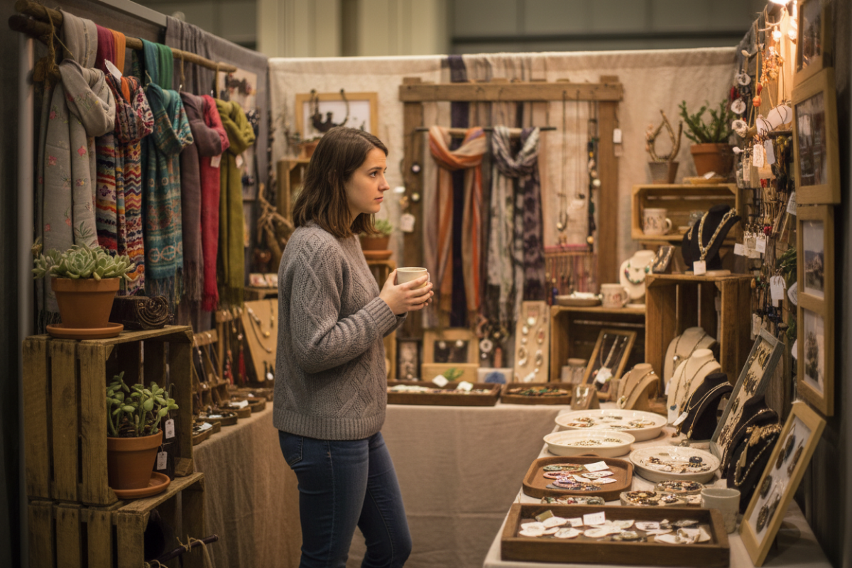
A shopper pauses at the edge—interested, but not stepping in. The moment where attention starts… and then drops.
That moment matters more than anything happening inside your booth.
Because if they don’t step in,
nothing else has a chance to work.
The Pattern
Shoppers are reacting to your booth—
but not committing to it.
They’re noticing something.
Enough to slow down.
Enough to look.
But not enough to enter.
—
So the interaction never actually begins.
It starts—
right at the edge—
and then drops.
The Cause
Stepping into a booth isn’t just about interest.
It’s about clarity.
—
When a booth works,
the next step is obvious.
There’s a clear place to look first.
A clear place to move next.
A clear sense of where they belong.
—
When that’s missing,
the shopper stays where they are—
in the aisle—
trying to figure it out from a distance.
—
And if they have to figure it out,
they don’t step in.

From the aisle, everything competes for attention—so nothing pulls the shopper in. This is where scanning replaces shopping.
What’s Actually Happening at the Edge
From the shopper’s perspective, this is happening fast:
They approach
→ Something catches their eye
→ They slow down
Then immediately:
Where do I start?
Where do I stand?
What am I supposed to look at first?
—
If those answers aren’t clear within seconds,
their attention spreads out across everything.
Nothing stands out enough to pull them forward.
—
So instead of stepping in,
they stay at the edge—
and scan.
—
And scanning is not shopping.
The Structural Break
Most booths are built to be seen—
not entered.
—
Everything is presented at once:
Multiple products
Multiple display heights
Decor layered throughout
—
But nothing is doing one specific job:
👉 pulling the shopper into the space

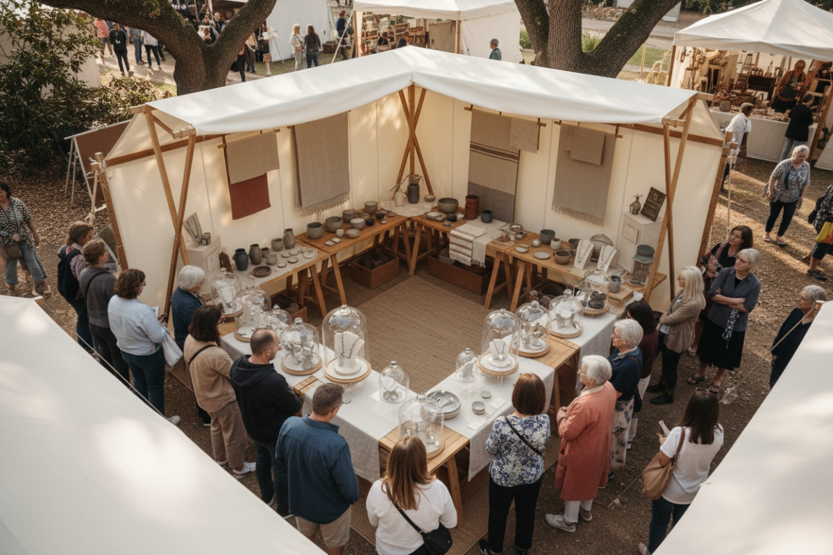
A defined entry changes everything—one clear focal point pulls attention in, and the space shows exactly where to go next.
So the booth works visually—
but not physically.
It doesn’t guide movement.
It doesn’t create an entry.
It doesn’t give permission to step in.
The Constraint (Why This Keeps Happening)
This is where most makers get stuck.
Because the booth looks good.
—
It feels styled.
It matches what they’ve seen online.
It looks like it should work.
—
So the instinct is to:
Add more
Adjust small details
Refine the look
—
But none of that changes the actual problem.
Because the issue isn’t how the booth looks.
It’s how it functions at the edge.
—
And if that doesn’t change,
the same moment repeats—
all day.
The Shift
What matters isn’t whether your booth gets attention.
It’s whether that attention turns into movement.
—
And that only happens when the entry is clear.
When the path is clear, movement follows—discovery leads to browsing, and browsing leads naturally to checkout.
A booth that works creates a sequence:
Something stands out first
→ That pulls attention in
Something holds attention next
→ That keeps them from moving on
Something invites movement
→ That brings them into the space
—
Without that sequence,
everything stays at the surface.
Diagnostic Checks
If this is happening in your booth, you’ll see it clearly:
If shoppers slow down—but don’t step in
→ your entry point isn’t defined
If they look across the display instead of into it
→ your focal point isn’t clear
If they hesitate at the aisle without changing direction
→ nothing is pulling them forward
If they scan quickly and move on
→ attention isn’t landing anywhere
—
These are all signs of the same issue:
👉 the booth isn’t guiding the first step
What This Means
Right now, your booth is creating attention—
but not direction.
—
And without direction,
attention doesn’t turn into action.
—
So the shopper never crosses the line from:
looking
to
entering.
—
And if they don’t enter—
nothing else matters.
Where This Leads
If this keeps happening,
you’re not dealing with a product problem.
You’re not dealing with pricing.
You’re not even dealing with interest.
—
You’re dealing with structure.
—
And until the entry is clear,
every other improvement stays invisible.
—
What’s Next:
👉 What to Focus On When Shoppers Slow Down—but Don’t Step Into Your Booth

What to Focus On When Your Booth Looks Good—But Still Doesn’t Work
Your booth doesn’t have a trend problem—it has a structure problem.
If shoppers aren’t entering, moving, or staying, nothing you add will fix it.
This is what to focus on first.
A clean, on-trend booth setup that still isn’t guiding shoppers—because structure hasn’t been fixed yet.
Your booth doesn’t have a trend problem.
It has a structure problem.
Right now, your setup might be:
clean
styled
aligned with what’s popular
But if shoppers:
don’t step in
don’t move through
don’t stay
Then the booth isn’t guiding them.
And nothing you add on top will fix that.
What to focus on
Focus on how your booth moves people.
Not how it looks.
Not what’s trending.
Not what you could add.
Just this:
Can a shopper enter, move, and settle naturally—without thinking?
If that’s not happening, that’s the break.
What this means
Until movement works:
better displays won’t help
new products won’t help
updated trends won’t help
They’ll just sit inside the same structure—
and produce the same result.
Start here
That’s where this changes.
When Your Booth Looks Trendy—but Still Feels Off
Your booth can look stylish, curated, and on-trend—but still feel hard to enter or shop. Learn why shoppers hesitate even when a booth “looks good,” and what to focus on instead.
They Slow Down
They don’t walk straight past.
That would be easier to ignore.
They slow down.

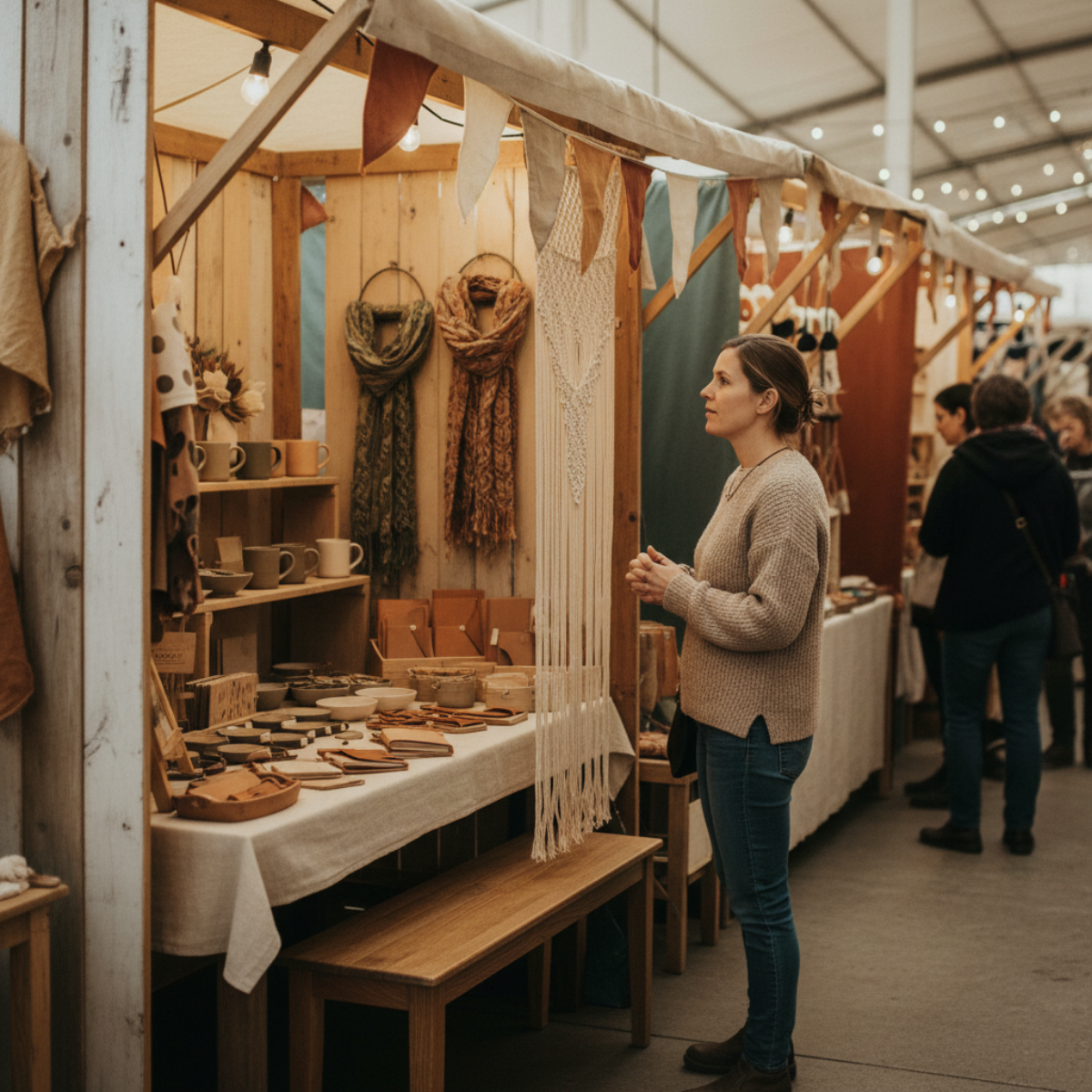
A shopper slowing down at the edge of a trendy craft booth without entering
You can see the moment.
They reach the front of your booth—
but their feet stop at the aisle.
They lean in just slightly.
Look across the table.
Not into the booth.
Across it.
They Don’t Step In
They don’t step in.
They don’t turn their body.
They just… hover.
And then they keep moving.

A shopper glancing across a styled booth display from the aisle instead of stepping inside
They Scan—But Don’t Land
It keeps happening.
Someone else slows down.
Their eyes move across the display—
left to right.
Top to bottom.
Quick scan.
No pause point.
And then—
they’re already past you.
Not because they didn’t see anything.
They saw it.
They just never settled on anything.

A visually busy, trendy booth display with multiple focal points and no clear stopping spot
This Is Where It Breaks
And that’s where it breaks.
Because the booth looks like it should be working.
It matches what you’ve been seeing.
It feels styled.
It feels current.
But the moment never locks.
It starts—
right at the edge—
and then slips.
Before anything builds.
Nothing Holds Them There
A close-up of layered trendy booth decor and products blending together without a clear visual anchor
So people react—
but they don’t commit.
They notice something.
They register it.
But they don’t move toward it.
They don’t step in.
They don’t reach.
They don’t pause long enough for anything to happen next.
It’s Not Random
And once you see that,
you start noticing exactly where it breaks.
Not after they walk away.
Right before they ever step in.
If this keeps happening,
it’s not random.
The moment starts—
but it never turns into anything.
Attention Isn’t Stopping
Because right now,
your booth is getting attention…
right at the edge—
but it’s not turning into stopping.
And those are not the same thing.
Once You See It…
Once you see that,
you can’t unsee it.
Start With What You’re Seeing
If shoppers slow down at the edge of your booth but don’t step in,
start with the Craft Booth Check.
If The Whole Booth Feels Off
If your booth feels crowded, confusing, or difficult to shop,
the Fix Your Booth Planning Guide helps you identify where the breakdown is happening.
Explore Related Booth Problems
Booth issues usually connect.
What feels like:
a product problem
a traffic problem
or a sales problem
is often:
flow
focus
spacing
or signal.
Explore more booth patterns and solutions.

What to Focus On When Your Booth Feels Busy - But Isn’t Selling
Your booth can feel active all day—people stopping, browsing, even picking things up—and still not convert into sales.
That’s usually not a traffic problem.
It’s a flow problem.
Something is catching attention, but it isn’t guiding shoppers into a clear next step. They enter just enough to look… but not enough to stay, engage, or buy.
When a booth feels busy but isn’t selling, the issue isn’t effort—it’s structure.
Fix the flow, and the behavior changes.
People are coming into your booth.
That’s not the problem.
People are already coming through—but nothing is causing them to stop.
They step in.
They look.
They keep moving.
Nothing changes once they’re inside.
That’s the break.
The booth looks complete—but nothing is interrupting the flow enough to make someone stop.
Not outside the booth.
Not before they enter.
Inside.
You’re not dealing with a traffic problem.
You’re dealing with uninterrupted movement.
It feels busy—and it is—but without a clear point of focus, the movement never turns into decisions.
And if movement doesn’t break—
nothing builds.
When the layout creates a smooth loop, people keep moving—because nothing tells them where to stop.
This is already decided
Every time someone walks in and walks out without stopping—
the outcome was already set.
Not because they weren’t interested.
Because nothing changed their behavior once they entered.
When something pulls attention forward and gives it a place to land, the moment doesn’t pass—it turns into interaction.
They did exactly what the booth allowed them to do.
So this is the focus
Not more products.
Not more setup changes.
Not more traffic.
Those don’t interrupt movement.
They add to it.
One job
Create a point where movement stops.
When the front of your booth invites interaction instead of just showing products, shoppers don’t just pass—they step in.
Not slows.
Not hesitates.
Stops.
A place where:
they pause
they look longer
they stay
Because that’s the moment everything depends on.
If that moment doesn’t exist—
nothing else matters.
This is where booths fail
They look active.
People are coming through.
It feels like something should be happening.
But nothing builds.
Because nothing holds.
The shift
You stop trying to improve the booth.
You start forcing a break in the pattern.
Because the pattern is the problem.
And until that changes—
nothing else will.
Why Some Booths Feel Easy to Shop (and Others Don’t)
People are stepping into your booth—but they’re not stopping. They move through, look around, and leave without anything changing. The difference isn’t traffic. It’s what happens after they step in.

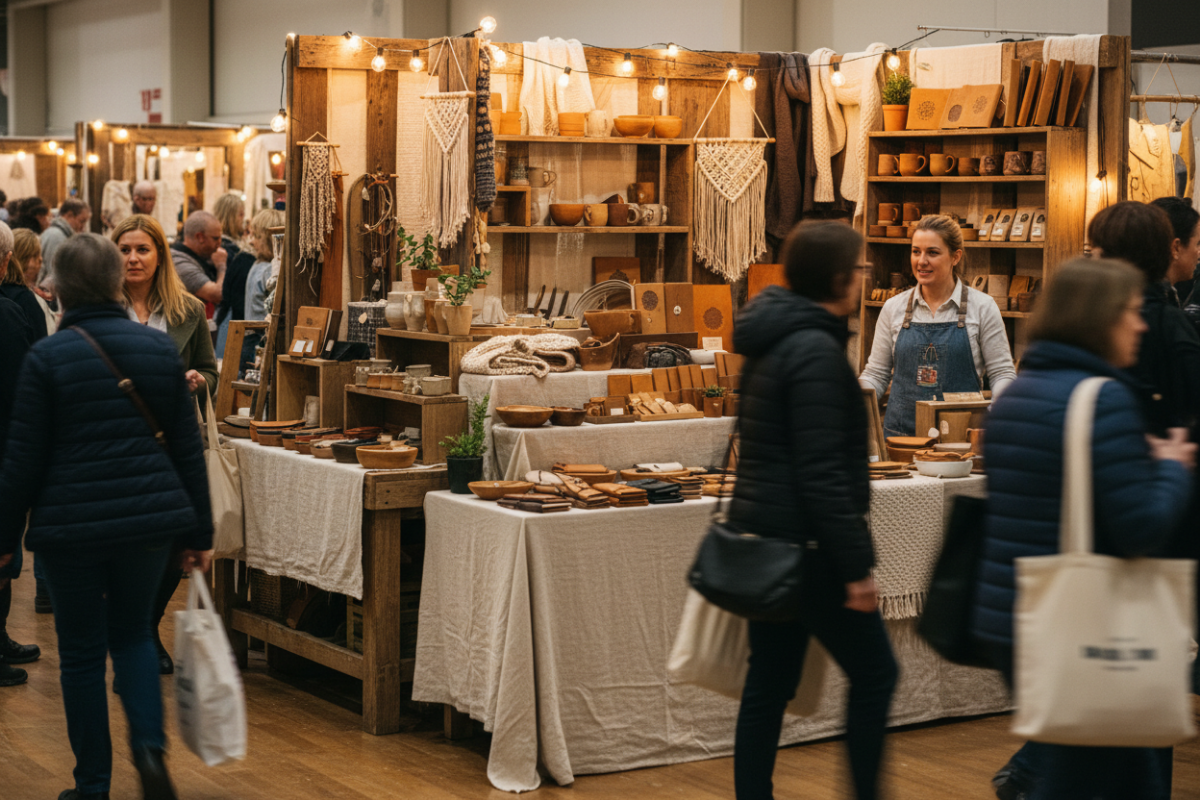
One person stops and engages—but most continue moving past without slowing down
Someone steps into your booth.
They slow down.
They look at something—
and then they keep moving.
It happens again.
Someone else comes in.
Makes a quick loop.
Glances across everything.
And leaves.
Nothing really stops them.
Nothing holds them long enough
for anything to change.
People move past the booth—but nothing slows them down or pulls them in
At first, it looks like activity.
People are coming in.
They’re looking around.
They’re not ignoring you.
But nothing builds.
No one stays in one place.
No one settles into anything.
No one moves from browsing into buying.
That’s the difference.
Not traffic.
Not visibility.
What happens after they step in.
The Pattern
When a booth feels easy to shop, something changes the moment a person enters.
They don’t just move through it.
They stop.
They shift from walking → looking → staying.
In booths that don’t feel easy to shop, that shift never happens.
The movement continues the same way it started.
In.
Around.
Out.
And because nothing interrupts that motion—
nothing builds from it.
The Cause
This isn’t about how your booth looks.
It’s about what your booth does to movement.
Most booths are set up to be seen.
Clean layout.
Nice products.
Everything visible at once.
But visibility doesn’t create engagement.
If everything can be seen at a glance,
there’s no reason to stop.
If nothing asks for a second look,
people don’t give one.
So they keep moving.
The Constraint
Even when someone is interested—
your booth still has to hold them long enough
for that interest to turn into something else.
If it doesn’t:
they don’t slow down
they don’t interact
they don’t stay long enough to decide
And without that time—
nothing progresses.
Some people approach—but most continue moving past without stopping
The Shift
In booths that feel easy to shop, something interrupts the flow.
Not everything.
Just enough.
There’s a moment where movement changes.
Where a person:
stops walking
focuses on one area
stays long enough to engage
That moment is what everything else depends on.
Without it,
the booth stays in motion.
With it,
everything starts to build.
When someone stops and engages, everything else has a chance to build
Diagnostic Checks
If you’re not sure where your booth falls, watch what people actually do:
If people step in but don’t move deeper → nothing is guiding them inward
If they look across everything at once → there’s no focal starting point
If they move continuously without pausing → nothing is interrupting motion
If they hesitate briefly but keep going → interest isn’t being held
These aren’t random behaviors.
They’re signals.
What This Means
A booth that feels easy to shop doesn’t feel easier because of better products.
It feels easier because movement changes inside it.
People don’t just pass through.
They stop.
They stay.
They engage.
That’s where the difference starts.
A booth can be set up well—and still not create any engagement
Where This Leads
Right now, your booth is doing one of two things:
letting people move through it
or giving them a reason to stop
That difference decides everything that happens next.
But knowing that isn’t enough.
👉 What to Focus On When Your Booth Feels Busy—But Isn’t Selling
When People Move Through Your Booth—but Nothing Actually Happens

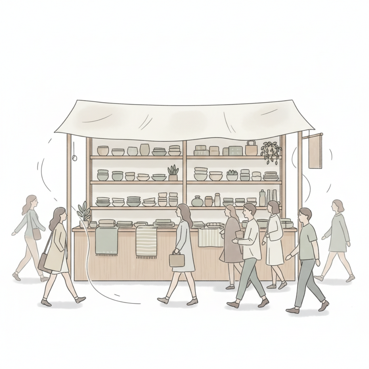
Shoppers walk past a craft booth display without stopping or interacting, moving in a steady flow while the products remain untouched.
They come in.
They don’t stop.
They don’t stay.
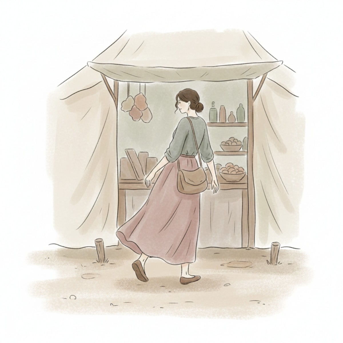
A shopper walks into a craft booth through soft draped curtains, moving toward the display without stopping or interacting.
One slow pass.
Eyes across the table—
not on anything.
Then they keep moving.
Another person does the same thing.
In.
Around.
Out.
And then another.
No one stops in one place.
No one settles into anything.
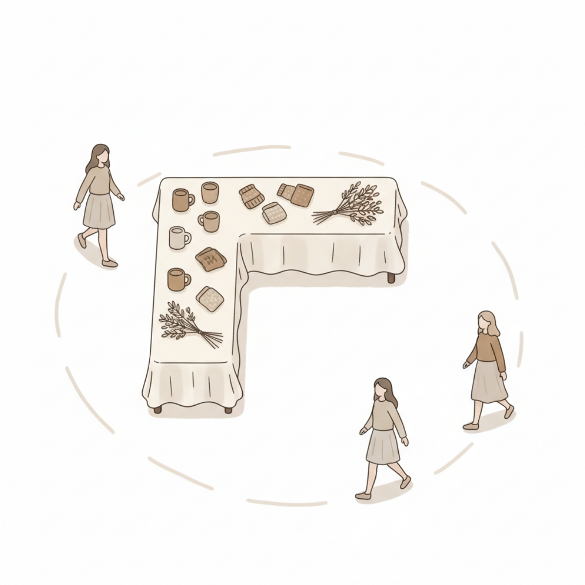
Shoppers walk in a circular path around a craft booth table, moving continuously without stopping to interact with any items.
Someone hesitates for a second.
Just enough to look like it might turn into something—
but it doesn’t.
They shift.
They keep moving.
Nothing holds them there.
They don’t lean in.
They don’t stay long enough for anything to change.
They don’t stay long enough for anything to start.
Shoppers walk past a fully stocked craft booth display in a steady flow without stopping to interact or engage with the products.
It keeps repeating.
In.
Around.
Out.
In.
Around.
Out.
More people come through.
The movement never really stops.
But nothing builds.
Nothing ever turns into anything more.
They don’t miss your booth.
They just don’t stay in it.
A shopper walks past a small craft booth display without stopping, continuing on without interacting with the products.
No one slows it down.
No one breaks the pattern.
It just keeps cycling—
the same way,
every time.
And after a while—
you don’t just see people coming in.
You start seeing how they move.
If this keeps happening,
it’s not random.
It’s the same motion,
repeating cleanly—
without ever turning into anything else.
And once you see that—
you can’t unsee it.

Spring Craft Booth Trends That Actually Get Customers to Stop (And What They Mean)
These booth trends are showing up everywhere right now—
and they’re getting people to stop.
But stopping isn’t the same as staying.
These are the booth trends showing up everywhere right now—
soft color, styled displays, and a calm, curated feel.
They’re getting people to stop.
But attention is only the first step.
What’s Getting People to Stop Right Now
Booths are getting attention right now.
You can see it.
People slow down.
They glance over.
They step in just enough to look.
And then—
they move on.
The Patterns Showing Up Across Spring Booths
A few things are showing up again and again this season:
1. Softer, styled displays
Neutral tones. Light woods. Clean layouts that feel calm and curated.
2. Small, easy-to-browse products
Jewelry trays. mini items. grouped pieces that invite a quick look.
3. “Giftable” presentation
Items that feel ready to pick up and give—simple, approachable, low-pressure.
4. Visual cohesion across the booth
Everything matches. Everything feels intentional.
None of this is random.
These are the booths pulling people in.
You’re seeing this across markets.
Booths that feel lighter.
More styled.
Easier to step into.
And they’re working—at least at first.
What These Trends Are Actually Showing
These setups are doing one thing really well:
They make people stop.
They lower resistance.
They feel easy to approach.
They invite a quick look without pressure.
That part is working.
But there’s a gap.
Because stopping isn’t the same as staying.
What This Points To
When attention improves—but buying doesn’t follow—
it starts to point somewhere specific.
Not toward traffic.
Not toward trends.
But toward what happens inside the booth.
These trends are exposing a pattern:
People are entering the moment…
but not continuing through it.
Where This Starts to Feel Familiar
You might be seeing it already.
People pause at the edge of your booth.
They look at a few things.
They react—maybe even smile.
But they don’t go further.
They don’t ask.
They don’t pick anything up.
They don’t shift into shopping.
It feels like interest.
But it doesn’t hold.
If your booth is getting more attention—but not more buying,
this is the pattern to look at next.
What to Focus On When Shoppers Browse—But Don’t Buy
Shoppers are stopping. They’re looking. And then they’re leaving.
That’s not a traffic problem.
This shows you exactly what to focus on when interest never turns into buying.
They Step In
That part worked.
They noticed your booth.
They crossed the edge.
They slowed down enough to look.
And then—
nothing continues.
They don’t move deeper into the booth.
They stay near the front table.
Near the aisle.
They glance around.
Pick something up.
Then put it back down.
And leave.
The Interaction Stalls
That’s the moment to watch.
Not whether people enter.
What happens after they do.
Because right now, shoppers are entering your booth—
but the interaction never builds.
They browse briefly.
Scan the display.
Look across the tables.
But nothing pulls them forward.
Nothing creates momentum.
They Don’t Know Where to Go Next
Most booths accidentally ask shoppers to make too many decisions at once.
Where should they stand?
What should they look at first?
What matters most here?
What should they pick up?
So people default to the easiest option.
They leave.

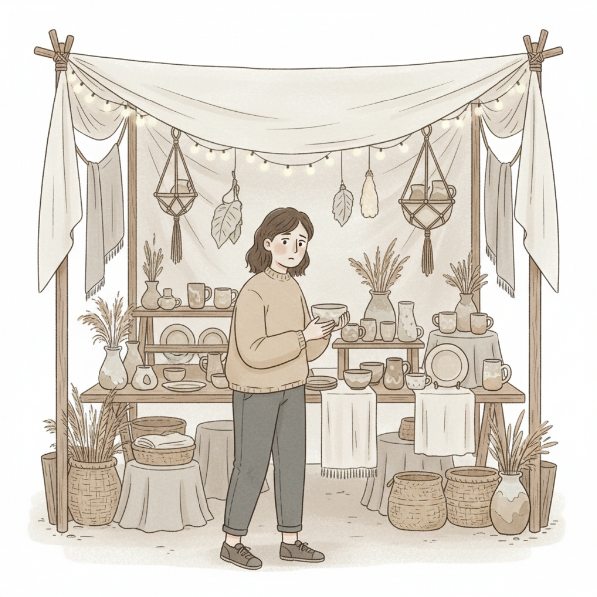
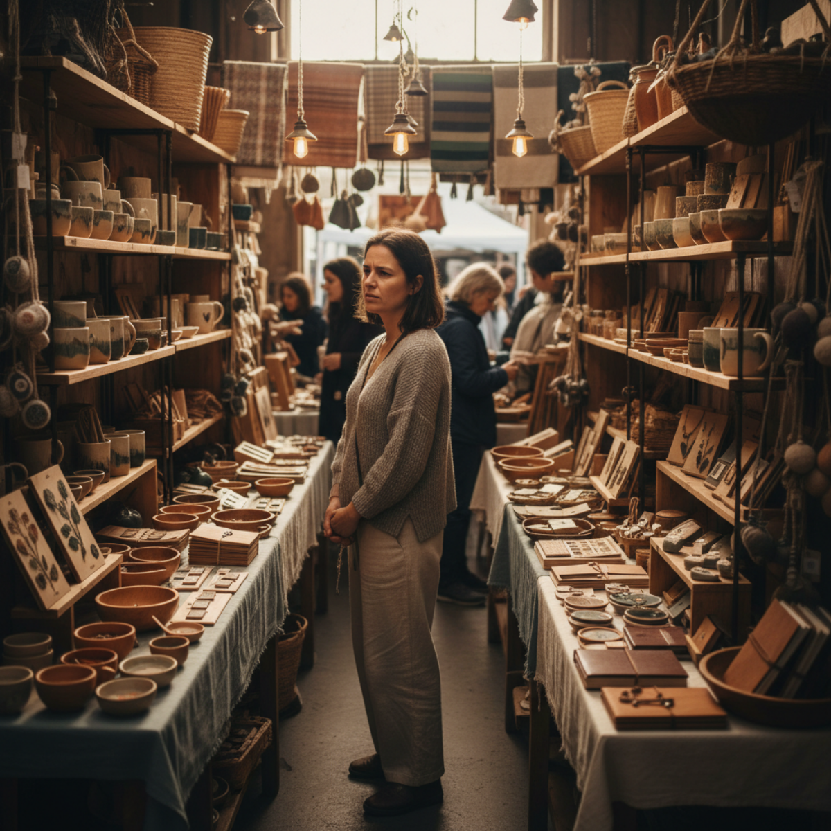
A shopper stands inside a handmade pottery booth holding a product—but without a clear path deeper into the display, the browsing moment stalls instead of turning into a purchase.
Why This Matters
If this stays broken, you don’t just lose sales.
You lose every opportunity after that moment.
They won’t:
pick something up
ask a question
discover your best items
They exit before any of that begins.
So the problem repeats.
All day.
And it looks like “interest”—
but it’s not.
It’s failure to continue.
A shopper inside a handmade craft booth pauses with interest—but without a clear next step, the moment never turns into buying.
This Is Where It Breaks
The problem usually isn’t attention anymore.
They already gave you attention.
The problem is continuation.
The booth never creates a clear next step.
So the shopper stays at surface level—
and the interaction ends before anything meaningful happens.
Before they:
pause long enough to connect
discover your strongest products
feel comfortable exploring
or build buying momentum
What to Focus On
Focus on the moment immediately after they stop.
Not the entire booth.
Not redesigning everything.
Just this:
What naturally pulls someone deeper into the space?
Because if nothing guides movement forward,
the shopper stays near the edge—
and leaves from there too.
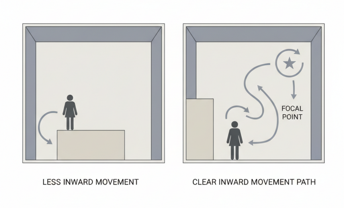
A simple booth layout comparison showing how clear inward movement paths and focal points help shoppers move deeper into a craft booth instead of stopping near the entrance.
What Usually Causes This
Sometimes it’s:
too many equal focal points
front tables blocking visual movement
products compressed together
no visual destination deeper inside the booth
or displays that all compete equally for attention
The shopper keeps scanning—
but never settles anywhere long enough to continue.
A shopper pauses inside a crowded handmade market booth filled with competing products, layered textures, and visual noise—showing how overwhelm can stop browsing momentum before buying begins.
What This Fix Changes
When the booth creates clear movement,
people naturally continue.
They move farther inside.
They slow down longer.
They notice more.
The interaction has room to build.
And once that happens,
everything else finally has a chance to work.
Start With What You’re Seeing
If shoppers slow down at the edge of your booth but don’t step in,
start with the Craft Booth Check.
If The Whole Booth Feels Off
If your booth feels crowded, confusing, or difficult to shop,
the Fix Your Booth Planning Guide helps you identify where the breakdown is happening.
Explore Related Booth Problems
Booth issues usually connect.
What feels like:
a product problem
a traffic problem
or a sales problem
is often:
flow
focus
spacing
or signal.
Explore more booth patterns and solutions.
Why Shoppers Browse Your Booth But Don’t Buy
Shoppers are stopping at your booth.
They’re noticing things.
Sometimes they even pause long enough to look more closely.
And then they leave.
If that pattern keeps repeating, it’s not just about interest—it’s about what happens after that first moment.
Because browsing doesn’t always mean someone has started shopping.
Sometimes it means they noticed something…
but didn’t have a clear way to move forward.
This is where a lot of booths quietly break down.
Not because they look wrong—
but because they don’t carry attention into a buying path.

She’s already in your booth.
Looking. Considering.
But nothing is moving her forward into buying.
They stop.
They look.
Sometimes they even lean in for a second.
And then they leave.
You notice it enough times that it stops feeling random.
Because it’s not that people ignored your booth.
It’s that something almost happened
…and then didn’t.
You can feel the break in it.
That weird moment where interest shows up—
but shopping never really starts.
And after a while, the thought creeps in:
Maybe they liked it.
Maybe it just wasn’t enough.
Or maybe something in the booth is asking too much too soon.
Shoppers are noticing your booth—but that doesn’t mean they’re entering the buying process.
A lot of makers read this moment as mild interest.
Better than being ignored.
Better than walking straight past.
At least something caught their attention.
But when shoppers browse and leave over and over, the problem usually isn’t that nothing worked.
It’s that the booth created enough interest to start attention—
but not enough clarity to carry that attention into a buying decision.
That’s a different problem.
And it needs to be understood clearly before you start changing everything.
They’re browsing—but they’re not entering the shopping process
When someone slows down at your booth, that does not automatically mean they’ve started shopping.
Sometimes they’re only reacting.
They noticed a product.
They liked the colors.
They saw something that felt pleasant or curious.
But noticing is not the same thing as moving into a clear buying path.
That’s the pattern a lot of booth setups create without meaning to.
They give shoppers just enough to glance, pause, and browse the surface—
but not enough structure to help them keep going.
So the booth gets attention.
But it doesn’t turn attention into movement.
The break usually happens before the product decision
This is the part that gets missed.
If shoppers are browsing but not buying, most makers assume the issue is product price, product appeal, or the shopper’s budget.
Sometimes that’s true.
But when the same browse-and-leave behavior keeps repeating across many shoppers, the booth itself is often creating the stall.
Not because it looks bad.
Because it asks the shopper to do too much interpretation on their own.
They have to figure out where to look first.
What matters most.
What kind of item this booth is really about.
How deep they should go.
Whether there’s a reason to stay.
That mental work feels small from the seller side.
From the shopper side, it’s friction.
And friction is often enough to stop a sale before the product ever gets a fair chance.
A neat booth can still feel mentally heavy
A booth does not have to look messy to feel hard to shop.
Sometimes the hardest booths to diagnose are the ones that look “pretty good.”
Everything is arranged.
Nothing seems obviously wrong.
There’s product variety.
The display looks decent from a distance.
But once shoppers step in, the booth gives them too many equal choices and not enough visual direction.
Nothing stands out as the place to begin.
Nothing clearly carries them from one thing to the next.
Nothing tells them what this booth is really helping them notice.
So they browse lightly.
They react in pieces.
They leave without ever locking onto a reason to buy.
When everything feels equally important, shoppers don’t know where to begin.
What’s really happening is not lack of interest—it’s lack of directional clarity
That distinction matters.
If people were fully uninterested, they would keep walking.
But they’re not doing that.
They’re stopping.
They’re browsing.
They’re showing signals.
What’s missing is the shift from passive looking to active shopping.
And that shift usually depends on directional clarity inside the booth:
what the shopper should notice first
what makes the booth feel easy to enter
what connects one product area to the next
what reduces hesitation instead of adding more choice
When that clarity is weak, the booth keeps generating shallow engagement.
Enough to look promising.
Not enough to convert.
What to look for in your own setup
These are the kinds of signals that often show up when the booth is creating browse behavior without buying momentum:
If shoppers stop at the outer edge and scan without stepping in, your booth entry point likely isn’t visually clear enough.
If they step in, look at one or two things, and then back out quickly, your display may be creating isolated points of interest instead of a connected shopping path.
If they pick up items but do not continue exploring nearby products, the booth may be functioning like separate mini-displays instead of one guided experience.
If they circle visually without asking questions or moving deeper, they may be doing too much silent sorting on their own.
If different shoppers keep reacting to different items but none of those reactions turn into sustained engagement, your booth may be catching attention in fragments rather than focusing it.
The pattern: pause → browse → lose momentum → leave.
That’s the part worth paying attention to.
Not just whether people stop.
But whether the booth helps them keep going after they stop.
Because that’s where the real loss usually happens.
And once you see that, a lot of random booth tweaking starts to make less sense.
Four shifts that change this pattern
1. Give the booth a clear starting point
A shopper should not have to decide where shopping begins.
When everything has equal visual importance, the booth feels open—but mentally flat.
A stronger starting point helps shoppers enter the booth with less hesitation. That might come from your most recognizable category, your clearest problem-solver, or the area that best tells shoppers what your booth is about.
The point is not to make one thing louder just to be loud.
The point is to reduce the first moment of uncertainty.
2. Connect interest instead of scattering it
A shopper who notices one item should feel pulled naturally toward the next useful thing to look at.
When products feel disconnected, browsing stays shallow.
When displays support one another, shoppers stay in motion longer.
That does not always mean adding more signs or more explanation.
Often it means reducing visual separation and making the booth easier to read as one environment instead of many unrelated decisions.
3. Make staying feel easier than leaving
A lot of browse-and-leave behavior happens because the booth does not give the shopper an easy reason to remain engaged.
Not a sales pitch.
Not pressure.
Just enough visual coherence that staying feels natural.
The booth should lower the effort required to keep looking.
When the experience feels disjointed, leaving becomes the easiest move.
4. Let the booth answer one question clearly
A shopper may not say it out loud, but the booth is always being judged by a silent question:
What am I supposed to notice here?
If the answer is fuzzy, the whole shopping experience becomes weaker.
If the answer is clear, attention has somewhere to go.
That does not mean the booth needs to be simple in a boring way.
It means the booth needs to make its value legible faster.
This is why “they stopped” is not enough
It’s easy to overvalue browsing because browsing looks close to shopping.
And sometimes it is close.
But not always.
Sometimes browsing is just polite curiosity.
Sometimes it is visual interest without structural support.
Sometimes it is the shopper’s way of saying, “Something here caught me—but I don’t know how to move further into it.”
That is a booth problem worth taking seriously.
Because it means the issue may not be your products at all.
It may be what the booth is asking the shopper to sort out before they can feel confident enough to buy.
A clear path helps shoppers move from interest into real engagement.
Once that starts happening, the next question is not just whether shoppers are interested.
It becomes:
What are they actually focusing on when they browse?
Because that focus point usually tells you where the booth is helping—
and where it’s failing.
And that’s the part you need to see clearly before you decide what to change next.
To keep going, read What to Focus On When Shoppers Browse—But Don’t Buy.
When People Stop, Smile… and Then Walk Away
Shoppers stop, smile, and walk away—and it keeps happening the same way. The moment starts, but something in the booth isn’t carrying it forward.
You see it happen all day.
Someone slows down as they pass your booth.
They glance over.
They stop.

They stop.
They smile.
But they never really step in.
They step in—just enough.
Lean in a little.
Almost pick something up.
They smile.
And then they leave.
No question.
No pause.
No shift into anything more.
At first, it feels like a good sign.
At least they stopped.
At least they noticed.
But then it happens again.
Stop.
Smile.
Walk away.
And again.
They don’t really enter your booth.
They hover at the edge of it.
Just far enough to react—
not far enough to stay.
You start to see the same moment play out.
Over and over.
Everything is being seen—
nothing is being engaged.
It starts.
And then it stops.
Right there.
This is what’s happening.
The moment begins—
but it doesn’t continue.
And once you see that,
you can’t unsee it.
Because now you’re not just watching people leave—
You’re watching the exact point where it breaks.
That’s the part that matters.
And it’s coming from the booth itself.
If this keeps happening,
it’s not random.
It’s coming from the booth.
A Pattern I Notice When Makers Are Waiting for Confidence
What I’ve noticed, though, is that confidence rarely arrives in advance.
It usually shows up after a decision has been made and lived with for a while. After tradeoffs are experienced. After uncertainty has been survived.
Why confidence usually appears after action — not before it.
Confidence is often treated like a prerequisite.
“I just want to feel more confident before I move forward.”
“I’ll know when it feels right.”
“I’m waiting until I’m sure.”
These are common phrases among makers who are trying to decide what step to take next.
What I’ve noticed, though, is that confidence rarely arrives in advance.
It usually appears after a decision has been made and lived with for a while. After tradeoffs are experienced. After uncertainty has been survived.
Waiting for confidence can quietly delay movement — not because someone isn’t capable, but because they’re expecting a feeling that tends to follow action rather than precede it.
Sometimes the hesitation isn’t really about confidence at all.
It’s about wanting certainty.
And certainty isn’t something most creative paths offer.
Making products.
Listing items.
Trying a new craft show.
Choosing a direction for a shop.
All of these involve moments where the outcome isn’t fully known yet.
Confidence tends to grow through contact.
Through repetition.
Through seeing what happens when you choose something and stay with it long enough to learn.
Key observation
Confidence rarely appears before a decision.
It usually grows after a direction has been chosen.
Sometimes the next step isn’t to feel more confident.
Sometimes it’s simply to choose a direction gently — and give yourself enough time inside that direction to learn from it.
Confidence often grows quietly once the work begins interacting with the real world.
Pause for a moment and ask yourself
• Am I waiting for confidence — or clarity about the next step?
• What small decision could I make without needing complete certainty?
• If I chose a direction today, what might I learn in the next few weeks?
Sometimes confidence is less about preparation and more about experience accumulating over time.
Where this fits in your Maker Path
Moments like this often appear in the Foundations stage, when makers are deciding where to focus their time and energy.
It’s a place where clarity matters more than confidence.
If you're at this point — wanting direction before certainty — the Foundations Path exists to help makers choose a direction gently and stay with it long enough to learn.
→ Explore the Foundations Path
More patterns we’ve noticed
• When Makers Confuse Momentum With Direction
• Why Selling Can Feel Harder Than It Should
• Before You Switch Platforms, Read This
Maker Notes are short reflections from the Artisan Kraftwerks team about patterns we notice while building and selling handmade work.
Why Your Booth Can Look Right—but Still Not Work
Your booth can look put together and still feel off to customers. When nothing appears obviously wrong, it’s often harder to see what’s actually holding your setup back.
Sometimes the booth looks fine.
The table is covered.
The display pieces are in place.
Nothing seems obviously wrong.
And yet something still feels off.
You step back and think, Why does this look better in my head than it works in real life?
Then the day starts, people glance in, and somehow the booth still doesn’t feel easy to enter, or easy to understand.
It can be frustrating when the booth appears “put together” but still doesn’t create the response you expected.
Because when nothing looks clearly broken, it becomes harder to see what actually needs to change.
If your booth looks good but still isn’t working, you don’t need to redo everything—you need to adjust how it functions.
Craft booth with an open layout where customers can step in and browse comfortably.
The Pattern
A booth can look finished… and still not work.
You don’t want to tear it all down… but you don’t trust it either.
Why This Happens
That usually happens when the maker is judging the booth by appearance alone:
everything fits
the table looks full
the colors feel cohesive
the display pieces match
the setup seems finished
But customers do not experience the booth as a still image.
What looks complete to you doesn’t always translate into something usable for the customer.
They experience it as movement—moment by moment.
They walk by.
They scan quickly.
They decide whether it feels approachable.
They try to understand what you sell.
They look for a place to pause—
without feeling crowded or trapped.
So a booth can “look right” to the maker because it appears complete, while still not working for the customer because the booth experience itself is unclear.
The Cause
What usually breaks here is not effort.
It’s structure.
Here are the patterns that usually show up when a booth looks right—but doesn’t work:
A visually pleasing booth can still struggle when one or more of these problems are present:
1. The booth has no clear entry point
(customers don’t know where to begin)
If customers cannot tell where to begin looking, they keep moving.
A setup that feels balanced to you may still read as closed, flat, or uncertain from the aisle.
2. The eye lands everywhere at once
When every area asks for equal attention, nothing stands out.
The booth may look full and thoughtfully arranged, but the customer never receives a clear first impression.
3. Product grouping is decorative instead of directional
Items may be arranged attractively, but not in a way that helps people understand categories, price relationships, or what kind of work you actually sell.
4. The setup protects symmetry more than shopping flow
Sometimes makers keep things visually even because it feels safer or more polished.
But symmetry does not always create movement.
In some booths, it actually flattens the experience and removes natural points of curiosity.
5. The booth is readable only after effort
If a customer has to work to understand what they are seeing, many simply won’t.
A booth does not need to be loud, but it does need to become clear quickly.
The Constraint
This is what makes booth problems hard to solve.
Most makers adjust based on what feels visibly wrong:
too empty
too cluttered
too plain
too busy
But when the booth looks “basically good,” the real issue often hides underneath those more obvious categories.
That is why you can keep tweaking small details without fixing the actual problem.
You change riser height.
You move a sign.
You add another crate.
You remove a basket.
You shift products around.
And still, the booth behaves the same way.
Because the issue was never just how it looked.
It was how it worked.

Working on a Booth Layout That Doesn’t Feel Settled Yet
The Shift
The question to ask isn’t:
Does my booth look right?
The better question is:
Does my booth help people know:
where to look,
where to move,
and why to stop?
That shift matters because a working booth is not just a styled space.
It’s a readable environment—one that makes sense without effort.
A strong booth usually does three things well:
it gives the eye somewhere to land first
it gives the customer a clear way to enter and browse
it makes the products easy to understand without effort
When those things are missing, the booth can still look attractive while quietly underperforming.
And that underperformance often gets misread as a sales problem, a product problem, or even a confidence issue.
Sometimes, it’s simply a structure problem.
How Customers Move Through a Craft Booth
Structured Change
Here are four ways to check whether your booth is only looking right—or actually working.
These aren’t design tweaks—they’re structure checks.
1. Check the first three seconds
Stand outside the booth and look at it the way a passing customer would.
Ask:
What do I notice first?
Is there one clear focal point?
Do I immediately understand what kind of products are here?
Does this feel open enough to approach?
If the booth isn’t clear within a few seconds, it may be visually fine—but functionally weak.
2. Check whether the layout creates entry
Look at the front edge and center of the booth.
Ask:
Is there a visible opening?
Does anything feel like a barrier?
Are display pieces creating hesitation instead of invitation?
Does the booth feel easy to step into with the body, not just the eyes?
Many booths look organized—but unintentionally block entry—through tight spacing, hard front lines, or overfilled front tables.
3. Check whether products are grouped for understanding
A customer should be able to make sense of the booth in sections.
Ask:
Are similar items grouped together clearly?
Can someone tell the difference between categories quickly?
Does each area help the customer understand something—or just fill space?
Is the arrangement helping the customer make decisions?
Pretty arrangements can still create confusion when the grouping logic is not obvious.
4. Check whether the booth supports movement
A working booth has rhythm.
Ask:
Where does the eye move after the first focal point?
Is there a natural next place to look?
Do height changes create interest or just busyness?
Is the booth guiding browsing, or scattering attention?
If movement feels random, the booth may look complete—but won’t support real browsing.
When a Booth Looks Finished but Still Isn’t Working
The Decision
If your booth has been feeling close—but not effective—the problem usually isn’t that it looks bad.
It may be that the booth is asking the customer to do too much work.
That’s a different problem.
And it needs a different kind of fix.
And once you see it that way, the next step becomes much clearer.
If you’re ready to fix what’s actually causing the problem, start here:
How to Make a Craft Booth Easier for Customers to Shop
When customers approach a craft booth, they are usually deciding one simple thing:
Does this look easy to explore?
Shoppers at markets often move quickly from booth to booth, scanning displays and deciding where to pause.
Booths that feel calm and easy to browse tend to hold attention longer. Customers feel comfortable stepping closer, taking their time, and exploring the products on display.
Making a booth easier to shop rarely requires dramatic changes.
Often it simply means arranging displays in a way that allows customers to move naturally through the space.
In This Post
We’ll explore a few simple ways makers often make their booths easier for customers to browse:
• why clear product groupings help shoppers explore
• how display height affects visibility
• why browsing comfort matters more than quantity
• small booth adjustments that improve the shopping experience
1. Group Similar Products Together
When customers approach a booth, they often scan quickly to understand what is being offered.
Displays that group similar products together help shoppers understand the booth more easily.
For example:
• jewelry grouped in one area
• candles arranged on a single display
• wood products displayed together
Clear groupings allow customers to explore naturally rather than feeling unsure where to begin.
2. Vary Display Heights
Flat displays can sometimes make products blend together visually.
Varying heights — through shelves, risers, or small stands — helps certain items become more visible.
This doesn’t require dramatic displays.
Even small height differences can guide the customer’s eye across the booth in a comfortable way.
3. Leave Space for Browsing
Customers often need a little physical and visual space to browse comfortably.
When displays are spaced slightly apart, shoppers can pause, lean closer, and look more carefully at products.
Open space also helps booths feel calmer and more inviting.
4. Let Your Best Pieces Stand Out
Not every product needs equal attention in a booth.
Allowing a few standout items to become natural focal points helps customers decide where to look first.
This can happen through:
• a slightly elevated display
• a centered table arrangement
• a small featured grouping
Focal pieces help guide browsing without overwhelming the booth.
If you're experimenting with booth layouts or product placement for the upcoming market season, the Craft Booth Layout Planner can help you sketch display ideas and test arrangements before setting up at a show.
Closing Reflection
A Small Clarity Before You Go
A craft booth doesn’t need to be elaborate to be inviting.
Often the booths that customers enjoy browsing most are simply the ones that feel easy to explore.
When displays are arranged with the shopper’s experience in mind, browsing tends to happen naturally — and the products have more room to be noticed.
How to Plan a Craft Booth Layout (Without Overthinking It)
Planning your craft booth layout doesn’t have to feel rushed or overwhelming. This guide helps you understand how booth flow works, avoid common layout mistakes, and create a setup that feels clear, organized, and easy for shoppers to browse.
Your booth layout probably isn’t the problem you think it is.
Most of the time, it’s not about creativity, effort, or having the “right” displays.
It’s about trying to make layout decisions at the wrong time.
If setup day has ever felt rushed…
if you’ve rearranged things more than once…
or if your booth looked fine but didn’t quite work…
you’re not doing anything wrong.
You’re just making decisions under pressure.
Why Booth Layout Feels Harder Than It Should
Booth layout feels complicated because everything is happening at once.
space is limited
inventory varies
displays take up more room than expected
and there’s pressure for everything to look “right”
On top of that, it’s easy to compare your booth to polished photos online—which can make simple, functional setups feel inadequate.
Then you arrive at the event, other vendors are already unloading, and suddenly every decision feels urgent.
That’s where most of the stress comes from.
Not a lack of ability—
just a lack of structure before you arrive.
The Real Problem: Planning During Setup
One of the most common patterns is trying to design your booth while setting it up.
But setup time is:
noisy
rushed
physically demanding
It’s the worst possible moment to decide:
where tables should go
how customers will move
what deserves priority placement
So what happens?
You adjust things on the fly.
You second-guess decisions.
You end up with a booth that feels a little crowded or unclear.
Not because your ideas were wrong—
but because the timing was.
Setup time is for assembling.
Not for designing.
Start With Booth Size (Not Product Placement)
A strong booth layout always begins with the space itself.
Most events give you standard sizes like:
6×6
8×8
10×10
Once you know your dimensions, everything else becomes easier.
Your space determines:
how much walking room you have
how many tables actually fit
where displays can realistically go
If you start with products instead, it often leads to overcrowding.
When you start with space, you make clearer decisions about what belongs—and what doesn’t.
Space is the framework.
Product comes second.
Design for Flow, Not Perfection
A good booth isn’t about filling every inch.
It’s about how people move through it.
Flow is:
how shoppers enter
how they move
how they exit
When flow is clear:
people step in more easily
they stay longer
they engage more naturally
When flow is blocked:
people hesitate
they glance and move on
they don’t fully browse
Booths that feel open and navigable almost always perform better than booths packed with inventory.
Perfection isn’t the goal.
Clarity is.
Common Booth Layout Traps
Even experienced vendors run into the same patterns:
blocking the entrance with tables or tall displays
placing too much inventory at the front
using displays that visually close in the space
having no clear focal point
forgetting to plan where you will stand and move
None of these are obvious while you’re setting up.
But once you know to look for them, they’re much easier to avoid.
Why Repeatable Layouts Work Better
It’s easy to feel like you need a new layout for every show.
But repeatable layouts are what actually reduce stress.
When you use a similar structure each time:
setup becomes faster
decisions feel easier
you know what works (and what doesn’t)
Instead of starting over, you refine.
Instead of guessing, you adjust.
You don’t need a new layout.
You need a better version of the same one.
A Simple Way to Plan Ahead
One of the easiest ways to reduce decision fatigue is to sketch your booth layout before show day.
It doesn’t have to be perfect.
It just needs to exist.
Planning ahead lets you:
test arrangements without pressure
visualize spacing
make decisions while you’re calm
If you prefer something more structured, simple planning tools can make this even easier.
Turn Your Plan Into a Real Setup
Once you have a basic layout, the next step is applying it in a real booth.
Inside Artisan Kraftwerks, you’ll find tools designed specifically for this:
Craft Booth Layout & Planning Guide
Map your space and create a layout you can reuseCraft Booth Display Planning Worksheet
Decide what goes where so your booth feels balancedCraft Booth Setup & Flow Checklist
Set up faster and check flow before the show begins
👉 Explore Craft Show Booth Tools
These are designed to help you move from:
guessing → planning → repeatable setup
Keep It Simple and Refine Over Time
You don’t need a perfect booth layout.
You need a clear one.
Start with your space.
Create a simple structure.
Refine it a little each time.
That’s where confidence comes from.
Not from getting it right all at once—
but from making it easier each time you set up.
Where This Fits
If your booth feels off but you’re not sure why:
👉 Booth Clarity Reset
If you’re noticing patterns but haven’t named them yet:
👉 Maker Notes
If you’re ready to plan your booth more intentionally:
👉 Craft Booth Layout & Planning Guide

A Pattern I Notice When Makers Are “Almost Ready”
“Almost ready” is a fascinating phrase.
It usually means the core work is done — the product exists, the idea is formed, the structure is there. What’s left feels small. Final. Responsible.
And yet, “almost ready” can stretch on for weeks or months.
“Almost ready” is a fascinating phrase.
It usually means the core work is done — the product exists, the idea is formed, the structure is there.
What’s left feels small.
Final.
Responsible.
And yet, “almost ready” can stretch on for weeks or months.
A pattern I notice
Finishing something often requires exposure.
Letting it be seen.
Letting it be used imperfectly.
Letting it leave the private space where it’s still protected.
Perfection isn’t always the barrier.
Sometimes it’s the transition from control to contact.
Once something is finished, it can be reacted to.
Misunderstood.
Ignored.
Appreciated.
Staying “almost ready” quietly delays that moment.
Key observation
Finishing isn't always about quality.
Sometimes it's about visibility.
I don’t think the solution is to rush.
But it can be helpful to notice what finishing would actually require — and whether the hesitation is about improving the work, or letting the work be seen.
For many makers and handmade sellers, that moment happens when:
• listing a product publicly
• setting up a craft booth display
• showing work for the first time
• or letting customers interact with something that used to live only in the workshop
Those moments shift a project from private creation into public contact.
Pause for a moment and ask yourself
• What would “finished” actually require right now?
• Is the hesitation about quality — or about visibility?
• If the work went live today, what would really happen?
Sometimes the difference between almost ready and ready is simply allowing the work to be seen.
Where this fits in your Maker Path
Moments like this usually appear in the Foundations stage — when makers are clarifying direction and deciding how their work will move into the world.
If you're noticing this “almost ready” moment, the Foundations path exists to help you slow down and understand what decision is still open.
→ Explore the Foundations Path
Related reflections for makers
If this pattern resonates, you may also find these helpful:
• When Makers Confuse Momentum With Direction
• Why You Can’t See What’s Working Yet
• Before You Switch Platforms, Read This
These reflections explore common patterns we notice while building and selling handmade work.
Maker Notes are short reflections from the Artisan Kraftwerks team about patterns we notice while building and selling handmade work.
Small Craft Booth Display Ideas That Maximize Limited Space
Smart display ideas that help small craft booths feel bigger, clearer, and easier for customers to browse.
You step back from your booth and try to see it the way customers do.
There’s product on every table.
Shelves are full.
You’ve brought everything you thought might sell.
And still… people glance, hesitate… and keep walking.
It doesn’t feel empty.
It feels… crowded.
Most makers don’t struggle with having enough product.
They struggle with how that product is experienced.
When everything is visible at once…
nothing stands out.
You’re trying to show everything equally
It feels logical:
More products = more chances to sell
More visibility = better results
But your booth doesn’t behave like inventory.
It behaves like a decision environment.
And too many equal choices create hesitation.
Why adding “better displays” doesn’t fix it
Most advice leads here:
Add more shelves
Stack vertically
Fill empty space
So the booth becomes:
👉 Taller
👉 Fuller
👉 Busier
But not clearer.
The problem isn’t space.
It’s lack of structure inside the space.
This isn’t a space problem—it’s a structure problem
Small booths don’t fail because they’re small.
They fail because:
👉 Everything competes at the same level
👉 Nothing guides the customer’s eye
👉 There’s no clear place to start
When structure is missing, space feels smaller than it actually is.
If this feels familiar, you’re not the only one noticing it.
→ When Your Booth Feels Crowded No Matter What You Do
4 ways to make a small booth feel bigger (without adding space)
1. Create a single starting point
Your booth needs an entry anchor.
Not everything at once—just one clear place to begin.
Examples:
One featured table
One product category front and center
One visual focal point
👉 This reduces hesitation immediately
2. Group by decision, not by product type
Instead of:
“All earrings here”
“All signs there”
Try:
“Quick gifts”
“Best sellers”
“Seasonal items”
👉 You’re helping customers decide faster, not sort inventory
3. Build visual levels—but limit them
Levels create clarity… until they don’t.
Use:
2–3 height layers max
Clear spacing between groups
Avoid:
Stacking everything upward
Filling every vertical inch
👉 Space between items is what creates visibility
4. Leave intentional empty space
This feels wrong—but it’s critical.
Empty space:
Gives products breathing room
Creates contrast
Signals where to look
👉 Without space, nothing feels important
This is a structure problem, not a space problem.
Until the structure changes:
More products won’t help
More displays won’t help
More effort won’t help
But once structure is clear…
Even a small booth can feel easy to browse.
If something feels off…
If your booth looks good but isn’t working…
👉 Craft Booth Check: Why It Looks Good But Isn’t Working
Small space doesn’t have to mean limited potential.
With a few intentional shifts, your booth can feel clear, open, and easy to explore —
which is exactly what makes people stop and stay.
When Your Booth Feels Too Crowded No Matter What You Do
A booth can look organized and still feel overwhelming to shoppers. Learn how visual compression affects browsing behavior, focal clarity, and shopper movement—and what to adjust first.
You move things around.
You create more room.
You remove products.
And somehow—
the booth still feels crowded.
Not messy.
Not disorganized.
Just… heavy.
Shoppers slow down,
scan quickly,
and keep moving.
Even when the booth technically “looks fine.”
That usually means the problem isn’t organization.
It’s visual compression.
An organized booth can still feel overwhelming when too many products compete for attention at once.
Booth Pattern:
Spacing & Visual Flow
This kind of booth problem happens when:
products compete too closely together
displays don’t have visual breathing room
too many areas ask for attention at once
the shopper never knows where to settle visually
—
And most makers don’t notice it while setting up.
Because they’re standing inside the booth—
not approaching it like a shopper.
What Shoppers Actually Experience
A crowded booth doesn’t always look crowded.
Sometimes it looks:
full
detailed
organized
carefully arranged
But to a shopper,
it feels like work.
—
Their eyes keep moving,
but nothing fully lands.

When every surface competes for attention, shoppers often scan the booth without knowing where to focus first.
They scan:
left
right
top
bottom
without comfortably settling anywhere.
—
So even interested shoppers move through the booth quickly.
Not because they dislike the products.
Because the booth never creates visual clarity.
When every product is given equal visual weight, shoppers often struggle to know what matters most first.
What Usually Causes It
This problem often starts when:
every product is visible at once
shelving heights compete equally
signs, displays, and products overlap visually
aisles feel tight or undefined
there’s no visual resting space
—
The issue usually isn’t:
“too much inventory.”
It’s:
too many simultaneous decisions.
The shopper keeps trying to figure out:
where to look
where to stand
what matters first
And when that effort builds up,
they leave the booth earlier than they intended to.
What To Focus On First

Clear entry space and intentional visual structure make the booth feel easier to enter, browse, and understand.
Do not start by redesigning everything.
And don’t immediately add:
more signage
more displays
more product variation
That usually increases the pressure.
—
Instead:
focus on reducing competition.
Start with one adjustment:
create more open space between focal areas
remove one visually busy section
lower display density
simplify one crowded surface
allow one product group to stand alone
—
The goal is not:
making the booth emptier.
The goal is:
making the booth easier to process.
What Changes When Spacing Improves
When visual pressure decreases:
shoppers slow down differently
browsing becomes calmer
products become easier to notice
focal points become clearer
movement feels more natural
—
The booth starts feeling intentional instead of overwhelming.
And shoppers stop trying to process everything at once.
This Is Usually Not A Product Problem
Many makers assume:
they need better products
stronger branding
more inventory
more variety
But often,
the booth is simply asking the shopper to absorb too much visually at one time.
—
Spacing affects:
attention
comfort
browsing pace
shopper confidence
before a product decision ever happens.
Start With What You’re Seeing
If shoppers slow down at the edge of your booth but don’t step in,
start with the Craft Booth Check.
If The Whole Booth Feels Off
If your booth feels crowded, confusing, or difficult to shop,
the Fix Your Booth Planning Guide helps you identify where the breakdown is happening.
Explore Related Booth Problems
Booth issues usually connect.
What feels like:
a product problem
a traffic problem
or a sales problem
is often:
flow
focus
spacing
or signal.
Explore more booth patterns and solutions.
Signs Your Craft Booth Display Might Be Too Crowded
A crowded craft booth display can make it harder for shoppers to browse your products. Learn the common signs of an overcrowded booth and simple layout changes that can improve shopper flow.
Introduction
A busy craft booth can look exciting at first glance. Tables filled with handmade products often signal creativity, effort, and a wide selection for shoppers.
But there is a quiet downside many craft show vendors discover over time.
When a craft booth display becomes too crowded, shoppers often stop browsing.
Not because the products aren’t good — but because the booth becomes mentally difficult to navigate.
Instead of feeling curious, visitors feel overwhelmed.
The goal of a strong craft booth layout is not to show everything at once.
It is to create a space that feels easy to explore.
Below are a few common signs that your booth display might be working harder than it needs to.
In This Post
We’ll explore a few common signs that a booth display may be feeling a bit crowded to customers:
• when every display surface is filled
• when shoppers hesitate instead of stepping closer
• when products compete equally for attention
• how small spacing changes can make displays easier to explore
1. Shoppers Look Quickly — Then Walk Away
One of the clearest signals of an overcrowded booth is fast scanning behavior.
Visitors glance across the table but don’t step in.
Why this happens:
When products are packed tightly together, the eye has trouble finding a starting point. Instead of curiosity, the shopper feels visual noise.
Strong booths create clear entry points:
• a focal display
• a featured product
• an open browsing area
This small change can dramatically increase how long shoppers stay.
2. Every Inch of Table Space Is Filled
Many vendors feel pressure to fill every available inch of their booth.
After all, more products should mean more sales, right?
In practice, the opposite is often true.
A well-designed craft show vendor booth uses intentional spacing.
Spacing allows:
• individual products to stand out
• shoppers to visually separate categories
• the display to feel organized and calm
Think of empty space as breathing room for your products.
3. Products Blend Together
When a display becomes crowded, different items start to visually merge together.
This makes it difficult for shoppers to notice individual pieces.
For example:
A table with 30 items tightly packed together may appear like one large collection rather than many unique products.
A table with 10–15 well-spaced items often sells better because each piece can be seen clearly.
Simple changes that help:
• small risers
• tiered displays
• grouped product zones
These adjustments give each item its own visual moment.
4. Shoppers Don’t Know Where to Look First
Good craft booth displays guide the eye.
Crowded displays remove that guidance.
If everything is equally dense, the shopper has to decide where to start — and many simply choose not to.
Instead, aim to create a visual hierarchy:
Top Level
Featured product
Middle Level
Primary items
Lower Level
Supporting items
This layered approach makes browsing feel natural.
5. Your Best Products Get Lost
Ironically, the products you are most proud of are often the ones that disappear in a crowded booth.
When too many items compete for attention, the strongest pieces lose their spotlight.
Consider creating:
• one hero display
• one secondary display
• supporting product areas
This structure naturally guides shoppers through the booth.
Practical Example
Imagine two vendor tables.
Booth A
• 40 items on one table
• no spacing
• flat layout
• similar product sizes
Shoppers scan quickly and move on.
Booth B
• 18 products displayed
• varied heights
• grouped categories
• open space between items
Shoppers step in, pause, and browse.
The difference isn’t product quality.
It’s display clarity.
Summary Insight
Crowded displays usually come from a good place.
Makers want to show the full range of their work.
But the most effective craft booth displays focus on clarity rather than quantity.
When shoppers can easily see:
• where to start
• what stands out
• how products are organized
They naturally spend more time browsing.
And time spent browsing is often the first step toward a sale.
Next Step
If you're working on improving your booth layout, you may find these helpful:
Craft Booth Layout Planner
A simple planning guide designed to help craft show vendors create balanced displays that are easier for shoppers to explore.
Maker Path
The broader Artisan Kraftwerks framework for building a craft business with intention, clarity, and steady progress.
Both resources are designed to help makers refine the small structural decisions that often make the biggest difference.
Related Craft Booth Display Guides
If you're thinking about improving your booth layout, these articles may help you explore the topic further:
• Small Craft Booth Display Ideas That Maximize Limited Space
• Why Some Craft Booth Displays Feel Easy to Browse
These posts explore how booth layout, product spacing, and display structure influence how shoppers experience your booth.
Happy Maker Monday 🌿
Connie - Artisan Kraftwerks

When Makers Confuse Momentum With Direction
Momentum feels productive.
Direction makes progress meaningful.
Why staying busy doesn’t always mean your handmade business is actually moving forward.
Momentum is often treated as the goal.
For many makers, progress starts to look like activity.
More posts.
More listings.
More products.
More motion.
From the outside, it can look like things are moving forward.
But momentum and direction are not the same thing.
I keep noticing that when makers feel stuck or uncertain about their business, the response is often to increase activity.
Post more.
Make more.
List more.
The assumption is that if the motion continues long enough, the path will eventually become clear.
And sometimes it does.
But often the result is something different.
Momentum without direction tends to feel unstable.
On the surface, it looks energetic.
But underneath there’s often a quiet tension — a sense that all the effort might not actually be building toward anything.
Many handmade sellers and craft show vendors experience this at some point.
They’re working hard.
They’re staying busy.
Yet it’s difficult to say exactly what all of that motion is meant to lead toward.
Direction changes the feeling entirely.
It doesn’t necessarily make things move faster.
But it makes effort cumulative.
Small actions start stacking instead of resetting.
Key observation
Momentum feels productive.
Direction makes progress meaningful.
When makers feel exhausted but can’t quite explain why, it’s often because they’ve been maintaining motion without a clear sense of where that motion is meant to lead.
Momentum is easy to start.
Direction requires a moment of thought.
Not necessarily slowing down —
just pausing long enough to understand what the energy is meant to build toward.
Pause for a moment and ask yourself
• Is the energy I’m spending reinforcing a direction?
• Or is it simply keeping things moving?
• If I stopped today, would the work I’ve done still make sense tomorrow?
Sometimes the difference between progress and exhaustion is simply knowing what the motion is meant to create.
Where this fits in your Maker Path
Moments like this usually appear in the Foundations stage, when makers pause to clarify direction before focusing their energy.
Without that pause, it’s easy to stay busy while still feeling uncertain about where the work is leading.
If you're noticing this moment in your own work:
→ Explore the Foundations Path
More patterns we’ve noticed
• Why Selling Can Feel Harder Than It Should
• Before You Switch Platforms, Read This
• Where You Sell Matters More Than You Think
Maker Notes are short reflections from the Artisan Kraftwerks team about patterns we notice while building and selling handmade work.