

Small Craft Booth Display Ideas That Maximize Limited Space
You step back from your booth and try to see it the way customers do.
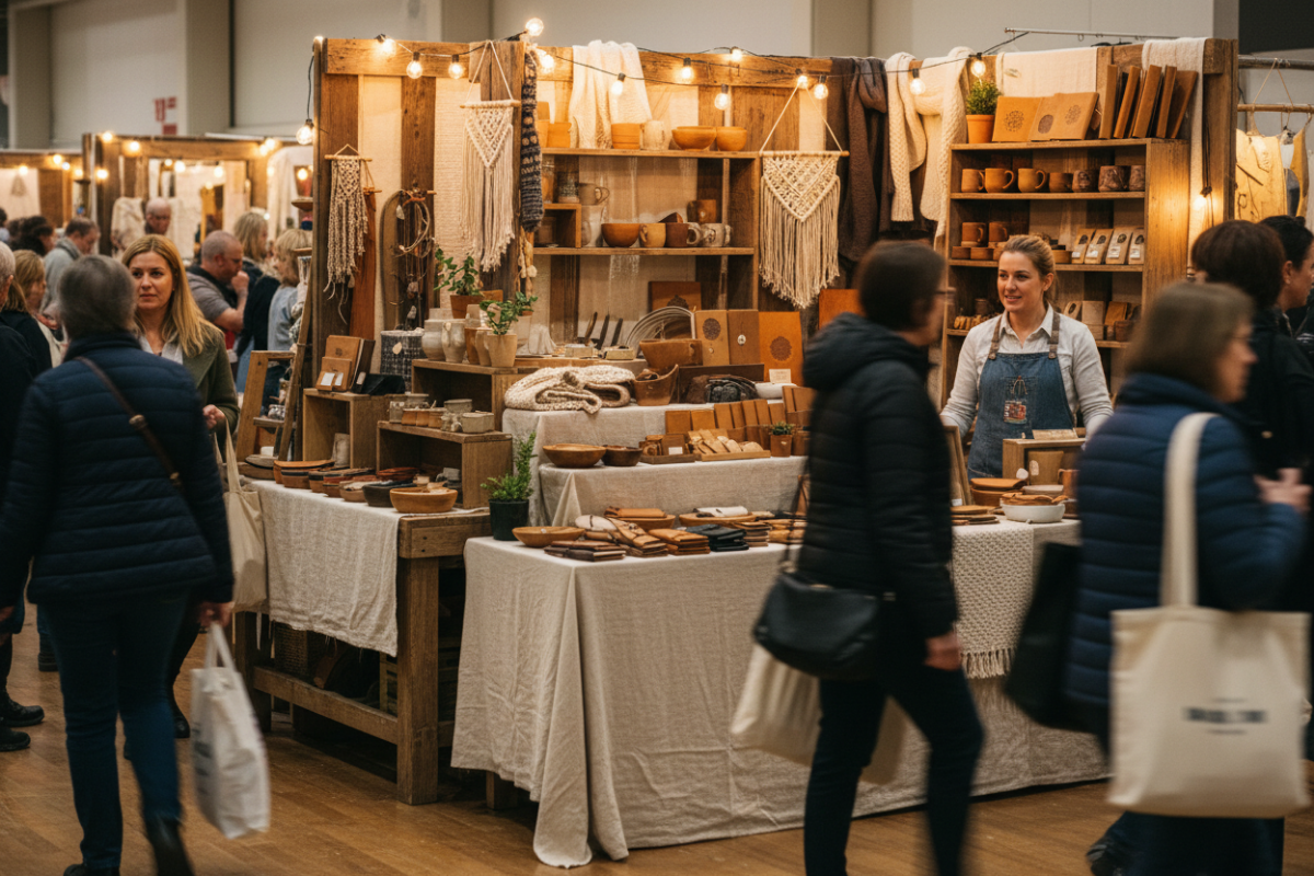
There’s product on every table.
Shelves are full.
You’ve brought everything you thought might sell.
And still… people glance, hesitate… and keep walking.
It doesn’t feel empty.
It feels… crowded.
Most makers don’t struggle with having enough product.
They struggle with how that product is experienced.
When everything is visible at once…
nothing stands out.
You’re trying to show everything equally
It feels logical:
More products = more chances to sell
More visibility = better results
But your booth doesn’t behave like inventory.
It behaves like a decision environment.
And too many equal choices create hesitation.
Why adding “better displays” doesn’t fix it
Most advice leads here:
Add more shelves
Stack vertically
Fill empty space
So the booth becomes:
👉 Taller
👉 Fuller
👉 Busier
But not clearer.
The problem isn’t space.
It’s lack of structure inside the space.
This isn’t a space problem—it’s a structure problem
Small booths don’t fail because they’re small.
They fail because:
👉 Everything competes at the same level
👉 Nothing guides the customer’s eye
👉 There’s no clear place to start
When structure is missing, space feels smaller than it actually is.
If this feels familiar, you’re not the only one noticing it.
→ When Your Booth Feels Crowded No Matter What You Do
4 ways to make a small booth feel bigger (without adding space)
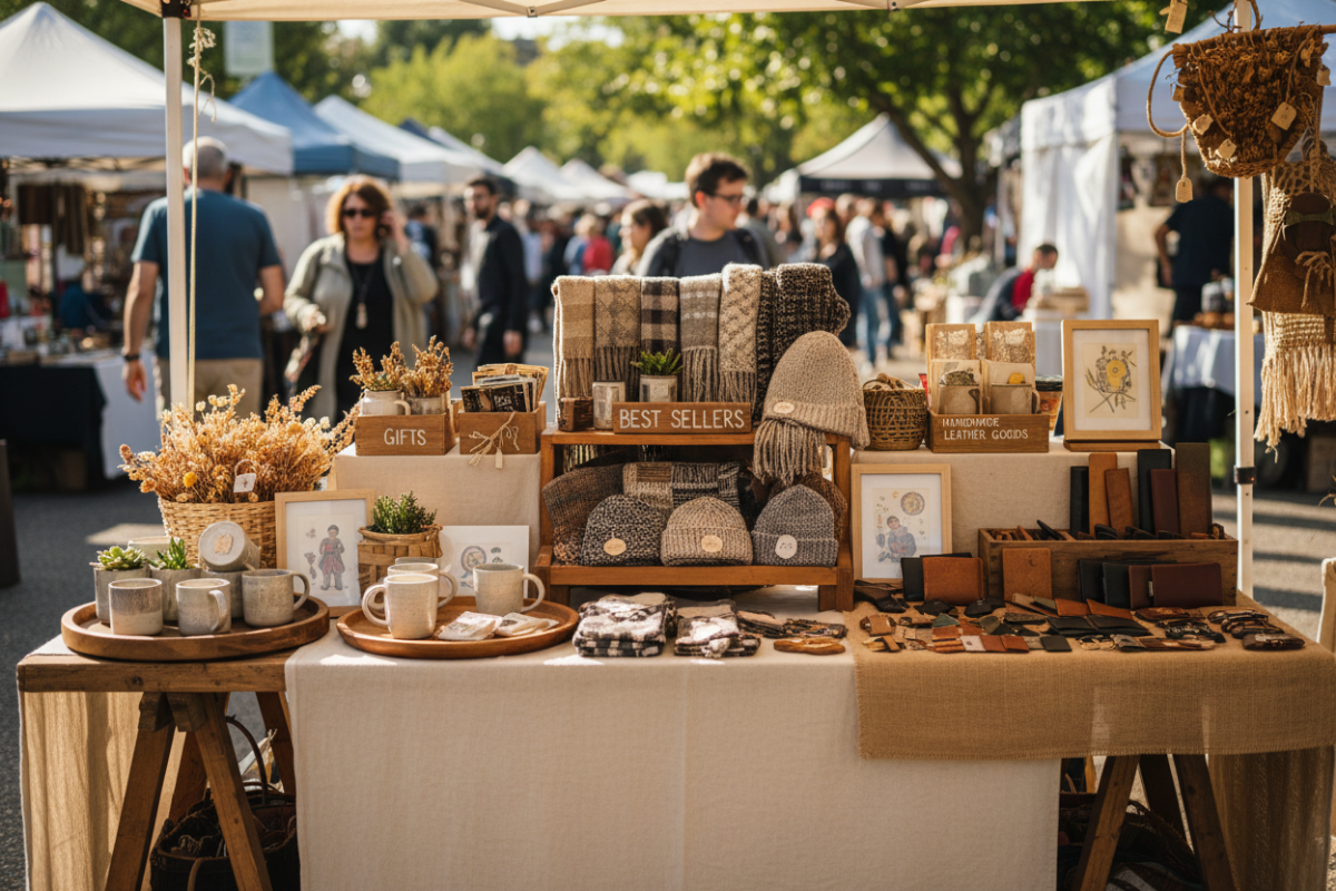
1. Create a single starting point
Your booth needs an entry anchor.
Not everything at once—just one clear place to begin.
Examples:
One featured table
One product category front and center
One visual focal point
👉 This reduces hesitation immediately
2. Group by decision, not by product type
Instead of:
“All earrings here”
“All signs there”
Try:
“Quick gifts”
“Best sellers”
“Seasonal items”
👉 You’re helping customers decide faster, not sort inventory
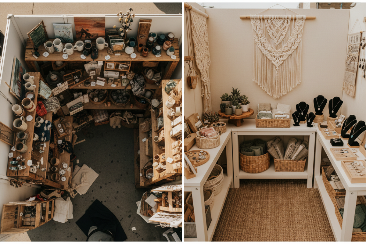
3. Build visual levels—but limit them
Levels create clarity… until they don’t.
Use:
2–3 height layers max
Clear spacing between groups
Avoid:
Stacking everything upward
Filling every vertical inch
👉 Space between items is what creates visibility
4. Leave intentional empty space
This feels wrong—but it’s critical.
Empty space:
Gives products breathing room
Creates contrast
Signals where to look
👉 Without space, nothing feels important
This is a structure problem, not a space problem.
Until the structure changes:
More products won’t help
More displays won’t help
More effort won’t help
But once structure is clear…
Even a small booth can feel easy to browse.
If something feels off…
If your booth looks good but isn’t working…
👉 Craft Booth Check: Why It Looks Good But Isn’t Working
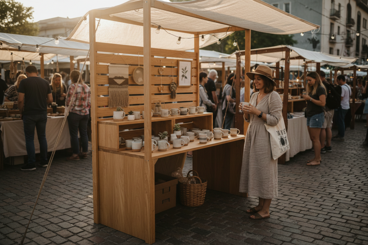
Small space doesn’t have to mean limited potential.
With a few intentional shifts, your booth can feel clear, open, and easy to explore —
which is exactly what makes people stop and stay.