

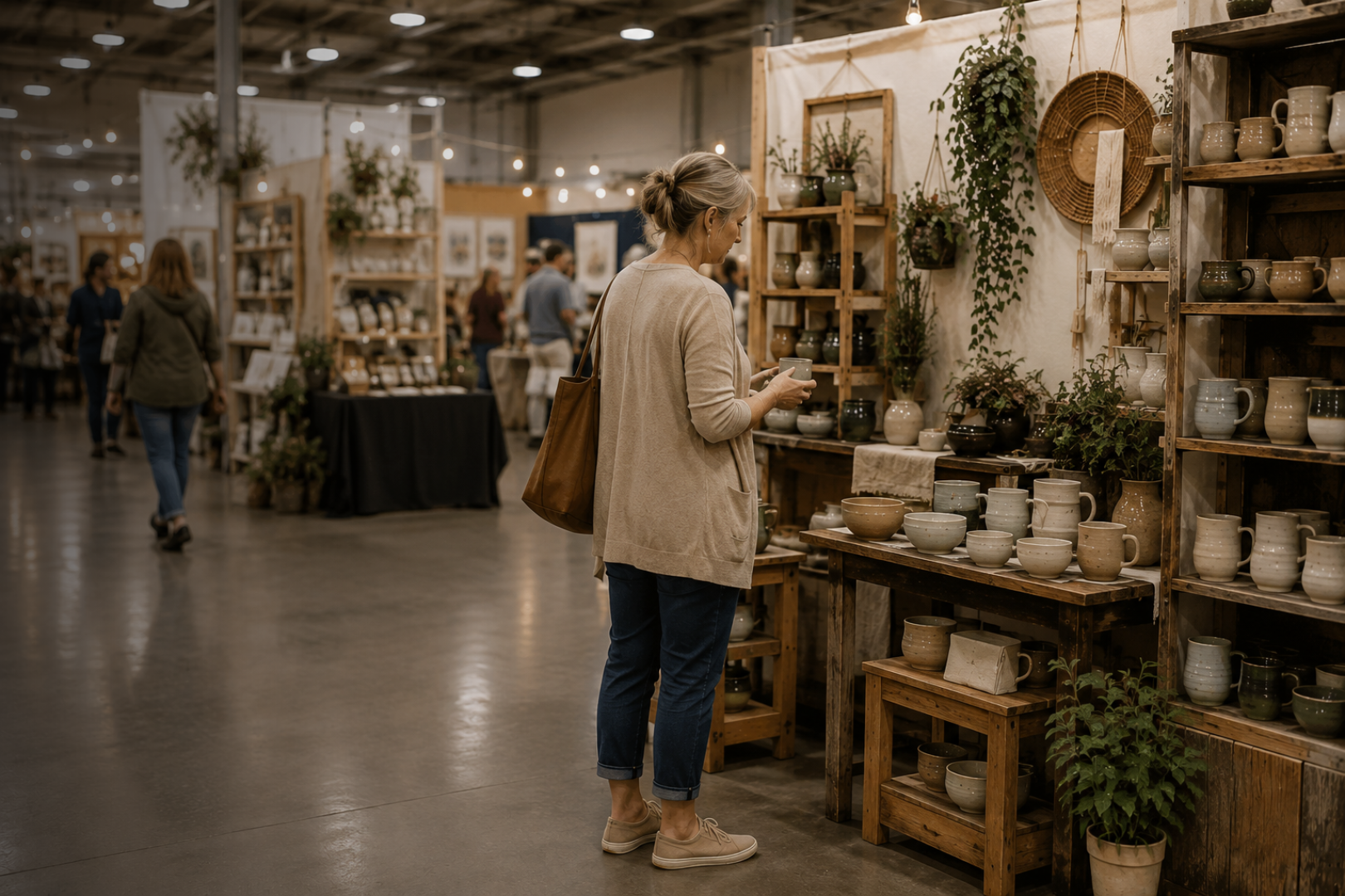
Why Some Booths Feel Easy to Shop (and Others Don’t).
Some booths seem to make shopping easy.
Shoppers step in, look around, move from one display to another, and stay long enough to see what’s there.
In other booths, they hesitate. They browse from the edge. They seem interested, but leave sooner than you expected.
It’s easy to assume the difference is the products.
Sometimes, it’s the booth itself.
Shoppers Shouldn’t Have to Figure Out the Booth
When someone approaches your booth, they’re taking in more than your products.
They’re also figuring out where they can enter, where to look first, how to move through the space, and what belongs together.
Most of that happens without much thought.
When the answers are easy to see, shoppers can spend their attention on what you made.
But when the booth makes them work a little harder — when the entrance feels uncertain, displays compete for attention, or there isn’t an obvious way to browse — some of that attention goes toward figuring out the space instead.
They may still stop.
They may still look interested.
But watch what happens next.
Do they step farther in?
Do they move naturally from one area to another?
Do they pick things up and explore?
Or do they stay near the edge, scan the booth, and move on?
Those small behaviors can tell you something your booth never says out loud.


Do they step farther in?
Do they move naturally from one area to another?
Do they pick things up and explore?
Or do they stay near the edge, scan the booth, and move on?
Look at the Moments That Shape the Visit
These snapshots show the kind of experiences shoppers have in just the first few moments.
EASY TO SHOP
Open entry.
It’s clear you can step in and explore.
EASY TO SHOP
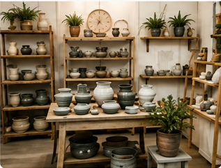
Easy to scan.
Your eye understands what’s here and where to look first.
HARDER TO SHOP
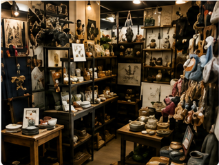
Unclear entry.
Shoppers pause and try to figure out where they can go.
HARDER TO SHOP
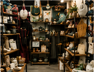
Takes more effort.
The eye has to work hard to find a place to start.
What Makes the Difference?
It’s rarely one big thing. It’s usually a combination of small, quiet signals that help shoppers relax and browse.
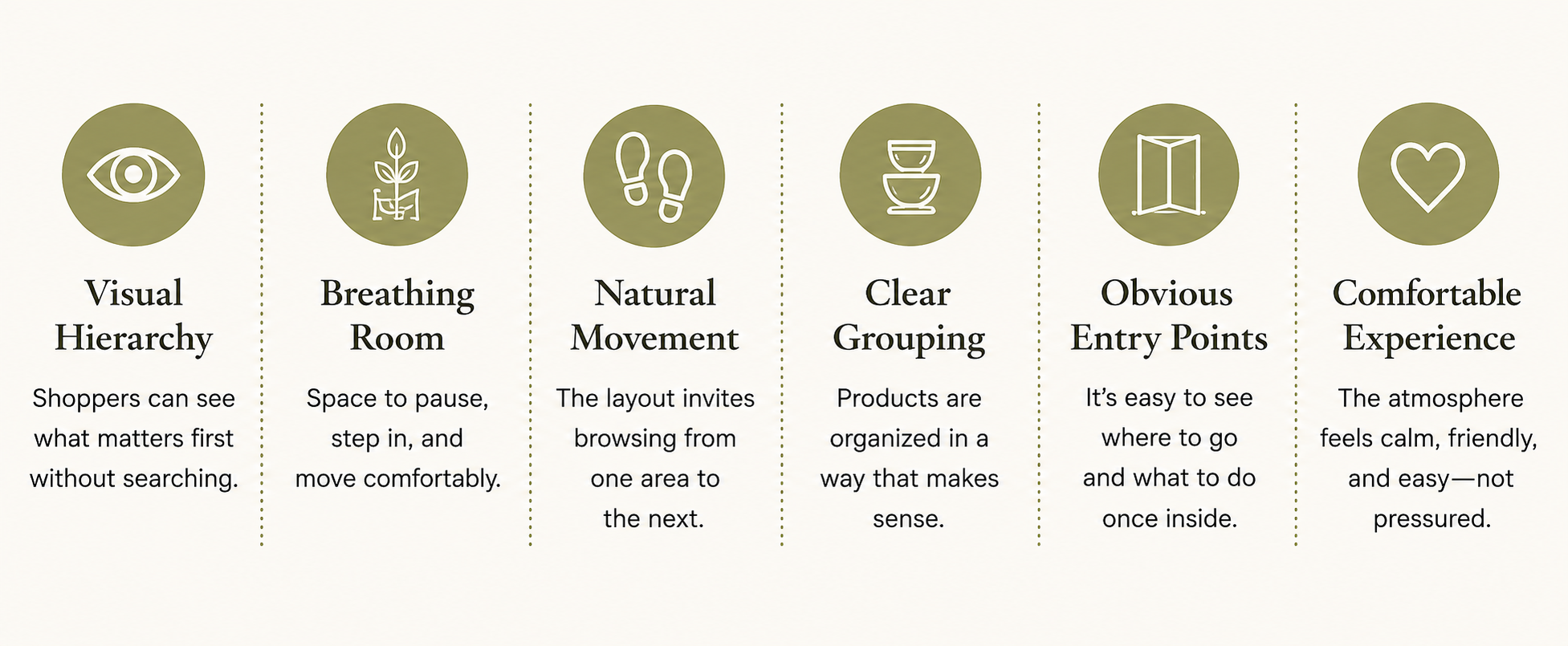
Easy to shop isn’t about having more space or more stuff.
It’s about making it easy for shoppers to say yest to browsing.
What to Watch For in Your Own Booth
These are clues you can observe - without changing anything yet.
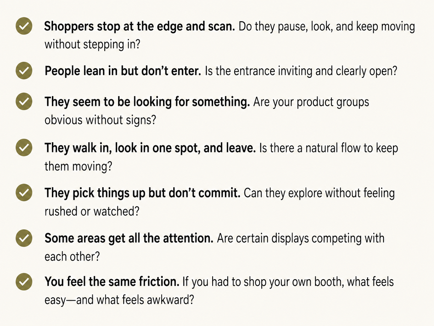
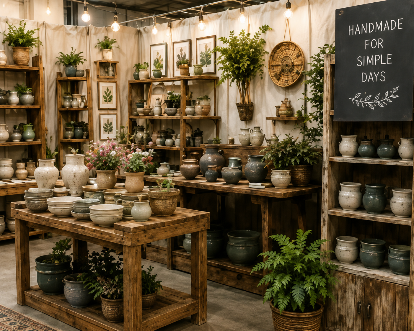
Watch for patterns. Small observations often reveal the big reasons.
An Easy-to-Shop Booth
doesn’t have to be perfect, and making it easier doesn’t require a total overhaul.
It just asks less of the shopper.
When shoppers don’t have to figure things out, they can relax, browse, and connect with what you’ve created.
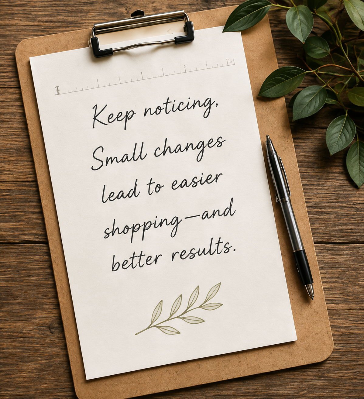
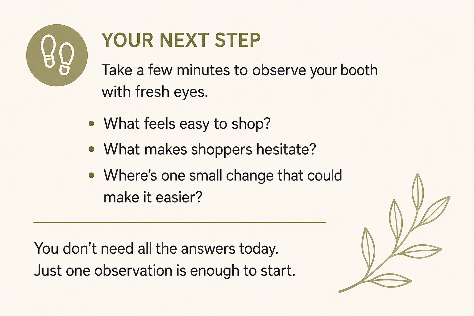
If something about your booth still feels off…
You don’t have to start by changing everything. When Something Feels Off helps you take a closer look at what shoppers are experiencing in your booth, notice where the friction may be happening, and decide what deserves your attention first.