

Why Shoppers Browse Your Booth But Don’t Buy
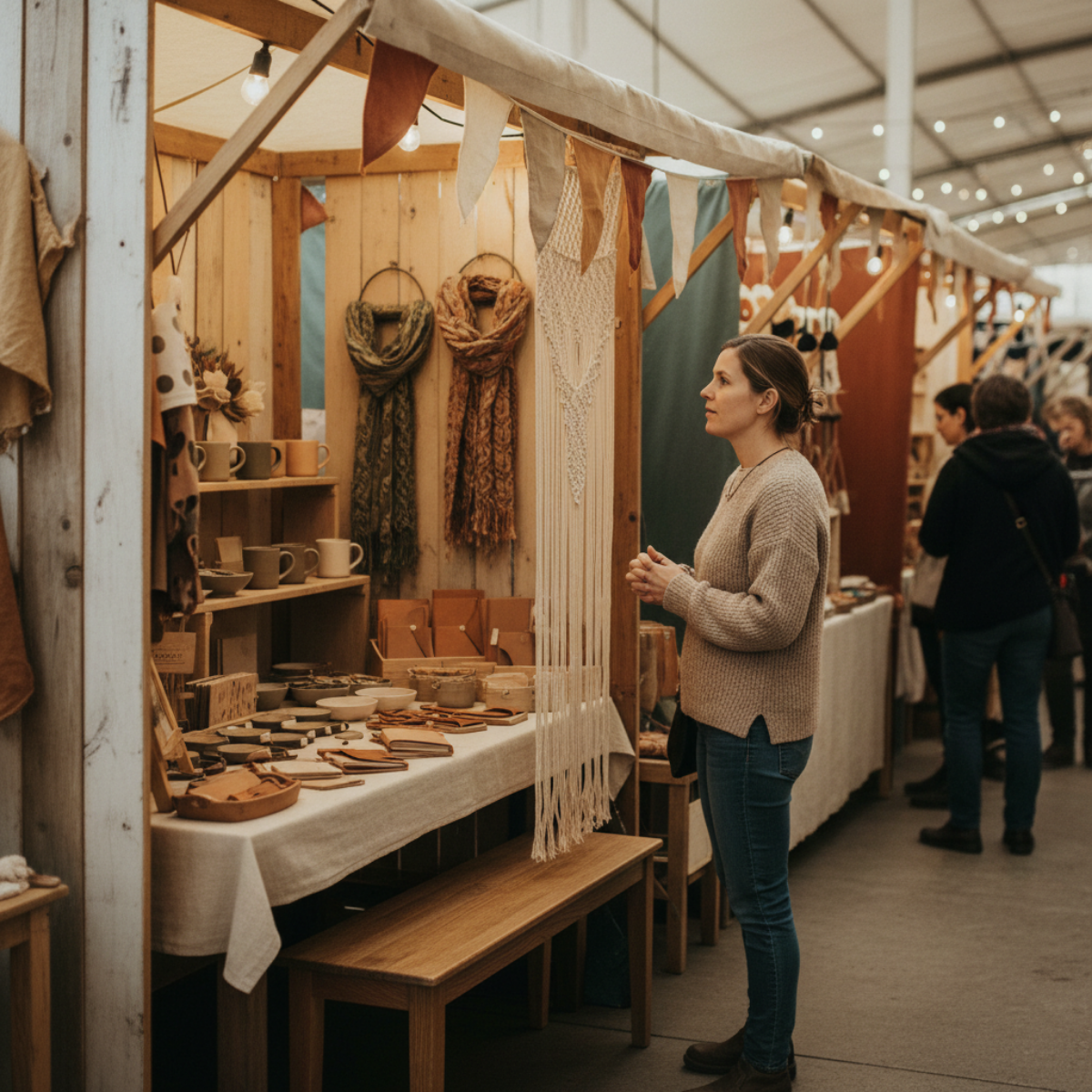
She’s already in your booth.
Looking. Considering.
But nothing is moving her forward into buying.
They stop.
They look.
Sometimes they even lean in for a second.
And then they leave.
You notice it enough times that it stops feeling random.
Because it’s not that people ignored your booth.
It’s that something almost happened
…and then didn’t.
You can feel the break in it.
That weird moment where interest shows up—
but shopping never really starts.
And after a while, the thought creeps in:
Maybe they liked it.
Maybe it just wasn’t enough.
Or maybe something in the booth is asking too much too soon.
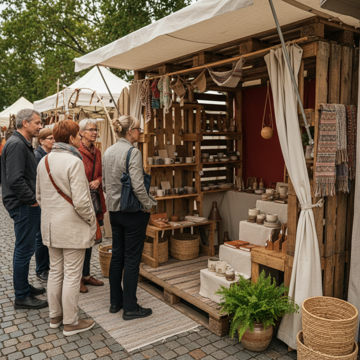
Shoppers are noticing your booth—but that doesn’t mean they’re entering the buying process.
A lot of makers read this moment as mild interest.
Better than being ignored.
Better than walking straight past.
At least something caught their attention.
But when shoppers browse and leave over and over, the problem usually isn’t that nothing worked.
It’s that the booth created enough interest to start attention—
but not enough clarity to carry that attention into a buying decision.
That’s a different problem.
And it needs to be understood clearly before you start changing everything.
They’re browsing—but they’re not entering the shopping process
When someone slows down at your booth, that does not automatically mean they’ve started shopping.
Sometimes they’re only reacting.
They noticed a product.
They liked the colors.
They saw something that felt pleasant or curious.
But noticing is not the same thing as moving into a clear buying path.
That’s the pattern a lot of booth setups create without meaning to.
They give shoppers just enough to glance, pause, and browse the surface—
but not enough structure to help them keep going.
So the booth gets attention.
But it doesn’t turn attention into movement.
The break usually happens before the product decision
This is the part that gets missed.
If shoppers are browsing but not buying, most makers assume the issue is product price, product appeal, or the shopper’s budget.
Sometimes that’s true.
But when the same browse-and-leave behavior keeps repeating across many shoppers, the booth itself is often creating the stall.
Not because it looks bad.
Because it asks the shopper to do too much interpretation on their own.
They have to figure out where to look first.
What matters most.
What kind of item this booth is really about.
How deep they should go.
Whether there’s a reason to stay.
That mental work feels small from the seller side.
From the shopper side, it’s friction.
And friction is often enough to stop a sale before the product ever gets a fair chance.
A neat booth can still feel mentally heavy
A booth does not have to look messy to feel hard to shop.
Sometimes the hardest booths to diagnose are the ones that look “pretty good.”
Everything is arranged.
Nothing seems obviously wrong.
There’s product variety.
The display looks decent from a distance.
But once shoppers step in, the booth gives them too many equal choices and not enough visual direction.
Nothing stands out as the place to begin.
Nothing clearly carries them from one thing to the next.
Nothing tells them what this booth is really helping them notice.
So they browse lightly.
They react in pieces.
They leave without ever locking onto a reason to buy.

When everything feels equally important, shoppers don’t know where to begin.
What’s really happening is not lack of interest—it’s lack of directional clarity
That distinction matters.
If people were fully uninterested, they would keep walking.
But they’re not doing that.
They’re stopping.
They’re browsing.
They’re showing signals.
What’s missing is the shift from passive looking to active shopping.
And that shift usually depends on directional clarity inside the booth:
what the shopper should notice first
what makes the booth feel easy to enter
what connects one product area to the next
what reduces hesitation instead of adding more choice
When that clarity is weak, the booth keeps generating shallow engagement.
Enough to look promising.
Not enough to convert.
What to look for in your own setup
These are the kinds of signals that often show up when the booth is creating browse behavior without buying momentum:
If shoppers stop at the outer edge and scan without stepping in, your booth entry point likely isn’t visually clear enough.
If they step in, look at one or two things, and then back out quickly, your display may be creating isolated points of interest instead of a connected shopping path.
If they pick up items but do not continue exploring nearby products, the booth may be functioning like separate mini-displays instead of one guided experience.
If they circle visually without asking questions or moving deeper, they may be doing too much silent sorting on their own.
If different shoppers keep reacting to different items but none of those reactions turn into sustained engagement, your booth may be catching attention in fragments rather than focusing it.
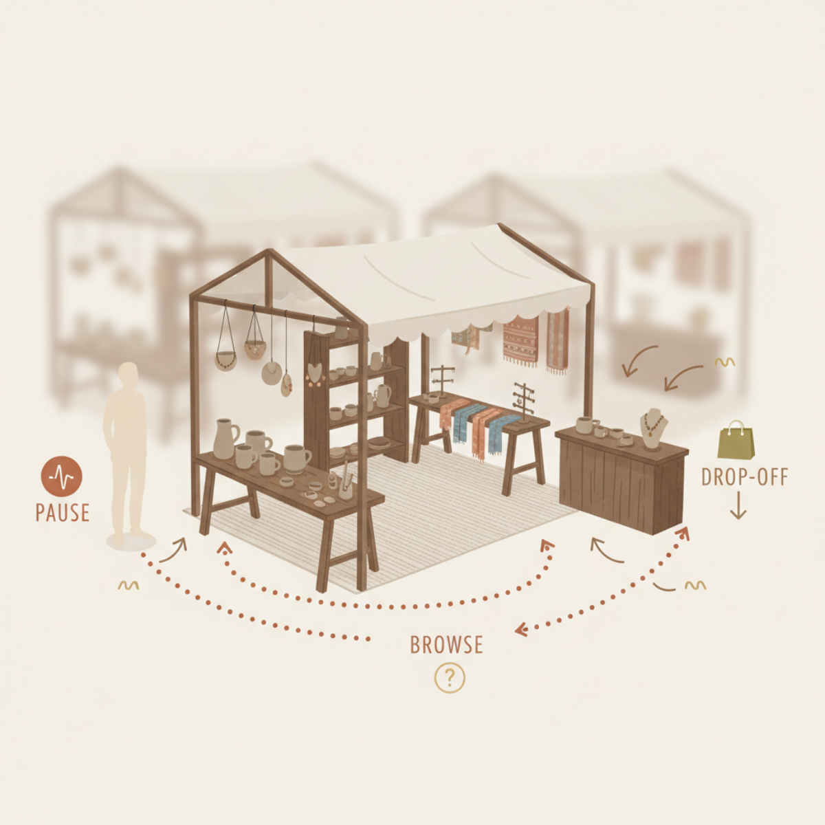
The pattern: pause → browse → lose momentum → leave.
That’s the part worth paying attention to.
Not just whether people stop.
But whether the booth helps them keep going after they stop.
Because that’s where the real loss usually happens.
And once you see that, a lot of random booth tweaking starts to make less sense.
Four shifts that change this pattern
1. Give the booth a clear starting point
A shopper should not have to decide where shopping begins.
When everything has equal visual importance, the booth feels open—but mentally flat.
A stronger starting point helps shoppers enter the booth with less hesitation. That might come from your most recognizable category, your clearest problem-solver, or the area that best tells shoppers what your booth is about.
The point is not to make one thing louder just to be loud.
The point is to reduce the first moment of uncertainty.
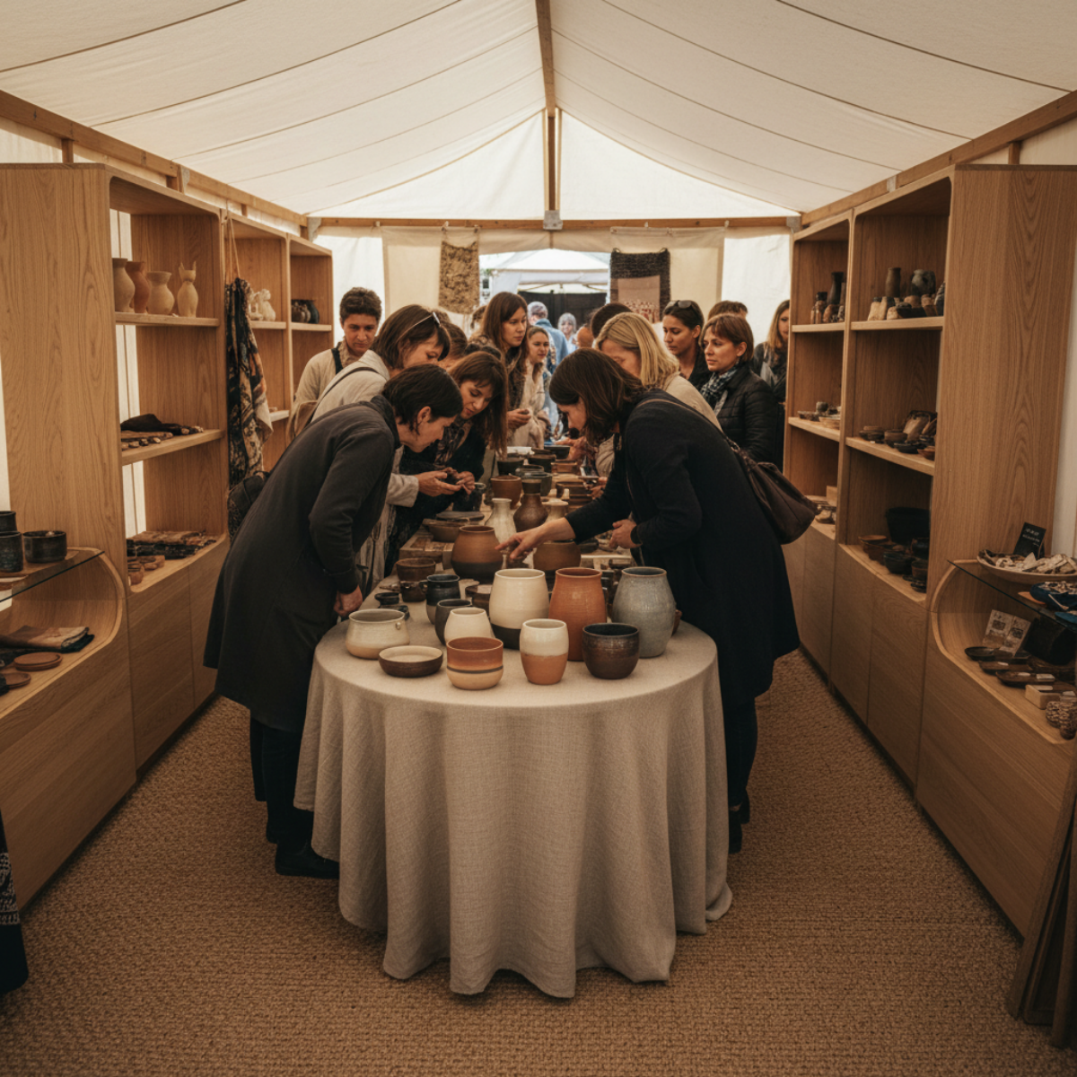
2. Connect interest instead of scattering it
A shopper who notices one item should feel pulled naturally toward the next useful thing to look at.
When products feel disconnected, browsing stays shallow.
When displays support one another, shoppers stay in motion longer.
That does not always mean adding more signs or more explanation.
Often it means reducing visual separation and making the booth easier to read as one environment instead of many unrelated decisions.
3. Make staying feel easier than leaving
A lot of browse-and-leave behavior happens because the booth does not give the shopper an easy reason to remain engaged.
Not a sales pitch.
Not pressure.
Just enough visual coherence that staying feels natural.
The booth should lower the effort required to keep looking.
When the experience feels disjointed, leaving becomes the easiest move.
4. Let the booth answer one question clearly
A shopper may not say it out loud, but the booth is always being judged by a silent question:
What am I supposed to notice here?
If the answer is fuzzy, the whole shopping experience becomes weaker.
If the answer is clear, attention has somewhere to go.
That does not mean the booth needs to be simple in a boring way.
It means the booth needs to make its value legible faster.
This is why “they stopped” is not enough
It’s easy to overvalue browsing because browsing looks close to shopping.
And sometimes it is close.
But not always.
Sometimes browsing is just polite curiosity.
Sometimes it is visual interest without structural support.
Sometimes it is the shopper’s way of saying, “Something here caught me—but I don’t know how to move further into it.”
That is a booth problem worth taking seriously.
Because it means the issue may not be your products at all.
It may be what the booth is asking the shopper to sort out before they can feel confident enough to buy.
A clear path helps shoppers move from interest into real engagement.
Once that starts happening, the next question is not just whether shoppers are interested.
It becomes:
What are they actually focusing on when they browse?
Because that focus point usually tells you where the booth is helping—
and where it’s failing.
And that’s the part you need to see clearly before you decide what to change next.
To keep going, read What to Focus On When Shoppers Browse—But Don’t Buy.