

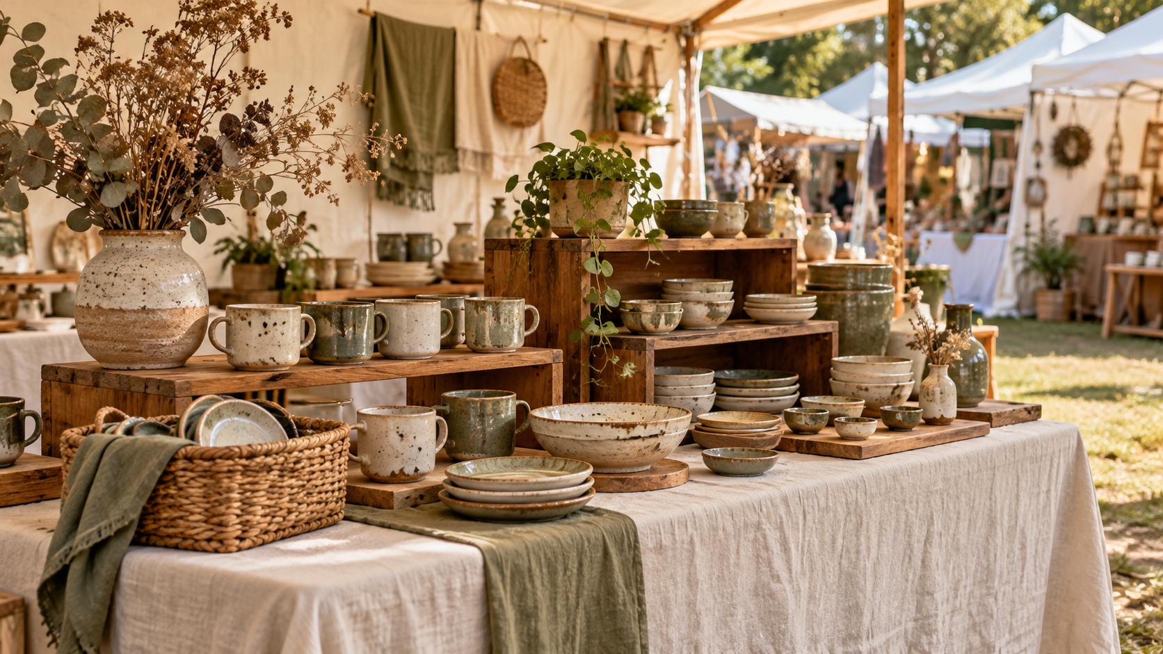
When Your Booth Looks Trendy - but Still Feels Off
How to assess a popular display idea and decide what to keep, adapt, or watch more closely.
You liked the look. Does it work in your booth?
You’ve seen the idea in booth photos, on Pinterest, or at several shows. Matching baskets. Natural wood risers. A backdrop that pulls everything together. The style keeps appearing, and you can picture it working with what you make.
So you try it.
There are things you like about the result, but something still feels unsettled. Perhaps your products blend into the display more than you expected. Prices are harder to spot. Or a decorative detail takes up space you find yourself needing while you sell.
You may notice shoppers pause, look, and move on. That doesn’t tell you whether the display choice played a part.
You don’t need to discard an idea simply because you borrowed it—or keep it exactly as you first saw it. You can look more closely at what it contributes, what it makes harder, and whether a different use would suit your booth better.
Start with one choice you’re unsure about: what did you want it to help shoppers do or understand?
What the inspiration photo doesn’t show
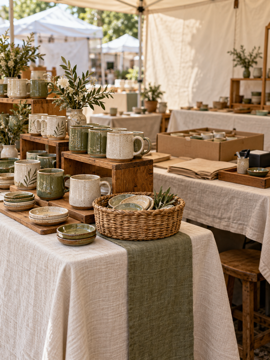
A booth photo can give you a useful idea. It rarely gives you all the conditions behind it.
Those matching baskets might hold tall, upright packages with labels visible above the rims. Your products may be smaller, loose, or something shoppers need to pick up and compare. The same baskets could create a different browsing experience.
The photograph may also leave out the price cards, the checkout area, or the stock waiting beneath the table. You can see the finished arrangement, but you may not know how it works once people begin shopping—or what the maker does to keep it stocked throughout the day.
That doesn’t make the inspiration less useful. It gives you something to adapt to your own products, space, and routine.
Before copying the arrangement, name what appeals to you. Is it the warmth of the materials? The way products are grouped? The height that makes something visible from the aisle?
Then give that choice a purpose in your booth.
“I want matching baskets” describes a look. “I want shoppers to find and compare these small items more easily” gives you something to assess.
You may be able to keep what attracted you while changing how you use it.
Keep the baskets, reconsider their role
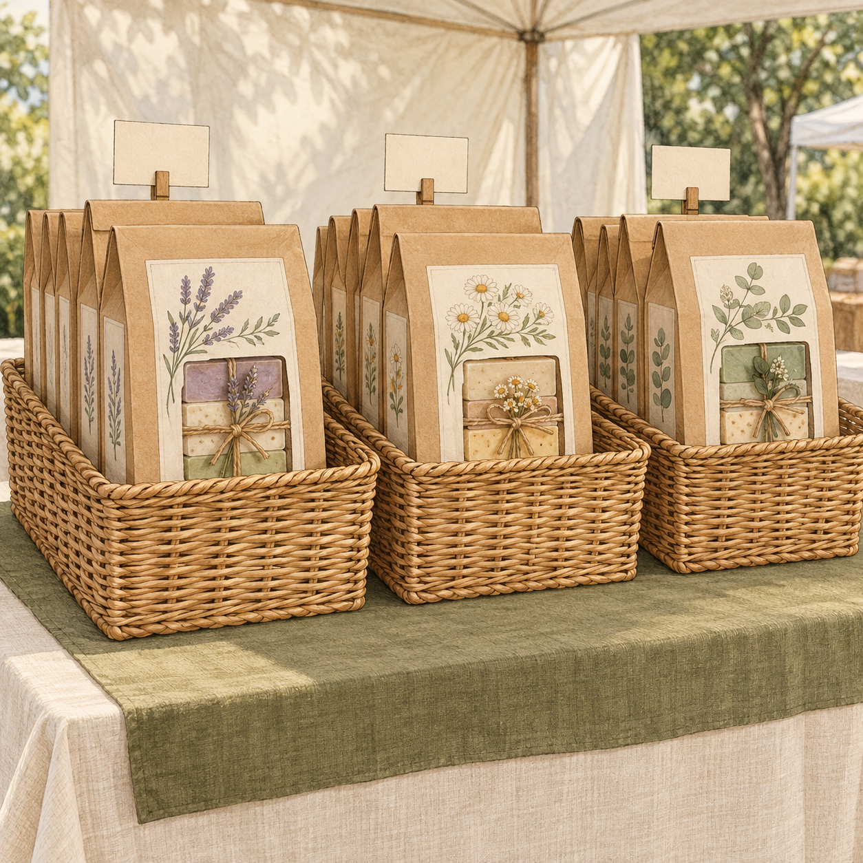
Imagine a maker borrowing a basket display idea from a booth photo. In the photo, large, upright packages sit neatly together, their labels visible above the basket rims.
The maker likes the warmth of the woven material and the way the baskets group the products. They try a similar arrangement with their own small, loose items.
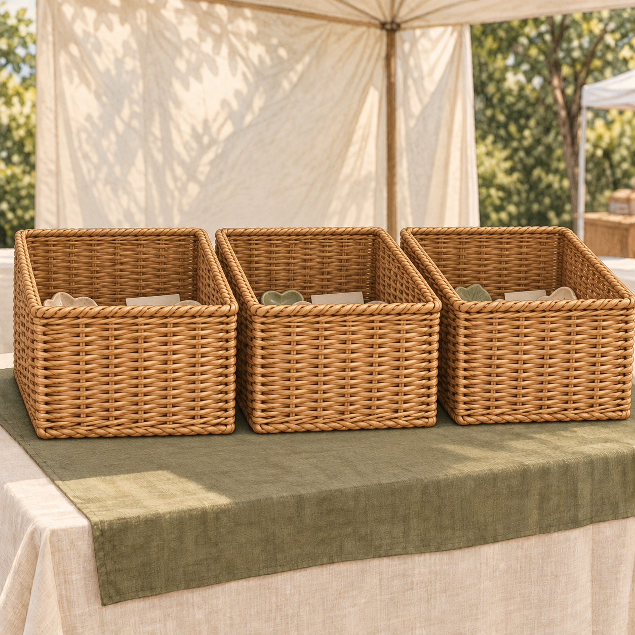
But the proportions are different. Some products sit below the rims, along with the price cards. The arrangement has the look they wanted, while leaving them unsure about how easily someone can browse it.
This is an illustrative example, not a conclusion about a particular booth. Here’s how the maker could look more closely.
Can shoppers see what’s available?
From the aisle, the baskets are easy to see. The differences between the smaller products are less visible.
That gives the maker a specific condition to examine: how much of each item can someone see before reaching into the basket?
Can shoppers reach and compare?
Someone may need to search through the contents to compare the items. Depending on the products, that browsing could be enjoyable—or awkward.
The maker can watch whether people comfortably sort through them, struggle to return an item, or ask questions the display could help answer.
What do the baskets contribute to the booth?
Their woven texture suits the character of the maker’s work. They create a consistent look the maker still likes.
That contribution matters. A concern about product visibility doesn’t erase the reasons the baskets appealed in the first place.
What makes them practical to keep?
The baskets also carry spare stock to the show and keep it grouped beneath the table. They remain useful even if their role in the display changes.
Visibility and access suggest trying a different presentation for the small items. Their character and carrying usefulness give the maker reasons to keep the baskets.
One possible adjustment is to move a single product group into a shallow tray, with its price clearly visible, and use the deeper basket for stock.
The maker keeps what they value about the idea while changing the part they’re unsure about. Whether that adjustment makes browsing easier is something to observe at the next show.
Try one manageable adjustment
Choose one display element you’re unsure about. You can begin with something you already own and one question you’d like to answer.
1. Name what you want it to do
This is your starting point. Beyond creating a look you like, what should the element help shoppers do or understand?
For the basket example: “I want shoppers to see the different small pieces and compare them easily.”
Your purpose might be to make prices easier to find, bring a product group into view, or show which items belong together.
2. Describe the condition you can see
Keep this separate from your explanation of shopper behavior.
“The small pieces and price cards sit below the basket rims” describes a visible condition.
“People aren’t buying because of the baskets” assumes a cause you haven’t established.
3. Choose one adjustment to try
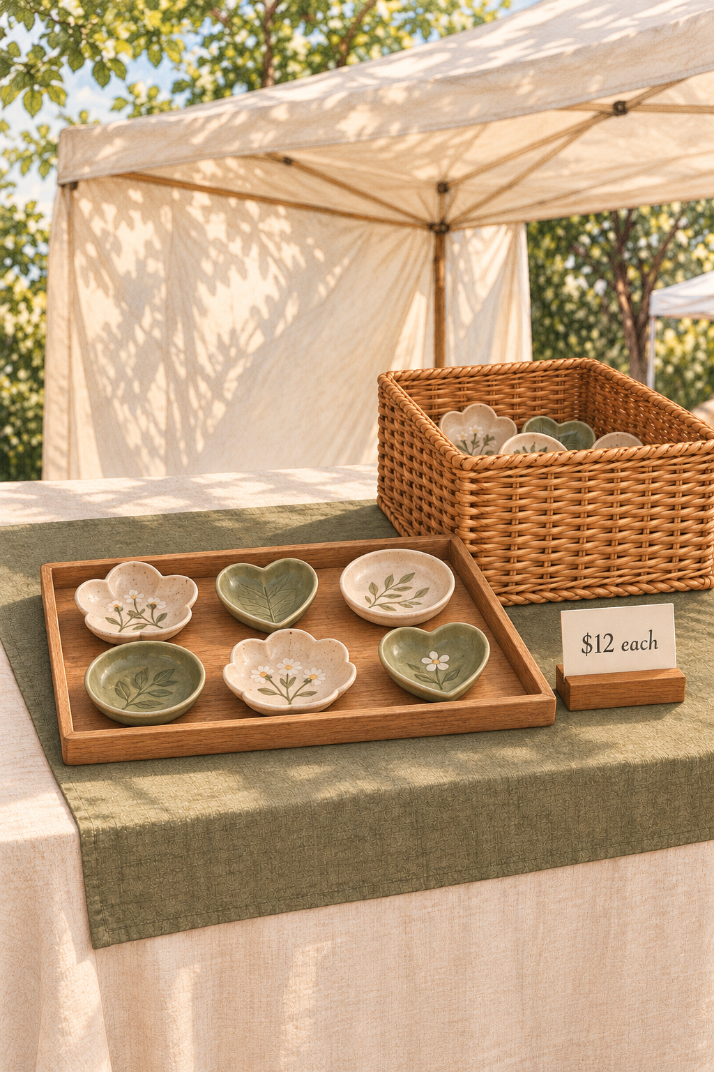
For one product group, you might replace the deep basket with a shallow tray and place its price card where it can be seen.
Make the adjustment before opening or between shows. Keep the products, prices, location, and surrounding arrangement as consistent as practical so you have fewer differences to untangle afterward.
One product group, one adjustment, and something specific to watch.
4. Watch for something relevant
Return to the purpose you named. If you wanted comparison to be easier, notice whether shoppers pick up different pieces, look between them, or have difficulty reaching an item.
A sale may be encouraging, but it won’t tell you on its own whether the display adjustment helped.
5. Leave yourself a short note
Serving customers comes first. During a quiet moment—or immediately after the show—write down a specific observation while you still remember it.
Observed: “Two shoppers searched through the basket before asking the price.”
Question: “Would a price card above the rim be easier to find?”
Keep the observation and the question separate. That gives you something concrete to return to without turning a possible explanation into a fact.
Traffic, shopper interests, neighboring booths, and other conditions can differ between shows. Treat what you record as information to build on. You may need to watch the arrangement again before deciding what deserves to stay.
This exercise starts with a display choice you’ve already identified. Sometimes the harder part is deciding which element to examine in the first place.
When you can’t tell where to start
The exercise above begins with a display choice you already have in mind. But sometimes several things feel unsettled, and you’re unsure which deserves attention first.
You may like the baskets, question the backdrop, and wonder whether the arrangement makes your products easy to find. Choosing where to look can be harder than coming up with another change.
When Something Feels Off is a visual guide and working planner that helps you begin that review. Illustrated booth examples give you situations to compare with your own, while observation pages help you record what shoppers do and separate those details from your possible explanations.
Watching while greeting customers, answering questions, and handling purchases can leave you with scattered impressions. The pages give you somewhere to bring those observations together afterward. The First Fix Plan then helps you choose one change to try and decide what to watch when you review it.
You don’t have to know why the booth feels off before you begin. You can start by choosing where to look more closely.